
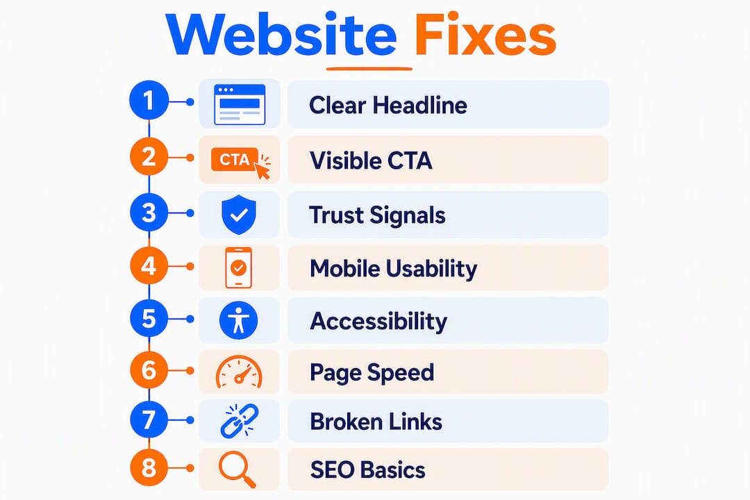
The fastest way to stop losing visitors is to fix these eight website mistakes. Most small business sites bleed traffic and leads from the same handful of problems, and the good news is that most fixes take less than a day.
Quick-action checklist:
- Unclear homepage headline → Rewrite it to answer what you do, who you help, and the benefit in one sentence.
- Weak or buried CTAs → Move your primary call-to-action above the fold and use action-first copy.
- Visual clutter → Remove any element that doesn’t support the page’s single goal.
- Missing trust signals → Add a testimonial, visible contact info, and an SSL badge near your CTA.
- No mobile optimization → Test on a real phone; fix tap targets and font sizes first.
- Accessibility gaps → Run a contrast check, add alt text to every image, and verify keyboard navigation.
- Slow load times → Convert images to WebP, lazy-load below-the-fold media, and remove unused scripts.
- Broken forms and SEO basics → Test every form, check for a unique title tag on each page, and run Google Search Console.
Table of Contents
- Does your homepage actually tell visitors what you do?
- Are your calls-to-action actually getting clicked?
- How visual clutter is quietly killing your conversions
- Why visitors don’t trust your site (and how to fix it fast)
- Is your site actually usable on a phone?
- Accessibility mistakes that hurt everyone, not just users with disabilities
- Slow pages cost you visitors before they even see your content
- Broken forms, bad URLs, and the SEO basics that stop leads from reaching you
- Homepage messaging checklist and accessibility quick tests
- Key Takeaways
- The mistake most small business owners don’t see coming
- Ibrand makes website fixes affordable for small businesses
- Useful resources and tools
- FAQ
Does your homepage actually tell visitors what you do?
Non-scannable text and poor navigation are among the most persistent usability failures on the web, according to Nielsen Norman Group. Visitors decide within seconds whether to stay, and a vague headline sends them straight to the back button.
A homepage headline needs to answer three questions fast: what you do, who you serve, and the result the visitor gets. “Welcome to Our Website” fails all three. “Affordable bookkeeping for freelancers in Chicago — close your books in a day” passes all three. If your headline can’t clear that bar, rewrite it before touching anything else.

Navigation labels matter just as much. Predictable labels (“Services,” “About,” “Contact”) outperform clever ones every time. Keep your primary action visible without scrolling, place search where users expect it (top right), and make sure visited links change color so users know where they’ve been.
| Navigation pattern | Pros | Cons | Best for |
|---|---|---|---|
| Simple top nav (few items) | Fast to scan, low cognitive load | Limited for large sites | Small business, portfolios |
| Mega menu | Handles many categories at once | Can overwhelm; hard on mobile | E-commerce, large directories |
| Hidden/hamburger (desktop) | Clean look | Hides options; reduces discoverability | Mobile-only; avoid on desktop |
Pro Tip: Run a five-task first-click test with three to five real users. Ask them to find your pricing, contact page, and main service without coaching. If more than one person hesitates or clicks the wrong thing first, your navigation needs work before any visual redesign.
Are your calls-to-action actually getting clicked?
Conversion friction is usually invisible to the site owner. The button is there, the offer is real, but the copy says “Submit” and it sits below the fold in a gray box that blends into the background. Nobody clicks it.
The fix is straightforward. Invisible friction points like unclear headlines and generic CTAs cause abandonment even when the site looks functional. Every CTA needs four things: placement near the headline, action-first copy, a single primary option per screen, and a tap target large enough for a thumb.
CTA copy quick fixes:
- ✗ “Submit” → ✓ “Get my free quote”
- ✗ “Learn more” → ✓ “See how it works”
- ✗ “Click here” → ✓ “Start my free trial”
- Make the button color contrast sharply with the background.
- Limit each page to one primary CTA; secondary options should be visually quieter.
For website conversion rate tips that go deeper, Ibrand’s guide covers button placement, copy testing, and page-level hierarchy.
Pro Tip: Change one CTA element at a time when testing: copy first, then color, then placement. Changing all three at once tells you something worked but not what.
How visual clutter is quietly killing your conversions
Every element on a page competes for attention. Add enough of them and visitors freeze, unsure where to look. That cognitive overload is a direct conversion killer, and it’s one of the most common web design pitfalls small business owners create by accident, usually by adding things over time without ever removing anything.
The best pages aren’t the ones with the most content. They’re the ones where every element earns its place by moving the visitor toward one clear action. Remove anything that doesn’t do that job.
A simple declutter workflow: inventory every element on the page, mark anything that doesn’t support the primary goal, remove or relocate it, then test. A before/after example: a local plumber’s homepage had a rotating banner, three different phone numbers, a blog feed, a video, and four CTAs. After stripping it to one headline, one phone number, one “Book a call” button, and two trust badges, time-on-page went up and bounce rate dropped. The page did less and converted more.
Intrusive pop-ups and autoplay media are particularly damaging, according to Webflow. Even small interruptions push users toward the exit.
Pro Tip: Print a screenshot of your homepage in grayscale. If your eye doesn’t land on the CTA within three seconds, the visual hierarchy needs work.
Why visitors don’t trust your site (and how to fix it fast)
About 75% of a site’s perceived credibility is attributed to its visual design, according to HubSpot. That number should reframe how you think about trust: it’s not just about having a privacy policy, it’s about every visual decision on the page.
The essential trust signals for a small business site:
- SSL certificate (the padlock in the browser bar): non-negotiable.
- Real testimonials with a name and, ideally, a photo or company.
- Visible contact information: a phone number or address, not just a contact form.
- Privacy policy link in the footer.
- Payment badges near checkout if you sell online.
- Consistent design across pages; design coherence across pages directly drives conversions, per Shopify.
Place trust signals near your CTAs, not buried in the footer. A testimonial sitting right above a “Book now” button does far more work than one on a dedicated reviews page. For a deeper look at building online credibility for small businesses, Ibrand’s guide walks through placement and proof types.
Pro Tip: Do a quick trust audit: open your homepage on a phone you’ve never used before. Can you find a phone number, a real customer quote, and a clear CTA within 10 seconds? If not, fix those three things first.

Is your site actually usable on a phone?
Mobile devices account for a majority of global web traffic, per Statista. A site that looks fine on a desktop but breaks on a phone isn’t a minor issue; it’s losing you a large share of potential customers.
| Mobile check | What to look for | Quick fix |
|---|---|---|
| Tap targets | Buttons with sufficiently large tap targets | Increase padding in CSS |
| Font size | Body text with readable font size | Set base font in stylesheet |
| CTA above the fold | Visible without scrolling | Restructure hero section |
| Hamburger menu | Opens and closes cleanly | Test on iOS and Android |
| Images | Not overflowing container | Use responsive image sizing |
Test on real devices, not just browser emulators. Chrome DevTools is useful for a quick check, but an actual iPhone and an Android mid-range phone will catch issues the emulator misses. Use flexible grids, SVG icons where possible, and scalable images to keep the layout solid across screen sizes.
Accessibility mistakes that hurt everyone, not just users with disabilities
Treating accessibility as an afterthought is one of the top website design mistakes, according to HubSpot. The four most common failures: insufficient color contrast, missing alt text on images, no keyboard focus indicators, and unlabeled form fields. Each one also degrades SEO, because search engines read alt text and rely on semantic structure.
High-impact accessibility checks:
- Color contrast: use WebAIM’s Contrast Checker; aim for a 4.5:1 ratio for normal text.
- Alt text: every meaningful image needs a description; decorative images get an empty alt attribute.
- Keyboard navigation: tab through your entire site without a mouse; every interactive element should be reachable and visibly focused.
- Form labels: every input field needs a visible label, not just placeholder text.
- Screen reader spot-check: run NVDA (Windows, free) or VoiceOver (Mac/iOS, built-in) on your homepage.
The WebAIM Million report consistently finds that the vast majority of the top one million websites have detectable WCAG failures, meaning fixing even the basics puts you ahead of most competitors.
Pro Tip: Build one simple persona of a user who navigates by keyboard only. Walk through your checkout or contact flow as that person once a quarter. You’ll catch issues no automated tool flags.
Slow pages cost you visitors before they even see your content
Speed is a ranking factor and a UX factor at the same time. Heavy images, unnecessary scripts, and missing caching are the most common causes of slow load times, and the fixes are well-established.
Minor UX annoyances can produce measurable drops in engagement, including reduced page views, according to Webflow. Slow pages are the most common source of that friction.
| Metric | What it measures | Target | Tool |
|---|---|---|---|
| LCP (Largest Contentful Paint) | How fast the main content loads | Fast load time target | Google Lighthouse |
| INP (Interaction to Next Paint) | Responsiveness to user input | Under 200ms | Chrome DevTools |
| CLS (Cumulative Layout Shift) | Visual stability during load | Low visual instability target | PageSpeed Insights |
The highest-impact fixes: convert images to WebP format, lazy-load anything below the fold, remove third-party scripts you don’t actively use (chat widgets, old analytics tags, social embeds), and enable browser caching. Run Google Lighthouse on every key page and treat a score below 70 as a problem worth fixing this week.
Broken forms, bad URLs, and the SEO basics that stop leads from reaching you
Poor structure, missing tracking, and broken forms are among the most common development mistakes that quietly kill leads and search rankings. Most of these are fixable in an afternoon.
Forms checklist:
- Test every form submission yourself, on mobile and desktop.
- Add a confirmation or thank-you page after submission (this also lets you track conversions in Google Analytics).
- Use clear error messages (“Please enter a valid email”) rather than generic ones (“Error”).
- Set up email notifications and log submissions so nothing gets lost.
SEO and URL basics:
- Every page needs a unique title tag (50–60 characters) and meta description.
- One H1 per page, matching the page’s primary topic.
- Clean URL slugs:
/services/bookkeepingbeats/page?id=47. - No duplicate pages; use canonical tags when similar content must exist in multiple places.
- Submit your sitemap to Google Search Console and check the Coverage report monthly.
For a full walkthrough of optimizing your site for search, Ibrand’s small-business SEO guide covers every technical baseline.
Homepage messaging checklist and accessibility quick tests
Designing to personal taste rather than user behavior is one of the most expensive mistakes small businesses make, according to Entrepreneur. The fix is a short, repeatable testing routine.
Homepage messaging checklist:
- Headline answers: what you do, who you serve, and the benefit.
- One primary CTA visible without scrolling.
- At least one piece of social proof (testimonial, rating, client logo) above the fold.
- Contact method visible in the header or hero.
Two high-impact accessibility quick tests:
- Paste your homepage URL into WebAIM’s WAVE tool; fix every red error before touching yellow warnings.
- Increase your browser zoom to 200% and confirm no content overlaps or disappears.
Stat to know: About 75% of a site’s perceived credibility is attributed to its visual design. That means a cluttered or inconsistent layout doesn’t just look bad — it actively erodes trust before a visitor reads a single word.
For the UX and SEO relationship that ties all of this together, the intersection of UX and SEO in ecommerce design is worth reading if you want a deeper technical view.
Pro Tip: Run a five-minute live test: share your homepage URL with someone who has never seen your business and ask them to describe what you do after five seconds. If they can’t, your headline needs a rewrite before any other fix.
Key Takeaways
Preventing common website mistakes comes down to five high-impact fixes: a clear headline, a visible CTA, trust signals near the conversion point, a mobile-ready layout, and images optimized for speed.
| Point | Details |
|---|---|
| Headline first | Rewrite your homepage headline to answer what, who, and the benefit before any other change. |
| CTA placement and copy | Move your primary CTA above the fold and use action-first copy (“Get my free quote”). |
| Trust signals near CTAs | Place a testimonial and visible contact info next to your call-to-action, not only in the footer. |
| Mobile and accessibility | Fix tap targets, font sizes, color contrast, and alt text — these affect both UX and search rankings. |
| Ibrand for hands-on help | Ibrand offers web design, SEO, and performance audits tailored to small businesses that need fast, affordable fixes. |
The mistake most small business owners don’t see coming
Most site owners I talk to have already fixed the obvious things: they have a logo, a contact page, and a mobile-friendly theme. What they haven’t fixed are the invisible friction points, the ones that look fine on the surface but quietly drain conversions every day.
The clearest example is the homepage headline. Owners write it for themselves, using language that feels natural to someone who already knows the business. Visitors read it cold and have no idea what the company actually does. That gap between “it makes sense to me” and “it makes sense to a stranger in three seconds” is where most small business sites lose the most ground.
The same pattern shows up in CTAs. A button that says “Learn more” feels polite and low-pressure to the owner. To a visitor, it signals that clicking will lead to more reading, not a clear next step. Changing it to “Get my free quote” or “Book a 15-minute call” removes that hesitation.
The broader point: small, invisible friction points compound. A weak headline plus a generic CTA plus no testimonial near the button adds up to a site that looks credible but converts poorly. Fixing all three in one afternoon often produces a bigger lift than a full redesign. Start with the words, then the trust signals, then the technical fixes. That order matters.
Ibrand makes website fixes affordable for small businesses
If you’ve worked through this checklist and still aren’t sure where the biggest leak is, Ibrand’s team does exactly this kind of work for small businesses every day.
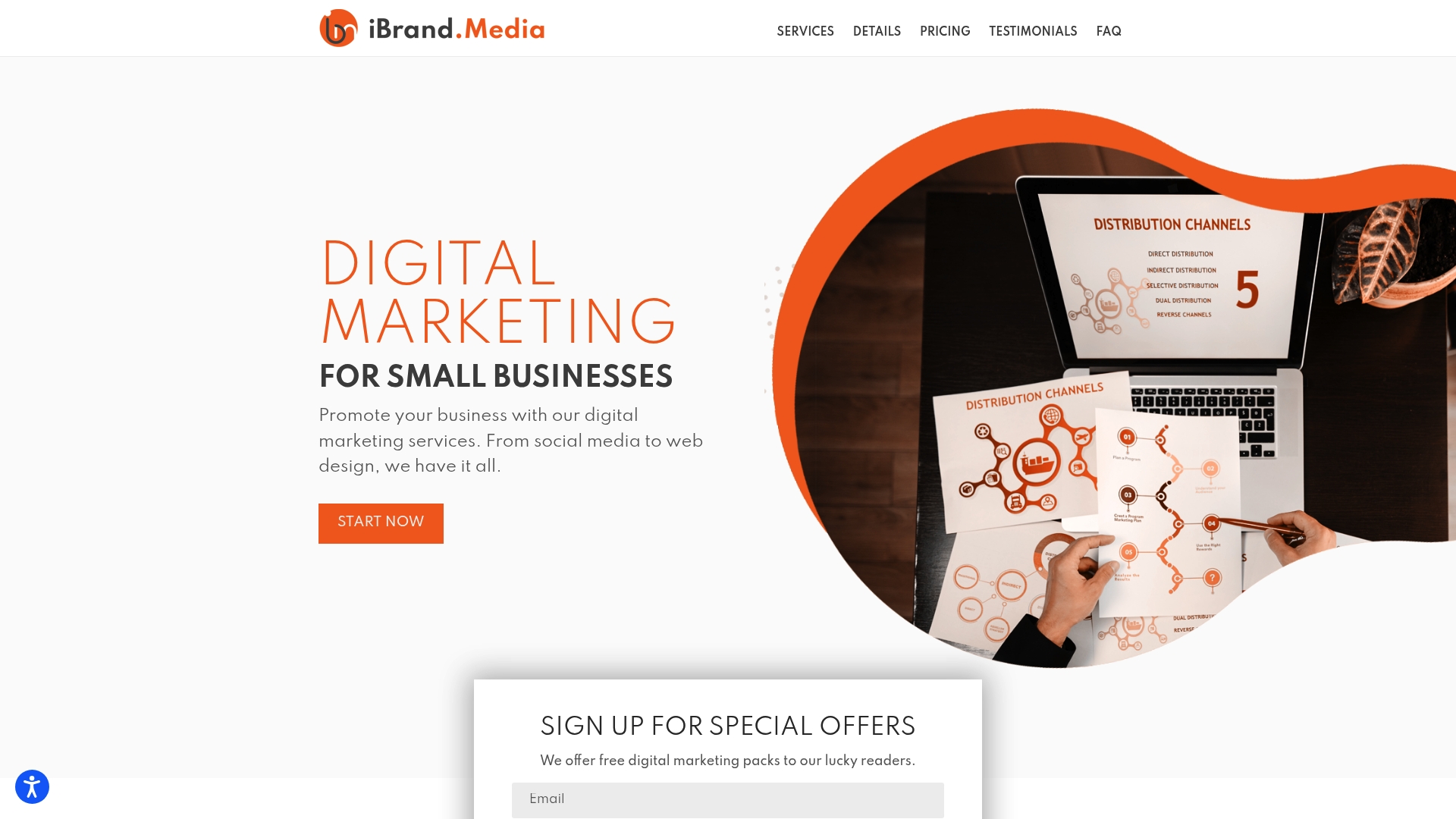
Ibrand offers web design and development built around the fixes covered here: conversion-focused layouts, mobile optimization, accessibility improvements, and performance tuning. The agency also handles SEO fundamentals, so your site gets found and converts once visitors arrive. Pricing is transparent and designed for businesses that can’t afford a six-month agency retainer. If you want a fast read on where your site stands, Ibrand’s small-business SEO guide is a practical starting point, or you can reach out directly for a site audit.
Useful resources and tools
- Google Lighthouse: run performance, accessibility, and SEO audits directly in Chrome DevTools; use it on every key page.
- Google PageSpeed Insights: get LCP, INP, and CLS scores with field data from real users.
- Google Search Console: monitor crawl errors, coverage issues, and search performance; check monthly.
- WebAIM Contrast Checker: paste in your foreground and background colors to verify a 4.5:1 ratio.
- WAVE Accessibility Tool: paste any URL for a visual overlay of accessibility errors and warnings.
- Screaming Frog SEO Spider: crawl your site for broken links, missing title tags, and duplicate content (free up to 500 URLs).
- WebP Converter (Squoosh): convert and compress images in the browser; no install needed.
- NVDA Screen Reader: free Windows screen reader for testing keyboard and screen-reader accessibility.
- Ibrand site audit: if you’d rather have an expert run these checks, Ibrand’s web design services include a performance and usability review as part of onboarding.
FAQ
What is the single most damaging website mistake for small businesses?
A homepage headline that doesn’t clearly state what you do, who you serve, and the benefit. Visitors who can’t answer those three questions in seconds leave, and no amount of design polish recovers that lost traffic.
Why do I keep getting errors or broken pages on my site?
Broken pages usually come from deleted content without redirects, plugin conflicts, or outdated CMS software. Run a crawl with Screaming Frog or Google Search Console’s Coverage report to find broken links, then either restore the content or set up redirects to the nearest relevant page.
How do I fix a poorly performing website without a full redesign?
Start with the highest-impact, lowest-effort fixes: rewrite the headline, move the CTA above the fold, compress images to WebP, and add one trust signal near the button. These four changes often produce a measurable improvement before any structural work begins.
What is the most common mistake web designers make on small business sites?
Designing for the owner’s taste rather than the visitor’s behavior, per Entrepreneur’s guidance on user-centered design. The fix is simple: test with real users, watch session recordings, and let data override personal preference.
Recent Comments