
A good case study page does three things in the first screen: it says who the client is, what problem you solved, and what changed. Everything after that is evidence. Put a short results summary at the top, tell the story in problem, solution, result order, show real proof, and end with one clear next step. Make the whole page work on a phone. The rest of this guide shows how, for both the page that lists your case studies and the page that tells one story.
We write this for owners of local and small businesses: dentists, med spas, HVAC and plumbing companies, contractors, venues and banquet halls. These are people who need prospects to believe a result is real before they pick up the phone.
TL;DR
- Lead with a summary: client, goal and key outcome should be visible before the long narrative starts.
- Build the listing page around filters or clear categories so a prospect finds a business like theirs in seconds.
- Tell each story as problem, solution, result, and back every claim with a real screenshot, number or quote.
- If you have no clean metric, show another verifiable form of evidence. Never invent or borrow a number.
- Design for thumbs: fast-loading images, readable type, and a call to action that repeats at the end and stays reachable on mobile.
Table of Contents
- What a case study page is really for
- The case study listing page
- The individual case study page: what goes where
- Presenting results so people believe them
- Layout choices that make a page easy to scan
- Mobile usability and calls to action
- A simple template you can copy
- Our perspective
- Turn your results into pages that bring in leads
- FAQ
- Sources
What a case study page is really for
A case study is a sales page that does not sound like one. A visitor who reads it is usually comparing you with two or three other providers and wants to know one thing: has this company already solved a problem like mine?
That changes how you design it. A portfolio piece is judged on looks. A case study is judged on whether a stranger can see themselves in the client and trust the outcome. So the layout should serve three jobs:
- Help the right visitor recognize their own situation (industry, size, location, problem).
- Make the result easy to find and easy to believe.
- Make the next step obvious for someone who is now convinced.
Design choices that do not serve one of those jobs, such as decorative sliders, full-screen animations or long intros, are usually worth cutting.
The case study listing page
Before anyone reads a story, they land on the page that lists them. This page decides whether they open one at all.
Organize by what the visitor is looking for
With three case studies, a simple grid is enough. Once you have a dozen, visitors need a way to narrow down. One B2B content marketing firm recommends filters for industry, company size, products or solutions, goals, content type and location, and points to a large software company that filters by industry, product, business type and size.
For a local service business, translate that into what your prospects actually ask:
- Type of business or service: dental practice, HVAC contractor, med spa, banquet hall.
- Goal: more calls, more bookings, better local rankings, a new website.
- Location: city or region, when you serve more than one.
- Service used: local SEO, web design, advertising, social media.
If you have fewer than ten stories, skip the filter widget and use simple labeled tabs or headings above the grid. A filter with two results in it feels broken.
Make every card carry a result
Each card on the listing page should work as a small ad for the full story. Include:
- The client name or logo (with permission) and their business type.
- One headline result in plain words, such as the thing that changed and over what period.
- A real image: a screenshot of the site, a photo of the business, a chart from the report.
- A link label that says something specific, not just “Read more”.
Cards that only show a logo and a title make the visitor click to find out whether the story is relevant. Most will not click.
Keep navigation short
Place the listing page one click from your main menu, usually under a label like “Case Studies” or “Results”. Add a closing call to action under the grid for visitors who have scrolled through everything and are ready to talk. If you want more on writing a prompt that works there, see our step-by-step guide to calls to action that convert.
The individual case study page: what goes where
This is where most of the work is. The order of information matters more than the visual style.
Start with a summary block
The top of the page should surface the main facts before the long narrative. One portfolio guide suggests an overview box showing role, goal and key outcome, plus any short context. A SaaS-focused blueprint goes a step further and recommends a hero with the customer logo and key stats, and a sticky summary sidebar that stays in view as the reader scrolls.
For a local business case study, a summary block might hold:
| Element | Example for a local business |
|---|---|
| Client | Name, business type, city |
| Challenge | One line, such as “Few online bookings outside referrals” |
| What we did | Two or three services used |
| Result | The single best measured outcome and its time frame |
| Timeline | How long the project ran |
A visitor who reads only this block should still understand the story. A visitor who wants more keeps scrolling.
Give the client context
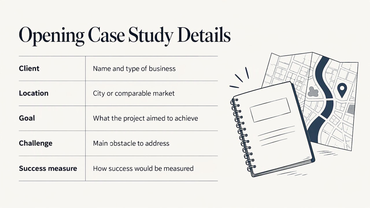
Guidance for project case studies says the opening should name the client, say what they do and where they are, then explain the goal, the main challenge and how success would be measured. Location matters especially for local work: a plumber in a mid-sized city wants to see another local-service business in a comparable market, not a global brand.
Tell the story in three beats
Keep the body in a predictable order so scanners can jump around:
- The problem. What was not working, in the client’s terms. Rankings, calls, an outdated site, an empty calendar.
- The approach. What was done and why, in plain language. Name the steps, not the jargon.
- The results. What changed, with numbers where you have clean ones, and a quote from the client.
Each section gets a descriptive heading, not a clever one. “Why the old website was losing calls” tells a scanner more than “The challenge”. Strong narrative structure helps here: a long-form guide on storytelling for public campaigns shows how to explain the work and its results as a sequence a reader can follow. We also cover the principle in our piece on the role of storytelling in branding.
Pull out quotes and metrics visually
The same blueprint recommends calling out key quotes and metrics visually inside the editorial flow. In practice that means:
- One large number per section, with a short label beneath it.
- A pull quote with the person’s name, role and business, ideally with a photo.
- Short paragraphs of two to four lines, so the numbers do not get buried.
Do not stack six big numbers in a row. Three is plenty, and each should link to a claim you explain in the text.
Add related stories and a next step
Finish with two or three related case studies from the same industry and one call to action. A visitor who has just read a convincing story is at their most willing to act, so do not make them hunt for the contact button.
Presenting results so people believe them
Small business owners have seen plenty of inflated marketing claims. Credibility is a design problem as much as a writing one.
Show the work, not only the claim
Real screenshots, dashboards, diagrams and heatmaps persuade more than descriptions. One review of SaaS case study pages identifies visual evidence of the work as a key credibility device and argues that precise metrics are harder to dismiss than vague claims such as “improved efficiency”.
For a local marketing project that could be:
- A Google Business Profile insights screenshot before and after.
- A rankings or traffic chart with the date range visible.
- A screenshot of the redesigned website on a phone and on a desktop.
- A call or booking log summary, with private client details removed.
Always label what the chart measures, over what period, and where the data came from. Our guide to tracking campaign performance explains which numbers are worth capturing from day one so that you have them when the story is written.
When you do not have a clean metric
Not every project has a tidy percentage. Guidance on portfolio case studies is clear that you should show a defensible outcome and state what was measured. If there is no clean business metric, use qualitative, proxy or directional evidence, and never invent or borrow a number. Before-and-after usability measurements are one example of acceptable substitute evidence.
Practical substitutes for a local business:
- A client quote describing a concrete change, such as fewer missed calls or a calendar that fills sooner.
- A before-and-after comparison of the page itself.
- The number of reviews or listings completed, clearly described as activity rather than results.
Say plainly which kind of evidence you are showing. Readers trust a modest, honest claim more than a big, vague one.
Get permission and keep it consistent
Ask clients before you publish their name, logo, photo or figures. Use the same template for every story: same order, same summary block, same style of numbers. Consistency makes a set of case studies look like a body of work instead of a pile of one-offs.
Layout choices that make a page easy to scan
People rarely read a case study top to bottom on first pass. They skim the headings, look at images and numbers, and decide whether to commit. Design for that behavior.
- One H1 and descriptive headings. Each section should answer a distinct question. Accessibility-minded guidance recommends one clear H1, descriptive headings and meaningful link labels, which also helps screen reader users and search engines.
- Useful alt text and captions. Describe what the screenshot shows and why it matters. The same guidance recommends setting image dimensions so the layout does not jump while loading.
- Short line length and generous spacing. A comfortable column width and clear gaps between sections make the page feel lighter than the same words in a dense block.
- Consistent visual hierarchy. Headings, numbers, quotes and body text should each look recognizably different, and look the same on every case study.
- Test the finished page. Click every link, check every image loads, and read it on a phone before it goes live.
If your site has structural problems that undermine all this, such as slow pages or confusing navigation, fix those first. Our guide on preventing common website mistakes covers the usual culprits.
Mobile usability and calls to action
A large share of your prospects will first see a case study on a phone, often after tapping a link from a search result, a social post or a text from a friend. Mobile is not a secondary version of the page.
Speed first
Heavy screenshots are the main reason case study pages load slowly. Google’s web performance guidance says a page should have its largest content element loaded within 2.5 seconds of when the page starts loading to give a good experience. Practical steps:
- Compress images and serve appropriately sized versions to phones.
- Do not auto-play background video in the hero.
- Load only the images needed near the top first.
Readable and tappable
- Use a single-column layout on small screens, with the summary block stacked at the top instead of in a sidebar.
- Make charts legible without zooming, or provide a cropped, simplified version for phones.
- Keep buttons large enough to tap comfortably, with space around them.
- Make the phone number a tap-to-call link. For a plumber or HVAC company, that single detail can matter more than any design flourish.
We go deeper on this in our mobile-friendly website tips.
Place the call to action where interest peaks
Use a small, low-pressure action near the top (for example, a link to jump to the results) and a clear primary action at the end. Make the wording specific to what happens next: “Get a plan for your practice” beats “Submit”. If your page has a sticky element, a slim bar with a phone or contact button is usually better than a large popup that covers the story. More ideas are in our guide to website conversion rate tips and our walkthrough of conversion-focused web design for small businesses.
A simple template you can copy
Use this order for every case study page:
- Headline that states the result in plain words.
- Summary block: client, challenge, services, result, timeline.
- About the client: what they do, where, and who their customers are.
- The problem: what was holding them back.
- What we did: the steps, with one or two images.
- The results: metrics with context, charts or screenshots, one quote.
- Related stories from the same industry.
- One call to action with a specific next step.
Aim for a page that can be read in a few minutes and skimmed in thirty seconds. If a section does not help the visitor decide, cut it.
Our perspective
We build marketing for small and local businesses, so we see case study pages from both sides: as the agency that has to show results, and as the partner helping a client show theirs.
Our view is that a case study page is part of your sales process, not a gallery. It should answer the question a busy owner asks before calling anyone: has this team done something like this for a business like mine? That is why we favor a plain order, a visible result and a clear next step over decoration.
It is also why we work from a custom plan for each client and track performance in real time. When the numbers are captured from the start, the story at the end writes itself, and every claim on the page can be tied to something real. For a dental practice, a banquet hall or an HVAC company, that kind of specific, collaborative work is what we want a case study to show.
TONY
Turn your results into pages that bring in leads
If you want case studies that persuade, you need three things working together: a site that loads fast on a phone, clear tracking so the results are measurable, and local visibility so the right people find the page. That is the work we do at IBrand Media, with services that include web design, SEO optimization, local marketing, advertising and real-time stats, planned around each client.
If you would like a custom plan for your business, start with our services and tell us what you want your site to achieve. For a closer look at the design side, our overview of web design for small businesses is a good place to begin.
FAQ
How long should a case study page be?
Long enough to tell the story with evidence, and short enough to skim. For most local business projects, a summary block plus three or four short sections is enough. If a section does not help a prospect decide, remove it. Use headings and visuals so a skimmer gets the point in under a minute.
What should I put at the very top of a case study?
Put a summary: who the client is, the goal or challenge, and the main result. Guidance on case studies recommends surfacing these before the longer narrative. A visitor who reads only that block should still understand what happened and why it matters.
What if I do not have impressive numbers?
Use honest, specific evidence instead. A client quote, a before-and-after screenshot or a usability comparison can all work, as long as you say what was measured. Never invent or borrow a figure. A modest result described precisely is more believable than a large one with no context.
Should case studies be a separate page or part of the home page?
Both, in different forms. Feature one or two short result cards on the home page and service pages, then link to a dedicated listing page with the full stories. The listing page lets visitors find a business like theirs, and the individual pages carry the detail.
How do I make case studies work on mobile?
Stack the layout into a single column, compress images so the page loads quickly, and keep buttons large and easy to tap. Add a tap-to-call link and repeat the call to action at the end. Then test the finished page on an actual phone.
Sources
- Why Filters Are Brilliant for Finding Your B2B Case Studies
- The Portfolio Case Study, One Project Carried to a Finish
- Mutiny case study blueprint
- How to write project case studies for your portfolio
- SaaS Case Study Page Design: 20 Examples from Real Products
- How I Build an Accessible Project Case Study From Real Evidence
- Web Vitals, web.dev
Recent Comments