
Over 60 percent of web traffic now comes from mobile devices. Businesses that ignore mobile-friendly website design risk losing customers before a single page even loads. With so many people using smartphones and tablets to search, shop, and connect online, a seamless digital experience matters more than ever. Learn what sets mobile-friendly design apart and how the right approach helps your website reach visitors wherever they are.
Table of Contents
- Defining Mobile-Friendly Website Design
- Types Of Mobile-Friendly Design Approaches
- Essential Features And Best Practices
- Benefits For Small Business Websites
- Common Mobile Design Mistakes To Avoid
Key Takeaways
| Point | Details |
|---|---|
| Mobile-friendly design is essential | With over 60% of web traffic coming from mobile devices, a responsive website is critical for reaching potential customers. |
| Responsive design is the preferred approach | It offers a fluid layout that adapts to various devices, ensuring a consistent user experience across platforms. |
| Prioritize user experience | Avoid common pitfalls like unreadable text and slow loading times to enhance customer engagement and retention. |
| Cost-efficiency for small businesses | A single responsive site reduces development costs and simplifies content management compared to creating separate mobile sites or apps. |
Defining Mobile-Friendly Website Design
Mobile-friendly website design is a comprehensive approach to creating digital experiences that seamlessly adapt to different device screens and user interactions. According to Educause, responsive web design is a “future-friendly approach” that transforms websites to match user needs across various technological capabilities.
At its core, mobile-friendly design means your website looks great and functions perfectly whether someone visits from a smartphone, tablet, desktop computer, or any other internet-connected device. This involves strategic considerations like:
- Fluid layout that resizes automatically
- Touch-friendly navigation elements
- Fast loading times on cellular networks
- Readable text without zooming
- Simplified menu structures
- Optimized image sizes
The technology behind mobile-friendly websites relies on responsive design principles that dynamically adjust page elements. As IACIS research indicates, this involves sophisticated infrastructure that allows websites to recognize device characteristics and adapt in real-time.
Successful mobile-friendly design isn’t just about making things smaller. It’s about creating an intuitive, accessible experience that feels natural across every screen size. Small businesses can’t afford to ignore this approach – with over 60% of web traffic now coming from mobile devices, a responsive website isn’t optional. It’s essential for reaching and engaging potential customers effectively.
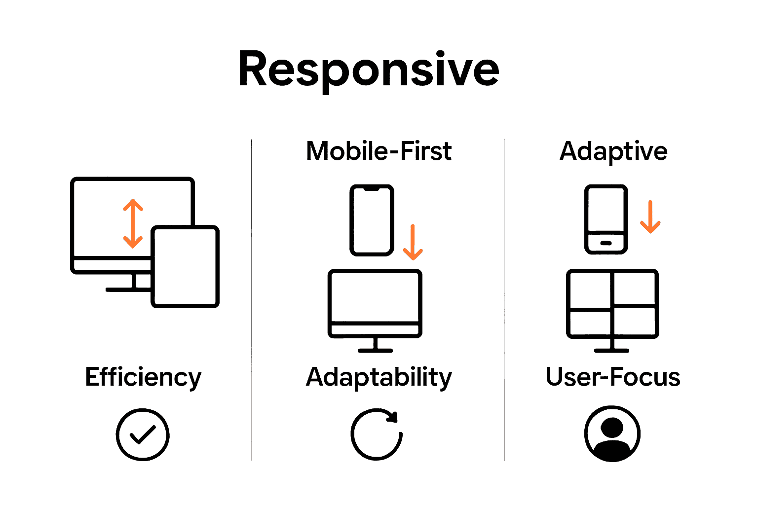
Types Of Mobile-Friendly Design Approaches
Mobile-friendly design isn’t a one-size-fits-all solution. Instead, businesses have multiple strategic approaches to creating responsive websites that work seamlessly across different devices. PubMed Central notes that responsive web design provides a cost-effective alternative to platform-specific mobile apps, making it an attractive option for small businesses.
The primary mobile-friendly design approaches include:
- Responsive Design
- Automatically adjusts layout based on screen size
- Single website that works across all devices
- Fluid grids and flexible images
- Most common and recommended approach
- Mobile-First Design
- Design begins with mobile screen considerations
- Prioritizes core content and functionality
- Progressively enhances design for larger screens
- Ensures optimal mobile user experience
- Adaptive Design
- Creates multiple fixed layouts for different device sizes
- Detects device characteristics and serves appropriate version
- More complex to develop and maintain
- Less fluid than responsive design
According to Educause, these approaches apply “standards-based technologies” to transform websites and match user needs. By understanding these design strategies, businesses can create digital experiences that look professional and function smoothly across smartphones, tablets, and desktop computers.

Choosing the right mobile-friendly approach depends on your specific business requirements, target audience, and technical resources.
 While responsive design remains the most versatile solution, each approach offers unique benefits for different scenarios.
Essential Features And Best Practices
Building a mobile-friendly website requires careful attention to specific technical and design elements. According to Educause, three core concepts define responsive design:
- Fluid Grid Layout: Proportional dimensions instead of fixed pixels
- Flexible Media: Scalable images and videos
- Adaptive CSS Rules: Dynamic typography and layout based on device characteristics
These foundational principles ensure your website looks great across every screen size. IACIS researchers emphasize additional critical design elements that small businesses must prioritize:
Performance Optimization
- Minimize large image files
- Compress JavaScript and CSS
- Leverage browser caching
- Use content delivery networks (CDNs)
User Experience Considerations
- Large, touch-friendly buttons
- Readable fonts (minimum 16px)
- High color contrast
- Simple, intuitive navigation
- Minimize form input requirements
The goal isn’t just making a website smaller. It’s creating an intuitive, seamless experience that feels natural on any device. By implementing these best practices, businesses can dramatically improve user engagement, reduce bounce rates, and create professional digital experiences that convert visitors into customers.
Remember, mobile-friendly design is an ongoing process. Regularly test your website on multiple devices, gather user feedback, and continuously refine your approach to stay ahead of evolving technology trends.
Benefits For Small Business Websites
PubMed Central highlights that responsive web design provides small businesses with a cost-effective digital solution that dramatically expands their online reach. Unlike traditional website approaches, mobile-friendly design offers substantial advantages for budget-conscious entrepreneurs.
Key benefits for small businesses include:
Enhanced Customer Engagement
- Accessible across all device types
- Improved user experience
- Higher conversion rates
- Increased time spent on website
Cost and Efficiency Advantages
- Single website instead of multiple platforms
- Lower development and maintenance costs
- Faster loading times
- Simplified content management
According to Educause, responsive design allows businesses to “create a single site supporting all types of devices” without complex technical complications. This means small businesses can maintain a professional online presence without extensive technical resources.
The competitive advantage is clear. A mobile-friendly website isn’t just a technical upgrade – it’s a strategic business investment that levels the playing field, allowing small businesses to compete effectively in an increasingly digital marketplace. By prioritizing responsive design, entrepreneurs can reach more customers, build credibility, and drive growth with a single, adaptable digital platform.
Common Mobile Design Mistakes To Avoid
PubMed Central emphasizes that user experience is paramount in mobile design, highlighting critical mistakes that can undermine a website’s effectiveness. Small businesses must be vigilant about avoiding technical pitfalls that frustrate potential customers.
Top mobile design mistakes include:
Visual and Functional Errors
- Unreadable Text: Font sizes too small for mobile screens
- Overcrowded Layouts: Cramming too much content into limited space
- Nonresponsive Elements: Buttons or links too small to tap accurately
- Slow Loading Times: Heavy graphics that bog down mobile performance
Navigation and Interaction Problems
- Complex menu structures
- Hidden navigation elements
- Form fields that are difficult to complete
- Inconsistent touch interactions
According to Educause, effective mobile design requires transforming websites to “fit the user’s needs and capabilities” – which means eliminating barriers that prevent smooth digital interactions.
The consequences of poor mobile design are severe. Potential customers will abandon websites that don’t provide immediate, intuitive experiences. By proactively addressing these common mistakes, businesses can create mobile interfaces that not only look professional but also genuinely serve user needs, turning casual visitors into engaged customers.
Make Your Website Truly Mobile-Friendly With Expert Help
Struggling to deliver a seamless experience across every device can hurt your business growth. This guide highlights how crucial it is to adopt responsive design, optimize performance, and avoid common mobile design mistakes that drive visitors away. If your website feels slow or hard to use on phones and tablets you need a solution that keeps your customers engaged and maximizes conversions.

Take control of your online presence today with ibrand.media, a digital marketing agency dedicated to helping small to medium businesses build mobile-friendly websites that look great and work perfectly everywhere. Explore tailored strategies and affordable plans in our Uncategorized category and discover how professional web design can boost your sales. Don’t let poor mobile experiences cost you customers. Visit ibrand.media now to start transforming your site into a powerful, responsive platform that meets modern user expectations.
Frequently Asked Questions
What is mobile-friendly website design?
Mobile-friendly website design refers to a strategic approach that ensures a website functions and looks great on various devices, including smartphones, tablets, and desktops. It focuses on creating intuitive and accessible user experiences across different screen sizes.
What are the main approaches to mobile-friendly design?
The main approaches to mobile-friendly design include responsive design, mobile-first design, and adaptive design. Each approach offers different strategies for optimizing a website’s layout and functionality for various devices.
What are essential features of a mobile-friendly website?
Essential features of a mobile-friendly website include a fluid grid layout, flexible media, adaptive CSS rules, performance optimization (like fast loading times), and user-friendly elements such as large touch-friendly buttons and readable fonts.
What are common mistakes to avoid in mobile design?
Common mobile design mistakes include using unreadable text sizes, overcrowded layouts, nonresponsive elements (like small buttons), complex navigation structures, and slow loading times. Avoiding these mistakes can significantly enhance user experience.
Recent Comments