
Mobile-friendly websites have become the backbone of how people browse and shop. Over half of all global internet traffic now comes from mobile devices, reshaping what users expect from any business online. Most businesses obsess over flashy designs or clever branding. Yet it is often the invisible features like fast loading, responsive menus, and touch-friendly layouts that decide whether a customer sticks around or leaves for good.
Table of Contents
- What Are Mobile-Friendly Websites And Their Features?
- Why Mobile-Friendly Websites Are Essential For Business Growth
- How Mobile-Friendly Websites Improve User Experience
- Key Principles Of Designing Mobile-Friendly Websites
Quick Summary
| Takeaway | Explanation |
|---|---|
| Mobile-friendly websites are essential for business growth. | Optimized mobile sites increase customer retention and engagement, crucial for modern businesses. |
| Invest in responsive design for all screen sizes. | Responsive design ensures consistent user experiences across devices, catering to varied audience needs. |
| Fast loading speed boosts user satisfaction. | Websites that load quickly reduce user frustration, keeping visitors engaged for longer. |
| Streamlined navigation enhances user interactions. | Intuitive, touch-friendly navigation simplifies interactions, improving overall user experience on mobile. |
| Prioritize accessibility for diverse user needs. | Creating accessible websites accommodates different devices and user abilities, expanding audience reach and inclusion. |
What Are Mobile-Friendly Websites and Their Features?
Mobile-friendly websites are digital platforms specifically designed to provide optimal viewing and interaction experiences across mobile devices like smartphones and tablets. Google’s mobile guidelines define these websites as interfaces that automatically adjust their layout, content, and functionality to match different screen sizes and device capabilities.
Core Characteristics of Mobile-Friendly Design
A truly mobile-friendly website goes beyond simple resizing. These websites feature several critical components that enhance user experience and accessibility:
- Responsive Layout: Content automatically reformats to fit various screen dimensions
- Touch-Friendly Navigation: Large, easily tappable buttons and intuitive menu structures
- Fast Loading Speed: Optimized images and streamlined code for quick mobile access
Website owners recognize that mobile users expect seamless interactions. This means text should be readable without zooming, buttons should be appropriately sized for finger taps, and navigation should feel natural on smaller screens.
Here is a table summarizing key characteristics that define a mobile-friendly website, allowing for easy comparison and understanding of their user-focused benefits.
| Characteristic | Description |
|---|---|
| Responsive Layout | Automatically adjusts content to various screen sizes |
| Touch-Friendly Navigation | Features large, tappable buttons and intuitive menus |
| Fast Loading Speed | Optimizes images and code for quick mobile loading |
| Readable Text | Ensures text is legible without zooming |
| Natural Navigation | Provides easy, intuitive movement through the website |
Technical Approaches to Mobile Optimization
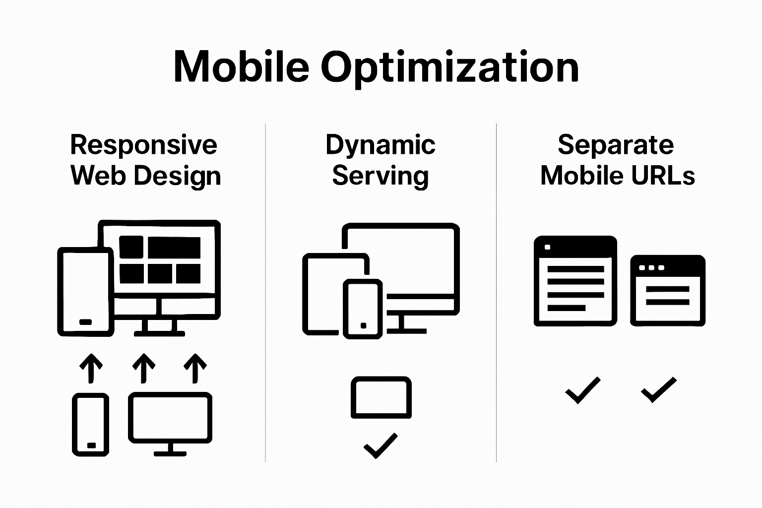
Developers typically implement mobile-friendly websites through three primary technical strategies
 :
:
- Responsive Web Design: Using flexible grid layouts and CSS media queries
- Dynamic Serving: Presenting different HTML code for mobile and desktop visitors
- Separate Mobile URLs: Creating distinct website versions for different devices
For small businesses looking to enhance their online presence, understanding these approaches is crucial. Read more about website design essentials to ensure your digital platform meets modern user expectations. Mobile-friendly websites are no longer optional they are a fundamental requirement for connecting with customers in today’s digital landscape.
Below is a comparison table outlining the main technical approaches to implementing mobile optimization, summarizing their features and characteristics for quick reference.
| Approach | Description | Key Feature |
|---|---|---|
| Responsive Web Design | Uses flexible grids and CSS media queries to adapt layout | Single URL, automatic adaptation |
| Dynamic Serving | Serves different HTML to mobile and desktop users | Device detection-based content |
| Separate Mobile URLs | Creates entirely distinct website versions for each device type | Separate URLs for mobile/desktop |
Why Mobile-Friendly Websites Are Essential for Business Growth
Mobile-friendly websites have transformed from a luxury to a critical business necessity. Research from Google reveals that 61% of users are unlikely to return to a mobile site they had trouble accessing, underscoring the direct impact of mobile design on customer retention and business success.
Economic Impact of Mobile Accessibility
Businesses that invest in mobile-friendly websites unlock significant economic opportunities. Mobile traffic now represents over half of global internet usage, meaning companies without optimized mobile experiences are effectively cutting themselves off from a massive potential customer base. This digital shift means mobile-friendly websites are no longer optional they are a fundamental business strategy for growth and customer engagement.
The table below highlights core economic advantages businesses gain by having a mobile-friendly website, helping clarify why mobile optimization is crucial for growth.
| Economic Advantage | Business Benefit |
|---|---|
| Expanded Market Reach | Access to a broader audience across devices |
| Improved Conversion | Higher purchase rates from easier navigation |
| Enhanced Brand Perception | Greater credibility through professional mobile UX |
Key economic advantages include:
- Expanded Market Reach: Access to mobile users across different devices and platforms
- Improved Customer Conversion: Easier navigation leads to higher purchase completion rates
- Enhanced Brand Perception: Professional mobile design signals business credibility
User Experience and Competitive Advantage
Mobile-friendly websites provide a critical competitive edge. Customers expect seamless, intuitive digital experiences that work perfectly on their smartphones.
A poorly designed mobile site can instantly drive potential customers to competitors with more user-friendly interfaces. Check out our comprehensive website design guide to understand how to create compelling mobile experiences that keep customers engaged.
Businesses that prioritize mobile optimization demonstrate they understand modern consumer behaviors. They show they are responsive, tech-savvy, and committed to providing convenient, accessible services. In an increasingly digital marketplace, mobile-friendly websites are not just a technical requirement they are a strategic investment in long-term business growth and customer satisfaction.
How Mobile-Friendly Websites Improve User Experience
Design principles for web accessibility demonstrate that mobile-friendly websites are not just technical adaptations but comprehensive user experience strategies. These digital platforms transform how users interact with online content, creating seamless and intuitive navigation across various devices.
Enhancing Interaction and Navigation
Mobile-friendly websites fundamentally reimagine user interaction through strategic design elements. By creating interfaces that respond dynamically to different screen sizes, these websites eliminate common frustrations associated with traditional desktop-centric designs. Users can now effortlessly scroll, tap, and navigate without pinching, zooming, or struggling with microscopic text.
Key interaction improvements include:
- Intuitive Touch Controls: Large, easily tappable buttons and simplified menu structures
- Adaptive Content Layout: Text and images that automatically resize and reposition
- Smooth Scrolling: Fluid navigation that feels natural on touchscreen devices
Reducing User Friction and Improving Engagement
The primary goal of mobile-friendly design is minimizing user friction. When websites load quickly, display content clearly, and provide straightforward navigation, users are more likely to stay engaged. Explore our comprehensive guide to user experience design to understand how these principles translate into tangible business benefits.
By prioritizing mobile user experience, businesses communicate their commitment to customer convenience. A well-designed mobile website signals professionalism, technological awareness, and a genuine understanding of modern digital consumption habits.
 This approach transforms mobile interfaces from mere information portals into powerful engagement platforms that respect and anticipate user needs.
Key Principles of Designing Mobile-Friendly Websites
Google’s mobile SEO guidelines emphasize that responsive design involves more than technical adaptation. Creating mobile-friendly websites requires a holistic approach that prioritizes user experience, performance, and accessibility across multiple devices and screen sizes.
Responsive Design Foundation
Responsive design serves as the cornerstone of mobile-friendly websites. This approach ensures that web content dynamically adjusts to different screen dimensions, providing consistent and optimal viewing experiences. Unlike traditional fixed layouts, responsive designs use flexible grids, scalable images, and adaptive navigation that seamlessly transform based on device characteristics.
Key responsive design principles include:
- Fluid Grid Systems: Percentage-based layouts that proportionally resize
- Flexible Media: Images and videos that scale without losing quality
- CSS Media Queries: Technical mechanisms enabling content adaptation
Performance and Accessibility Considerations
Mobile-friendly websites must balance visual appeal with rapid performance. Slow-loading pages can instantly discourage user engagement, making optimization crucial. This involves minimizing code complexity, compressing images, and prioritizing critical content rendering.
Accessibility goes beyond visual design. Websites must accommodate diverse user interactions, including touch interfaces, screen readers, and varying internet connection speeds. For deeper insights into website design best practices, businesses should focus on creating inclusive digital experiences that work seamlessly across different devices and user abilities.
Successful mobile-friendly design is an ongoing process of understanding user needs, technological constraints, and evolving digital consumption patterns. By embracing these principles, businesses can create websites that not only look good but also provide genuinely useful and enjoyable mobile experiences.
Power Your Business Growth With a Truly Mobile-Friendly Website
Are you feeling frustrated by missed opportunities because your website just does not work smoothly for mobile visitors? In the article above, we explored why mobile-friendly sites are now absolutely essential and how user experience, fast loading, and responsive layouts decide whether customers stay or leave. If you have noticed visitors dropping off or low conversions from mobile users, you are not alone. These are real pain points for small businesses trying to stand out online.
Discover more about effective digital strategies tailored to meet today’s mobile standards and boost your web performance!

Do not let another customer slip away because your site is not optimized for mobile. At ibrand.media, our team specializes in creating mobile-friendly websites that not only look great but also convert. Get a custom plan that fits your budget and see real results. Start your transformation now by visiting our homepage.
Frequently Asked Questions
What is a mobile-friendly website?
A mobile-friendly website is designed to provide an optimal viewing and interaction experience on mobile devices like smartphones and tablets. It automatically adjusts its layout and content according to different screen sizes.
Why is mobile-friendliness important for businesses?
Mobile-friendliness is crucial for businesses because mobile traffic constitutes over half of global internet usage. A mobile-optimized site enhances customer retention and drives conversions by providing seamless user experiences.
How does responsive web design contribute to mobile-friendliness?
Responsive web design ensures that web content dynamically adjusts to various screen sizes using flexible grids and CSS media queries, providing consistent and optimal viewing experiences on any device.
What are some key features of mobile-friendly websites?
Key features of mobile-friendly websites include responsive layouts, touch-friendly navigation, fast loading speeds, adaptive content layouts, and intuitive touch controls.
Recommended
- 10 Essential Website Design Tips for Small Businesses | Ibrandmedia
- Understanding Website Design Basics for Local Businesses | Ibrandmedia
- 10 Essential Website Design Best Practices for Small Businesses | Ibrandmedia
- Understanding User Experience in Web Design | Ibrandmedia
- Mobile SEO Meaning: Essential 2025 Strategies & Tips
Recent Comments