
TL;DR:
- Poor user experience causes high bounce rates and lost revenue for small businesses.
- Using tools like Google Analytics and heatmaps helps identify UX issues effectively.
- Designing for edge cases and recovery paths builds trust and improves conversions.
Your website might be getting traffic, but if visitors leave within seconds, confused by cluttered menus or waiting on slow-loading pages, you’re losing real revenue every day. Poor user experience (UX) is one of the most overlooked reasons small businesses fail to convert online visitors into paying customers. The good news is that fixing it doesn’t require a developer on speed dial or a massive budget. This guide walks you through understanding why UX matters, the tools you need, and a practical step-by-step process for making your site work harder for your business.
Table of Contents
- Understanding the importance of user experience for small businesses
- Essential tools and requirements checklist for improving website UX
- Step-by-step instructions to optimize key user journeys
- Troubleshooting common mistakes and missed opportunities
- A deeper look: Why edge cases define your website’s success
- Ready to take your next step? Expert help is just a click away
- Frequently asked questions
Key Takeaways
| Point | Details |
|---|---|
| Prioritize real user journeys | Address errors, returns, and real-world interruptions, not just ideal scenarios. |
| Use practical tools | Simple analytics and clarity tests help identify and fix website pain points quickly. |
| Favor clarity and flexibility | Fluid layouts and plain language ensure a better experience across devices and audiences. |
| Small tweaks, big results | Minor UX improvements often lead to major gains in engagement and sales. |
Understanding the importance of user experience for small businesses
User experience is simply how a person feels when they interact with your website. Is it easy to find what they need? Does it load fast? Can they complete a purchase or fill out a contact form without hitting a wall? These details aren’t just cosmetic. They directly shape whether someone trusts your business enough to spend money with you.
For small and medium-sized businesses, the stakes are especially high. You don’t have the brand recognition of a large corporation to fall back on. A visitor who lands on your site and hits a broken form or a confusing navigation menu will leave, and they probably won’t come back. Why user experience matters for your bottom line is straightforward: friction kills conversions.
Here are the most common UX pain points that drive users away:
- Slow load times (more than 3 seconds and most users are gone)
- Broken or unclear contact forms
- Navigation menus that bury key information
- Pages that don’t display correctly on mobile devices
- Missing error messages when something goes wrong
Here’s something most business owners don’t consider. The majority of UX advice focuses on the “happy path,” meaning the ideal scenario where a user finds your product, adds it to their cart, and checks out smoothly. But real users don’t always follow that path. They mistype URLs, hit out-of-stock pages, or abandon a form halfway through. As edge cases become main journeys, recovery paths and error feedback are just as critical as your homepage design.
| UX issue | Business impact | Quick fix |
|---|---|---|
| Slow load time | High bounce rate | Compress images, use caching |
| Broken forms | Lost leads | Test forms weekly |
| Poor mobile layout | Lost mobile sales | Use responsive design |
| Missing error messages | User frustration | Add clear feedback text |
| Cluttered navigation | Confused visitors | Limit menu items to 5-7 |
Understanding which user experience factors affect your specific audience is the first step toward making meaningful improvements. Start by looking at your analytics to see where users drop off, and treat those exit points as your first priority.
Essential tools and requirements checklist for improving website UX
Before you start making changes, you need the right tools and a clear picture of where your site currently stands. The good news is that most of the essential tools are either free or very affordable, making them accessible for small business budgets.
Core tools you’ll need:
- Google Analytics or similar: Tracks where users go, how long they stay, and where they leave.
- Heatmap tools (Hotjar, Microsoft Clarity): Show you exactly where users click, scroll, and stop engaging.
- User testing platforms (UsabilityHub, Maze): Let real users complete tasks on your site while you watch.
- Google Search Console: Reveals technical issues affecting how your site performs in search results.
- Browser developer tools: Built into Chrome and Firefox, these let you simulate different screen sizes for free.
Basic requirements before you begin:
- Access to your site on at least two devices (a desktop and a smartphone)
- A written list of your top three business goals (lead generation, sales, bookings, etc.)
- A rough map of your most important user journeys (more on this in the next section)
One of the most common mistakes we see is business owners chasing visual perfection before fixing functional problems. As flexible layouts beat pixel-perfect designs for real-world users, prioritizing contrast, readability, and fluid layouts will serve your visitors far better than a flawless design that breaks on older phones.
Pro Tip: Set up Microsoft Clarity on your site today. It’s completely free, installs in minutes, and gives you heatmaps and session recordings so you can see exactly how real visitors interact with your pages. This alone can reveal problems you’d never notice just by looking at your site yourself.
Review website design best practices to make sure your foundation is solid before layering on more complex improvements. A well-structured, fast, and readable site is your starting point.
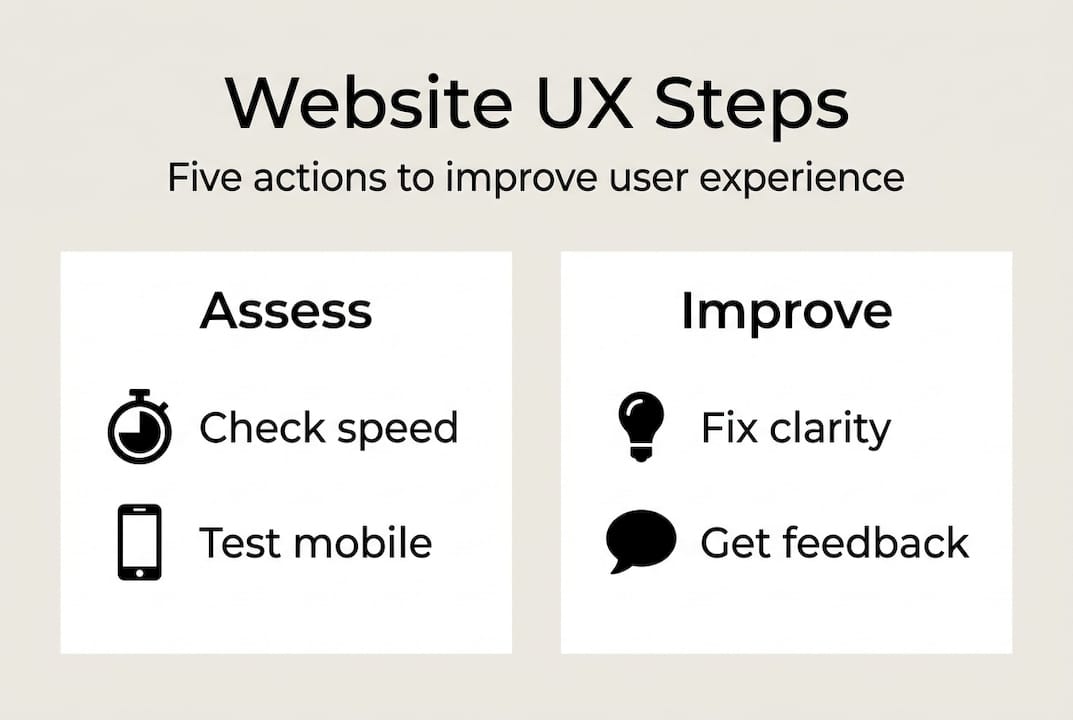
Step-by-step instructions to optimize key user journeys
Now it’s time to get practical. A user journey is the path someone takes through your site to complete a specific goal, like finding a product, submitting a contact form, or booking an appointment. Optimizing these journeys is where UX improvements translate directly into more revenue.

Step 1: Identify your top three user journeys.
Think about what most visitors come to your site to do. Common journeys for small businesses include product discovery, contact form submission, and reading about your services before calling.
Step 2: Walk each journey yourself, on mobile.
Use your phone, not your desktop. Most of your visitors are on mobile, and issues that are invisible on a large screen become glaring on a small one.
Step 3: Note every point of friction.
Is a button hard to tap? Is a form field labeled clearly? Does the page load quickly enough? Write down every moment you hesitate or feel confused.
Step 4: Fix clarity issues first.
Before redesigning anything, rewrite confusing labels, button text, and headings. Vague calls to action like “Submit” or “Click here” perform far worse than specific ones like “Get my free quote.”
Step 5: Test with real users.
Ask a friend, family member, or loyal customer to complete a task on your site while thinking out loud. You’ll be surprised what they struggle with. Testing content clarity is crucial; techniques include the banana test (replace a button label with “banana” to see if the action is still obvious) and cloze tests (remove words from copy and see if users can fill in the blanks).
Step 6: Measure the result.
After making changes, check your analytics for improvements in time on page, form completions, or conversion rate. Use this data to guide your next round of fixes.
Pro Tip: Focus on one user journey at a time. Trying to fix everything at once leads to scattered results and makes it impossible to know what actually worked.
“Don’t assume your customers use your site the way you designed it. Watch real users complete real tasks, and let their confusion guide your improvements.”
For a deeper look at what shapes these interactions, review this user experience factors guide and explore specific tactics to increase website conversions once your core journeys are clean.
Troubleshooting common mistakes and missed opportunities
Even with the best intentions, UX improvements can go sideways. Here are the most frequent mistakes we see small business owners make, and how to fix them quickly.
Non-responsive design. If your site doesn’t adapt to different screen sizes, you’re losing a massive share of your audience. Over 60% of web traffic now comes from mobile devices. Test your site on multiple screen sizes and use a responsive framework if you haven’t already.
Poor color contrast. Text that’s hard to read drives users away and also creates accessibility barriers. Use a free contrast checker tool to make sure your text meets at least a 4.5:1 contrast ratio against its background.
Cluttered modal popups. Modals (those pop-up windows that appear over your content) can feel helpful when used sparingly for simple confirmations. But modals disrupt complex tasks, and alternatives like drawers, accordions, or separate pages are often better for multi-step processes. If you’re using a modal for anything longer than a two-line confirmation, reconsider.
Ignoring accessibility. Accessibility isn’t just a legal consideration. It’s a business one. Users with visual impairments, motor limitations, or older devices make up a significant portion of your potential customers. Add alt text to images, ensure keyboard navigation works, and use clear heading structures.
Common UX mistakes and their fixes:
- Autoplay video or audio: Immediately mutes user trust. Remove autoplay entirely.
- Too many menu items: Limit primary navigation to 5 to 7 items maximum.
- No search function: If your site has more than 10 pages, add a search bar.
- Outdated contact information: Audit your contact page every quarter.
- Missing 404 page guidance: A helpful 404 page with navigation options recovers lost visitors.
Review website design best practices and explore web accessibility tips to make sure you’re not leaving any segment of your audience behind.
“Accessibility improvements almost always improve the experience for everyone, not just users with disabilities.”
A deeper look: Why edge cases define your website’s success
Here’s a perspective most UX guides won’t give you. Every website is built around an ideal user who knows exactly what they want, never makes a mistake, and follows your intended path without hesitation. That user doesn’t exist.
Real customers mistype search terms, land on the wrong page, get interrupted mid-checkout, and come back days later on a different device. When your site handles these moments gracefully, something powerful happens: users trust you more, not less. A clear error message, a helpful 404 redirect, or a saved shopping cart can turn a frustrated visitor into a loyal customer.
As recovery paths and error feedback are vital in real user journeys, small businesses that invest in these moments gain a real competitive edge. Most of your competitors are only polishing their homepage. You can win by also designing for what happens when things go wrong.
This connects directly to understanding user experience at a deeper level: it’s not about making a beautiful site, it’s about making a resilient one.
Ready to take your next step? Expert help is just a click away
Improving your website’s user experience is one of the highest-return investments you can make as a small business owner. Better UX means more engaged visitors, more completed forms, and more sales without increasing your ad spend.

At ibrand.media, we work with small and medium-sized businesses to identify exactly where their websites are losing visitors and build practical solutions that drive real results. Whether you’re starting with a website optimization guide, exploring SEO for small businesses, or ready for a full web design for small businesses overhaul, we have the expertise and tools to help you move forward with confidence.
Frequently asked questions
What is the biggest UX mistake small businesses make?
Focusing only on ideal scenarios and ignoring edge cases like errors or incomplete actions frustrates real users and costs you sales.
How can I test if my website content confuses users?
Use simple content clarity techniques: banana and cloze tests reveal where users get stuck or misread your intent.
Are modal popups always bad for user experience?
Not always, but modals disrupt complex tasks significantly, so drawers, accordions, or separate pages are often smarter choices for multi-step interactions.
What are the fastest improvements I can make for better user experience?
Prioritize mobile responsiveness, clear navigation labels, and real-user testing, since fluid, flexible layouts consistently outperform rigid designs in real-world conditions.
Recent Comments