
A single button tweak can triple your revenue. That sounds like an exaggeration, but personalized CTAs convert 202% better than generic ones, according to HubSpot. Most small business owners treat calls to action (CTAs) as an afterthought, slapping a “Click Here” button at the bottom of a page and hoping for the best. This guide breaks down exactly what separates a CTA that drives sales from one that gets ignored, with research-backed strategies you can apply today.
Table of Contents
- Why strong calls to action are essential
- Understanding the science behind high-converting CTAs
- Personalization: The CTA superpower for SMBs
- Mobile optimization: Making CTAs tap-friendly for every user
- Testing and improving your CTAs: Data-driven decision making
- Common mistakes to avoid with calls to action
- Next steps: Power up your digital strategy with expert help
- Frequently asked questions
Key Takeaways
| Point | Details |
|---|---|
| Prioritize one CTA | Pages with a single focused CTA convert up to 32% better by reducing decision overload. |
| Personalize for results | Tailoring CTAs to your audience boosts conversion rates by over 200% compared to generic prompts. |
| Optimize for mobile | Well-designed mobile CTAs increase taps and sales by up to 200% versus simple text links. |
| Test and refine continually | A/B testing CTA text, color, and layout can double conversion rates and uncover new opportunities. |
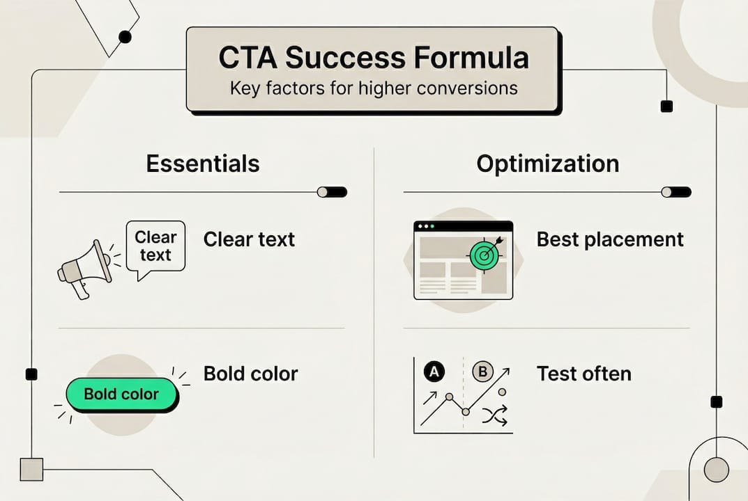
Why strong calls to action are essential
A call to action is any prompt that tells your visitor what to do next. It could be a button, a link, a form, or even a line of text. In digital marketing, CTAs are the bridge between a visitor browsing your site and a customer taking action. Without a clear CTA, even the best content leaves money on the table.
“A confused mind never buys.” This is why clarity in your CTA is not optional. It is the difference between a bounce and a conversion.
The numbers back this up. Landing pages with one CTA convert at 13.5%, compared to just 10.5% for pages with multiple CTAs. That is a 28% relative improvement from simply removing distractions. For a small business running paid ads or online advertising campaigns, that gap directly affects your return on investment.
Here is what optimized CTAs deliver for SMB owners:
- Higher conversion rates from the same traffic you already have
- Lower cost per lead because more visitors take action without extra ad spend
- Clearer customer journeys that guide buyers from awareness to purchase
- Better email results when you apply CTA best practices to email campaigns
- Measurable growth you can track and improve over time
The research on CTA conversions consistently shows that focused, intentional CTAs outperform generic ones across every channel. This is not about design trends. It is about understanding what motivates your specific audience to act.
Understanding the science behind high-converting CTAs
Not all CTAs are created equal. The wording, color, size, and placement all influence whether someone clicks or scrolls past. The biggest factor, though, is psychology. People respond to CTAs that speak to their desires, not your business goals.
Compare these two examples. “Submit” tells the user nothing about what they get. “Get My Free Marketing Plan” tells them exactly what happens next and frames it as something they own. Benefit-driven CTAs using active language consistently increase engagement because they reduce uncertainty and create anticipation.
Three psychological triggers make CTAs perform better:
- Urgency creates a reason to act now rather than later (“Claim Your Spot Today”)
- Ownership language makes the offer feel personal (“Get My Free Guide” vs. “Get a Free Guide”)
- Curiosity pulls readers forward when the benefit is intriguing but not fully revealed
Here is a quick comparison of CTA wording styles and their typical impact:
| CTA style | Example | Relative performance |
|---|---|---|
| Generic/passive | Submit | Lowest |
| Action-based | Download Now | Moderate |
| Benefit-driven | Get My Free Audit | High |
| Personalized + urgent | Claim My Spot Today | Highest |
For website conversion strategies, this table is your starting point. Move every CTA on your site up at least one level on this scale.
Pro Tip: Never use the word “Submit” on a button. It implies you are taking something from the user. Replace it with what the user receives, such as “Send Me the Guide” or “Start My Free Trial.”
Personalization: The CTA superpower for SMBs
Personalization means showing different CTAs to different visitors based on where they are in the buying journey, their location, or their past behavior on your site. A first-time visitor and a returning customer have different needs. Showing them the same CTA is like giving everyone in a restaurant the same meal without asking what they want.
The data is striking. Personalized CTAs deliver 202% higher conversion rates on average. In one documented case, a single personalization change lifted conversions by 560%. For an SMB with limited ad budget, this is the highest-leverage improvement you can make.
Here is how personalization breaks down by user stage:
| User stage | CTA goal | Example CTA text |
|---|---|---|
| New visitor | Build awareness | “See How We Help Businesses Like Yours” |
| Returning visitor | Deepen interest | “Continue Where You Left Off” |
| Lead (email subscriber) | Drive purchase | “Claim Your Exclusive Offer” |
| Existing customer | Upsell or retain | “Unlock Your Next Level” |
You do not need an enterprise budget to implement this. Tools like HubSpot’s free CRM, Mailchimp, and even basic WordPress plugins let you show different CTAs based on user behavior. Pair this with lead generation strategies and conversion rate optimization tactics to build a full funnel.
Here is a simple numbered process to set up personalized CTAs for your business:
- Map your audience segments by stage: new, returning, lead, or customer
- Write a unique CTA for each segment that matches their specific need
- Choose a tool that supports conditional content (HubSpot, ActiveCampaign, or Elementor Pro)
- Set the trigger rules so each segment sees the right CTA automatically
- Track results separately for each segment so you know what is working
The evidence on personalized CTA results shows this is not a nice-to-have. For SMBs competing against larger brands, personalization is one of the few areas where you can outperform bigger competitors without outspending them.
Mobile optimization: Making CTAs tap-friendly for every user
More than half of all web traffic now comes from mobile devices. If your CTA button is tiny, hard to tap, or buried below the fold, you are losing sales every single day. Mobile CTA optimization is not just a design preference. It is a revenue decision.

Button CTAs on mobile yield 200% higher conversions than plain text links. That alone should convince you to replace any text-based CTAs on your mobile pages with proper buttons. Beyond that, button width, color, contrast, and placement can raise mobile CTA taps by up to 20%.
Here are the key design factors to get right:
- Button size: Aim for at least 44 to 72 pixels tall so thumbs can tap accurately
- Color contrast: Your CTA button should stand out clearly from the background
- Thumb zone placement: Position primary CTAs in the lower center of the screen where thumbs naturally rest
- Spacing: Add enough padding around the button so users do not accidentally tap nearby elements
- Short text: Mobile buttons should have 2 to 4 words maximum for readability
For deeper guidance, explore mobile optimization tips, responsive design strategies, and the importance of mobile optimization for your overall digital presence.
Pro Tip: Test a full-width sticky button at the bottom of your mobile pages. This button stays visible as users scroll, keeping your CTA in view without interrupting the reading experience. Many businesses see immediate conversion lifts from this one change alone.
Testing and improving your CTAs: Data-driven decision making
You cannot improve what you do not measure. A/B testing (also called split testing) means showing two versions of a CTA to different visitors and measuring which one performs better. It removes guesswork and replaces it with evidence.
The results from CTA testing are significant. A/B testing button text can increase conversions by over 100%, changing button color lifts results by 21%, and overall CTA testing drives a 28% average improvement. These are not marginal gains. They are the kind of numbers that change a business.
Key stat: Changing button text alone can more than double your conversion rate. That is the power of systematic testing.
Follow this process to run your first CTA test:
- Pick one element to test such as button text, color, or placement (never test multiple things at once)
- Create two versions: Version A is your current CTA, Version B has one change
- Set a sample size goal of at least 100 clicks per version before drawing conclusions
- Use a tool like Google Optimize, VWO, or your email platform’s built-in A/B feature
- Run the test for at least 2 weeks to account for day-of-week traffic variation
- Declare a winner based on conversion rate, then start the next test
For context, industry CTA benchmarks show average click-through rates between 2% and 5% for most industries, with top performers reaching 10% or higher. Use these as reference points, not ceilings. Pair your testing with solid campaign tracking practices so every data point feeds your next decision.
Common mistakes to avoid with calls to action
Even well-intentioned CTAs fail when common mistakes go unchecked. Knowing what to avoid saves you from losing conversions you should have won.
Here are the most costly CTA mistakes SMB owners make:
- Too many CTAs on one page: Single CTAs outperform multiple because more choices create decision paralysis. Pick one primary action per page.
- Vague or generic language: Words like “Learn More” or “Click Here” give no reason to act. Replace them with specific, benefit-driven text.
- Ignoring mobile users: A CTA that works on desktop but is hard to tap on a phone loses more than half your potential conversions.
- No testing or analytics: Running CTAs without tracking results means you are guessing. Even basic Google Analytics data tells you what is working.
- Mismatched CTAs and content: If your page is about SEO tips and your CTA is “Buy Now,” there is a trust gap. Your CTA should feel like the natural next step from the content above it.
For a full review of what holds back conversions, the conversion optimization mistakes guide covers the most common errors with practical fixes for each one.
Next steps: Power up your digital strategy with expert help
Putting CTA strategies into practice is one piece of a larger digital marketing puzzle. The businesses that see the biggest results combine strong CTAs with optimized websites, consistent SEO, and active social media presence.
At ibrand.media, we help small and medium-sized businesses build digital strategies that work together, not in isolation. Whether you need website optimization for search, want to understand the benefits of social media management, or are ready to invest in SEO for your small business, we offer affordable, personalized plans built around your goals. Your CTAs can be the spark, but a full strategy is what turns that spark into consistent, scalable growth. Reach out today and let us build something that converts.
Frequently asked questions
What is the best text for a call to action?
The best CTA text is benefit-driven, specific, and creates urgency. For example, “Get My Free Audit” consistently outperforms “Submit” because it tells users exactly what they receive, and benefit-driven CTAs drive more clicks and conversions across all channels.
How many calls to action should I have on a page?
Use a single, focused CTA per page or section for the highest conversions. Single CTAs convert at 13.5% compared to 10.5% for pages with multiple CTAs, because fewer choices reduce customer indecision.
Do personalized CTAs really make a difference?
Yes, the impact is significant. Personalized CTAs deliver 202% higher conversion rates on average compared to generic ones, making personalization one of the highest-return changes you can make.
How can I test if my CTA is effective?
Run A/B tests by changing one element at a time, such as button text, color, or placement, and track conversion rates for each version. A/B testing CTAs can boost conversions by over 100% based on button text changes alone.
What makes a CTA mobile-friendly?
Mobile-friendly CTAs use large, high-contrast buttons positioned in the thumb zone with clear spacing around them. Button CTAs on mobile yield 200% higher conversions than text links, and a preferred button size of 44 to 72 pixels ensures easy tapping for all users.
Recommended
- Increase Website Conversions: Proven Strategies for 2025 Success | Ibrandmedia
- How to Get More Leads: A Step-by-Step Guide for 2025 | Ibrandmedia
- How to Track Campaign Performance for Measurable Growth | Ibrandmedia
- Lead Generation Strategies for Business Growth Success | Ibrandmedia
- Performance Marketing Team | Multi‑Channel Paid Ads
Recent Comments