
More than 60% of global web traffic now comes from mobile devices, making mobile optimization essential for every American retailer aiming to compete online. In a world where attention spans run short and smartphone shopping is on the rise, small businesses risk losing customers if their websites feel slow or clumsy on mobile. This guide highlights smart strategies and affordable solutions that help retail business owners improve their mobile presence and attract more mobile shoppers efficiently.
Table of Contents
- Defining Mobile Optimization For Businesses
- Key Features Of A Mobile-Optimized Site
- Responsive Design Vs. True Mobile Optimization
- Mobile Optimization And Seo Rankings
- Practical Benefits For Retailers And Customers
- Costs, Common Mistakes, And Performance Risks
Key Takeaways
| Point | Details |
|---|---|
| Mobile Optimization is Essential | Over 60% of global web traffic comes from mobile devices, making mobile optimization a critical focus for businesses. |
| Responsive Design vs. True Optimization | While responsive design allows for layout adaptation, true mobile optimization focuses on enhancing performance and user experience on various devices. |
| Impact on SEO Rankings | Mobile optimization directly influences search rankings, as search engines prioritize sites with superior mobile performance and user experiences. |
| Benefits for Retailers and Customers | Optimizing for mobile can lead to higher conversion rates for retailers and improved convenience for customers, fostering brand loyalty. |
Defining Mobile Optimization for Businesses
Mobile optimization is a strategic approach that transforms how businesses present their digital presence across mobile devices. At its core, mobile optimization ensures websites and web applications function seamlessly on smartphones and tablets, creating an exceptional user experience regardless of screen size or device type.
The process goes far beyond simple mobile compatibility. Mobile optimization involves deliberately redesigning website elements to deliver faster load times, intuitive navigation, and responsive layouts that adapt instantly to different devices. This means carefully adjusting text sizes, image resolutions, button placements, and overall site architecture to provide an optimal viewing experience. With over 60% of global web traffic originating from mobile devices, businesses can no longer treat mobile design as an afterthought.
Key components of effective mobile optimization include responsive web design, performance optimization, and mobile-specific user experience enhancements. Responsive design ensures your website automatically adjusts to different screen dimensions, while performance optimization focuses on reducing loading times and minimizing unnecessary data consumption. Mobile-specific enhancements might involve simplifying menus, enlarging touch targets, and streamlining checkout processes to reduce friction for mobile users.
Pro tip: Regularly test your website on multiple mobile devices and use Google’s mobile-friendly test tool to identify and quickly resolve potential optimization issues.
Key Features of a Mobile-Optimized Site
A mobile-optimized website demands strategic design that goes beyond simple screen resizing. Responsive web design serves as the foundation for creating seamless mobile experiences, ensuring content adapts fluidly across different device types and screen dimensions. Modern businesses must prioritize layouts that automatically adjust text, images, and interactive elements to provide consistent, user-friendly interactions.
The technical backbone of mobile optimization includes several critical components. Performance optimization stands out as a crucial feature, focusing on reducing load times and minimizing data consumption. This involves compressing images, leveraging browser caching, and streamlining code to ensure rapid page rendering. Mobile-specific navigation also plays a pivotal role, with simplified menus, enlarged touch targets, and clear calls-to-action that accommodate smaller screens and touch-based interactions.

Content strategy becomes equally important in mobile optimization. Websites must present information concisely, using shorter paragraphs, legible font sizes, and strategic content hierarchy. Eliminating intrusive pop-ups, ensuring readable text without zooming, and creating thumb-friendly interaction zones are essential considerations. Strategic placement of critical information and streamlined forms can significantly improve user engagement and conversion rates on mobile platforms.
Pro tip: Conduct regular mobile usability testing using real devices and analytics tools to continuously identify and address potential user experience barriers.
Responsive Design vs. True Mobile Optimization
Responsive design represents the baseline approach to mobile adaptability, creating websites that flexibly resize across different devices. True mobile optimization goes significantly deeper, transforming the entire user experience beyond simple visual adjustments, addressing performance, functionality, and user interaction at a fundamental level.
While responsive design focuses on layout fluidity, true mobile optimization considers the unique behavioral patterns and technical constraints of mobile users. This means reimagining website architecture to prioritize speed, minimize data consumption, and create touch-friendly interfaces. Key differences include optimizing image sizes for mobile bandwidth, implementing accelerated mobile pages (AMP), reducing server request times, and designing navigation that accommodates thumb-based interactions rather than mouse clicks.
The technological nuances between these approaches are substantial. Responsive design uses CSS media queries and flexible grid systems to adjust content presentation, whereas true mobile optimization integrates advanced techniques like progressive web app technologies, offline functionality, and device-specific performance tuning. Small businesses must understand that simply having a website that looks good on mobile is no longer sufficient – users expect lightning-fast loading, intuitive interactions, and content that feels native to their mobile experience.
Here’s how responsive design and true mobile optimization differ fundamentally:
| Aspect | Responsive Design | True Mobile Optimization |
|---|---|---|
| Focus | Layout adaptation | Performance and user experience |
| Technology | CSS media queries, flexible grids | Progressive web apps, AMP, offline |
| User Experience | Visual consistency | Touch-friendly, fast interactions |
| SEO Impact | Basic mobile compliance | Enhanced rankings, reduced bounce |
Pro tip: Conduct comprehensive mobile performance audits using tools like Google PageSpeed Insights to identify specific optimization opportunities beyond basic responsive design.
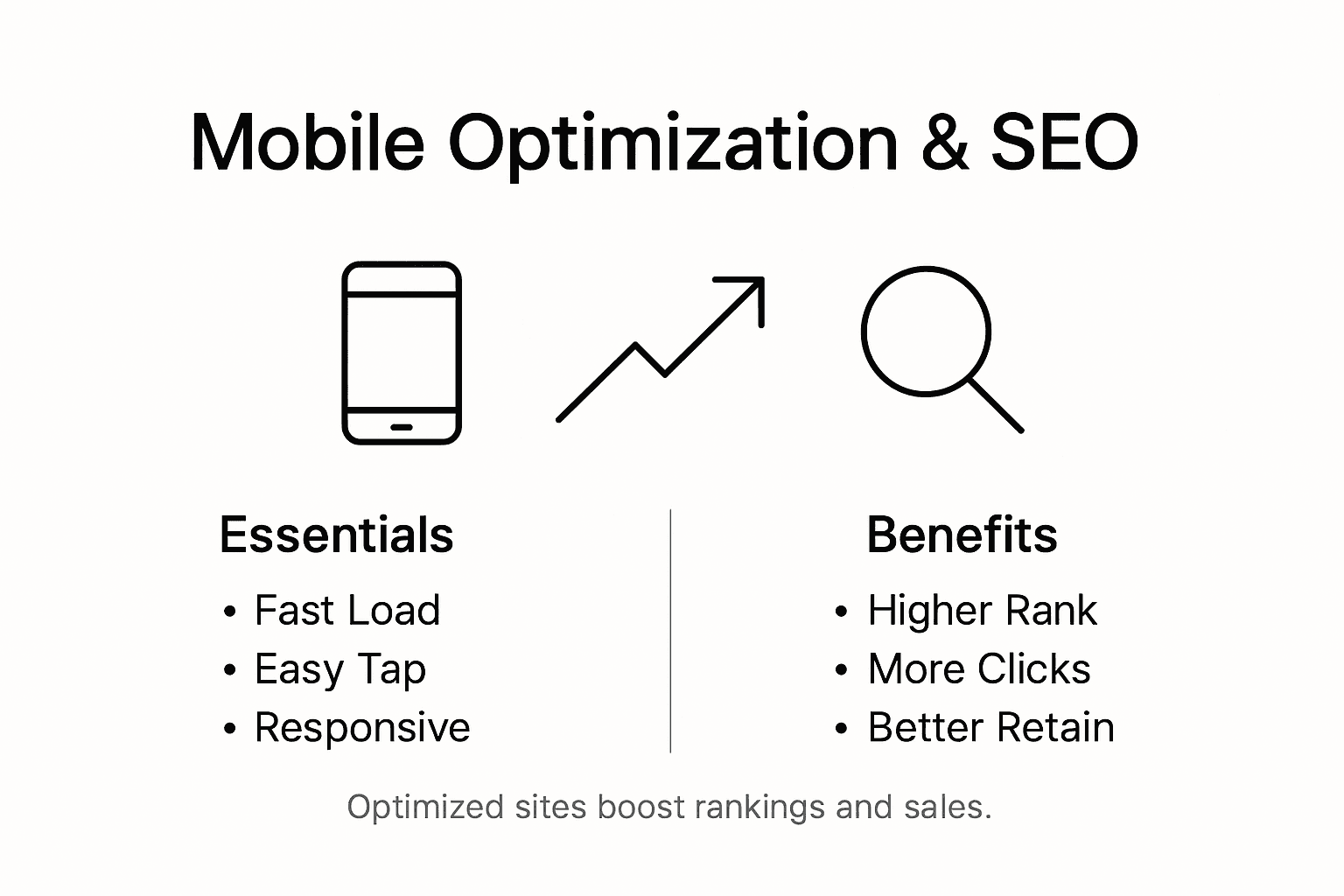
Mobile Optimization and SEO Rankings
Search engine algorithms have fundamentally transformed how websites gain visibility, with mobile optimization becoming a critical ranking factor. Google’s mobile-first indexing approach means that websites are now primarily evaluated based on their mobile performance, making mobile optimization an essential strategy for improving search engine rankings and attracting organic traffic.
The connection between mobile optimization and SEO goes beyond simple technical compliance. Search engines prioritize websites that deliver exceptional mobile user experiences, measuring factors like page load speed, mobile usability, and engagement metrics. Websites with slow loading times, unresponsive designs, or difficult navigation will experience significant ranking penalties. This means small businesses must invest in comprehensive mobile optimization strategies that include reducing image file sizes, implementing accelerated mobile pages (AMP), minimizing server response times, and creating touch-friendly interfaces.
Understanding the technical nuances of mobile SEO requires a holistic approach. Beyond responsive design, businesses need to consider mobile-specific elements such as touch-target sizes, simplified navigation, compressed content, and rapid page rendering. Google’s algorithms actively analyze mobile site performance, considering metrics like bounce rates, time on site, and interaction quality. Websites that demonstrate superior mobile experiences are rewarded with higher search rankings, increased visibility, and ultimately, more potential customer interactions.
Pro tip: Regularly audit your mobile site performance using Google PageSpeed Insights and mobile-friendly test tools to identify and quickly resolve optimization barriers.
Practical Benefits for Retailers and Customers
Mobile optimization transforms digital shopping experiences, creating unprecedented value for both retailers and customers. Mobile-optimized platforms provide seamless, fast, and engaging shopping interactions that fundamentally reshape how small businesses connect with potential buyers.
For retailers, mobile optimization delivers substantial competitive advantages. Businesses can expect significant improvements in conversion rates, reduced cart abandonment, and enhanced customer engagement. Mobile-friendly websites enable customers to browse products, compare prices, and complete purchases quickly and effortlessly. The streamlined experience means fewer barriers between customer interest and actual sales, directly translating technical improvements into tangible revenue growth for small businesses.
Customers benefit equally from mobile optimization through convenience and accessibility. Modern consumers expect instant access to information, product details, and purchasing options from anywhere at any time. Websites with fast loading speeds, intuitive navigation, and responsive design create positive user experiences that build trust and encourage repeat interactions. By prioritizing mobile user experience, retailers can differentiate themselves in crowded marketplaces, offering smooth, friction-free shopping experiences that meet contemporary digital expectations.
Key business impacts of mobile optimization for retailers and customers:
| Benefit Type | Retailer Impact | Customer Benefit |
|---|---|---|
| Conversion Rate | Higher sales, fewer abandonments | Fast, easy purchases |
| Engagement | Repeat visits, brand loyalty | Trust, return shopping preference |
| Accessibility | Wider reach, mobile shoppers | Anytime, anywhere access |
Pro tip: Conduct monthly mobile user experience audits to identify and quickly resolve potential navigation or performance barriers that might discourage potential customers.
Costs, Common Mistakes, and Performance Risks
Mobile optimization presents small businesses with complex financial and technical challenges that require strategic planning and investment. Performance optimization demands careful testing and continuous monitoring to identify potential bottlenecks and technical vulnerabilities, making it a multifaceted process beyond simple website design.
The financial landscape of mobile optimization involves several significant costs. Small businesses must budget for professional development, comprehensive performance testing, specialized tools, and ongoing maintenance. Key expenses include technical audits, user experience design, backend performance optimization, and potential infrastructure upgrades. Common mistakes often stem from underestimating these costs or attempting to implement mobile optimization through piecemeal approaches that ultimately prove more expensive and less effective than comprehensive strategies.
Performance risks can critically impact business success, extending far beyond simple technical metrics. Slow load times, inefficient resource management, and poor user interaction can lead to immediate customer abandonment and long-term reputation damage. Businesses must proactively address potential performance issues by establishing clear performance baselines, implementing robust monitoring systems, and creating flexible optimization frameworks that can adapt to evolving mobile technology landscapes. This requires a holistic approach that considers network variability, device diversity, and user experience expectations.
Pro tip: Allocate at least 15% of your digital marketing budget specifically for ongoing mobile performance testing and continuous optimization efforts.
Boost Your Small Business with Expert Mobile Optimization Solutions
Mobile optimization is no longer optional for small businesses aiming to thrive in today’s digital marketplace. As the article highlights, challenges like slow load times and clunky navigation keep potential customers from completing purchases. If your website isn’t fast, touch-friendly, and tailored for mobile users, you could be losing sales and hurting your Google rankings. That’s why a strategic, comprehensive approach to mobile optimization is essential.
At ibrand.media, we understand how vital mobile-optimized web design is to converting clicks into customers. Our expert team offers tailored digital marketing strategies designed specifically for small to medium-sized businesses. We combine mobile-friendly development with proven SEO and real-time performance tracking to deliver fast results without breaking your budget. Discover more about our approach in Uncategorized | Ibrandmedia.

Ready to unlock your business’s full online potential? Act now to connect with a partner who prioritizes the mobile experience that today’s customers demand. Visit ibrand.media to start your personalized plan and gain the competitive edge your business deserves.
Frequently Asked Questions
What is mobile optimization and why is it important for small businesses?
Mobile optimization is the process of adjusting websites and applications to function seamlessly on mobile devices, providing fast load times and intuitive navigation. For small businesses, it enhances user experience, increases engagement, and improves conversion rates, making it essential in today’s mobile-driven market.
How can I ensure my website is mobile-optimized?
To ensure your website is mobile-optimized, focus on implementing responsive design, optimizing performance by reducing load times, and enhancing navigation for smaller screens. Regularly test your site on various devices and use tools like Google’s mobile-friendly test to identify issues.
What are the key features of a mobile-optimized website?
Key features include responsive web design that adapts to screen sizes, fast loading times, simplified mobile navigation, clear calls-to-action, and smaller, easily readable content. These elements work together to provide a seamless and engaging user experience.
How does mobile optimization impact SEO rankings?
Mobile optimization significantly impacts SEO rankings, as search engines like Google prioritize mobile-friendly sites in their mobile-first indexing. A well-optimized mobile site improves page load speed, usability, and engagement, contributing to higher search rankings and more organic traffic.
Recommended
- Why Mobile Optimization Matters for Local Businesses | Ibrandmedia
- Understanding Mobile-Friendly Websites: Why They Matter | Ibrandmedia
- How to Optimize Website Speed: Faster Sites for Small Businesses 2025 | Ibrandmedia
- Mobile-Friendly Website Benefits: Complete Guide | Ibrandmedia
- Complete Guide to Instagram E-Commerce Success
Recent Comments