
Over 60 percent of American website visits now happen on mobile devices. Small businesses can no longer afford to overlook how their sites perform on smartphones and tablets. With so many myths and misconceptions about mobile optimization, understanding the real requirements is key to making smarter decisions. This guide helps American entrepreneurs identify which mobile strategies drive better user experiences, reduce bounce rates, and grow online sales.
Table of Contents
- Mobile Optimization Defined And Common Myths
- Variations: Responsive, Adaptive, Mobile-First
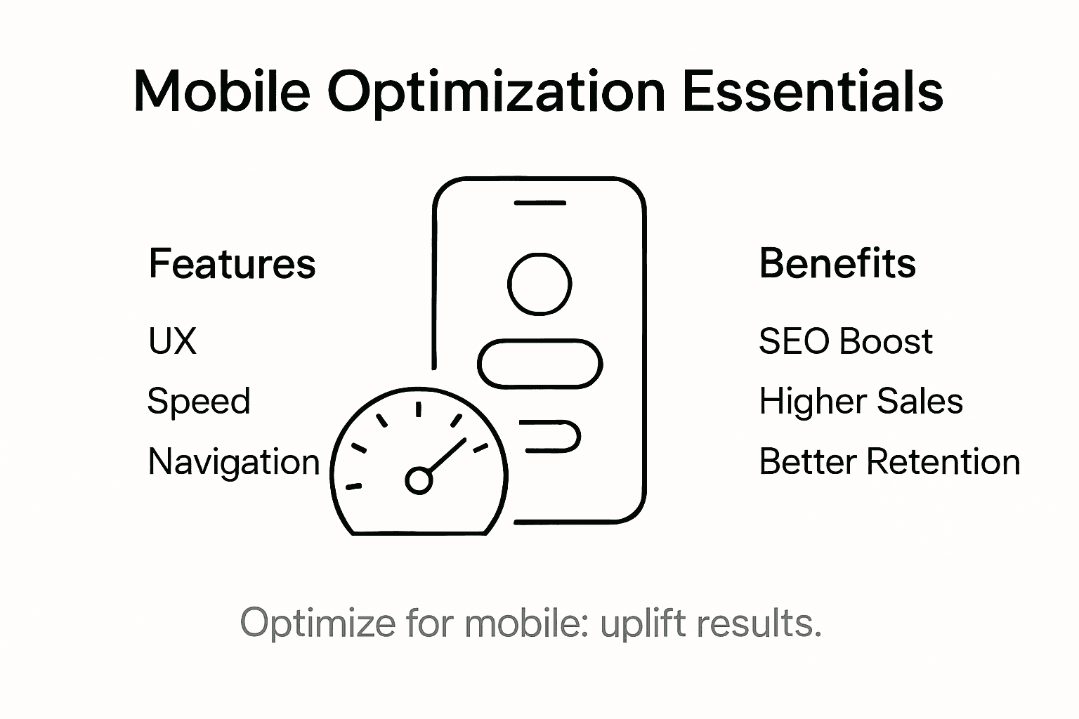
- Key Features: Ux, Speed, And Navigation
- Seo And Conversion Impacts For Businesses
- Risks, Costs, And Mistakes To Avoid
Key Takeaways
| Point | Details |
|---|---|
| Understanding Mobile Optimization | Mobile optimization is about ensuring seamless performance across devices, not just a responsive layout. It involves enhancing speed, navigation, and content for better user experience. |
| Design Strategies | Choose between responsive, adaptive, or mobile-first design based on your audience’s primary device usage and project goals. Each approach has distinct technical complexities and use cases. |
| Impact on SEO and Conversions | Mobile optimization directly affects search rankings and conversion rates. Prioritizing mobile-friendly features can enhance user engagement and boost revenue. |
| Avoiding Common Pitfalls | Be mindful of potential risks and costs associated with mobile optimization. Conduct thorough planning, risk assessments, and incremental investments to ensure success. |
Mobile Optimization Defined and Common Myths
Mobile optimization is far more than just making a website look good on smartphones. Mobile optimization involves strategically adapting websites to ensure seamless performance across multiple mobile devices by tailoring content, design, and technical infrastructure to meet users’ expectations and technical constraints.
Contrary to popular misconceptions, mobile optimization is not simply about creating a responsive layout that adjusts screen sizes. It encompasses a comprehensive approach involving performance enhancements, content strategy, and backend improvements. Small business owners must understand that effective mobile optimization requires considering factors like page load speed, touch-friendly navigation, content readability, and compatibility across different operating systems and device types.
Some persistent myths about mobile optimization can mislead businesses into ineffective digital strategies. Many believe that having a website automatically means it works well on mobile devices. However, true mobile optimization goes beyond basic responsiveness and involves creating an accessible, fast, and user-friendly experience that keeps potential customers engaged and prevents them from abandoning your site due to poor performance.
Pro tip: Test your website’s mobile performance using free tools like Google’s Mobile-Friendly Test to identify specific areas needing improvement and understand how users experience your site on different devices.
Variations: Responsive, Adaptive, Mobile-First
Mobile design strategies have evolved to address the complex landscape of devices and user experiences. Responsive, adaptive, and mobile-first represent three distinct approaches to creating websites that work seamlessly across different screen sizes and platforms, each with unique characteristics and implementation techniques.
In responsive design, websites use flexible grid systems and CSS media queries to automatically adjust layouts dynamically. This approach allows content to flow and resize smoothly across devices, from tiny smartphone screens to large desktop monitors. Responsive websites essentially create one flexible design that adapts to whatever screen size a user happens to be viewing.
Adaptive design takes a different approach by creating multiple predefined layout versions for specific device categories. Unlike responsive design’s fluid transformation, adaptive websites detect the user’s device and serve a precise layout optimized for that particular screen size. Mobile-first development further refines this strategy by prioritizing mobile constraints and user needs from the initial design phase, ensuring that core content and functionality work perfectly on smaller screens before adding complexity for larger displays.
Pro tip: When choosing a mobile design strategy, start by analyzing your target audience’s primary device usage and prioritize performance and user experience over complex visual elements.
Here’s a comparison of mobile design strategies to help you choose the most suitable approach for your business:
| Approach | Core Principle | Technical Complexity | Ideal Use Case |
|---|---|---|---|
| Responsive | Flexible layout adapts to any screen | Moderate | Sites with diverse device traffic |
| Adaptive | Specific layouts for device types | High | High-control, performance-sensitive apps |
| Mobile-First | Design starts with mobile priority | Moderate | New projects focused on mobile audiences |
Key Features: UX, Speed, and Navigation
Mobile user experience represents a critical battleground for online businesses seeking to convert visitors into customers. Key optimization features focus on creating intuitive, fast, and accessible digital experiences that keep users engaged across different mobile devices, addressing the complex challenges of modern digital interactions.
User experience (UX) goes beyond simple visual design, encompassing a holistic approach to how visitors interact with your digital platform. This includes creating clear information architectures, developing touch-friendly interfaces, and ensuring consistent visual elements that guide users naturally through their journey. Successful mobile UX means anticipating user needs and removing potential friction points that might cause frustration or abandonment.
Mobile performance optimization involves strategic improvements in speed and navigation that directly impact user satisfaction. Critical elements include minimizing load times, compressing images, reducing unnecessary scripts, and creating intuitive navigation menus that work seamlessly on smaller screens. Accessibility features like supporting screen readers and creating adjustable displays can further enhance the overall user experience, making your digital platform welcoming to a broader audience.
Review these critical business impacts of mobile optimization features:
| Feature | What It Does | Direct Business Impact |
|---|---|---|
| Page Load Speed | Reduces time to interactive content | Increases user retention |
| Touch-Friendly Navigation | Simplifies and speeds up access | Reduces abandonment rate |
| Content Readability | Ensures text scales well on devices | Improves engagement and conversions |
| Multiplatform Compatibility | Supports various OS and devices | Expands market reach and audience |
Pro tip: Conduct regular mobile usability testing with real users to identify and quickly address potential navigation or performance issues before they impact your conversion rates.
SEO and Conversion Impacts for Businesses
Mobile search optimization has become a critical determinant of online business success in an increasingly mobile-driven digital landscape. Mobile SEO directly influences search engine rankings, website visibility, and ultimately, business performance, with over half of global internet traffic now originating from mobile devices.

Search engines like Google have fundamentally transformed their approach to website indexing, prioritizing mobile-friendly websites through mobile-first indexing. This means the mobile version of your website is now the primary source for determining search rankings, making mobile optimization not just a recommendation but a necessity. Websites that fail to meet mobile optimization standards risk significant drops in search visibility, potentially losing substantial organic traffic and potential customer engagement.
Conversion rates are intrinsically linked to mobile optimization strategies, with mobile-friendly websites experiencing higher user engagement, reduced bounce rates, and improved overall performance. Key factors like fast loading times, responsive design, intuitive navigation, and accessible content directly impact how potential customers interact with your digital platform. Businesses that invest in comprehensive mobile optimization can expect not just improved search rankings, but tangible increases in online conversions and revenue.
Pro tip: Regularly audit your mobile website’s performance using tools like Google PageSpeed Insights to identify and address optimization opportunities that can directly improve your search rankings and conversion potential.
Risks, Costs, and Mistakes to Avoid
Mobile optimization requires strategic investment and careful planning to navigate potential pitfalls that can derail digital transformation efforts. Understanding technological infrastructure gaps, digital implementation challenges, and potential risks is crucial for businesses seeking sustainable mobile strategies, particularly when considering the significant financial and operational implications.
The financial landscape of mobile optimization involves complex cost considerations beyond initial development. Businesses must budget for technology infrastructure, ongoing maintenance, continuous training, and potential security enhancements. Unexpected expenses can emerge from integration challenges, complex technological requirements, and the need for specialized technical talent to implement and maintain mobile platforms effectively.
Strategic risk management involves anticipating and mitigating potential implementation mistakes, such as over-engineering solutions, neglecting user experience, or failing to prioritize critical features. Common mistakes include inadequate quality assurance, ignoring scalability requirements, and underestimating the complexity of creating a truly responsive mobile experience that meets diverse user needs and technological constraints.
Pro tip: Conduct a comprehensive risk assessment and create a phased implementation plan that allows for incremental investment, continuous performance monitoring, and flexible adaptation to emerging technological trends.
Transform Your Mobile Optimization Challenges Into Business Growth
The article highlights key challenges such as improving mobile user experience, speeding up page load times, and implementing mobile-first design strategies to boost SEO and conversions. If you are struggling to turn these insights into effective action for your small or medium-sized business, you are not alone. Many businesses face the pressure of creating fast, touch-friendly, and mobile-optimized websites that truly engage users and increase sales.
At Ibrandmedia, we specialize in overcoming these barriers by offering affordable and tailored solutions that combine expert web design with strategic SEO and local marketing. With our proven track record, you can achieve mobile-friendly, high-performance sites that attract traffic and convert visitors into customers. Explore how our approach addresses the exact pain points discussed in the article on our Uncategorized page.

Don’t let poor mobile optimization hold your business back. Visit ibrand.media now to start your customized plan and watch your online presence and sales soar with mobile-ready strategies designed for your unique audience.
Frequently Asked Questions
What is mobile optimization, and why is it important for online businesses?
Mobile optimization involves adapting websites for seamless performance across various mobile devices. It’s crucial because a well-optimized site improves user experience, engagement, and ultimately conversion rates, making it essential for business success in a mobile-driven landscape.
How do responsive, adaptive, and mobile-first designs differ in mobile optimization?
Responsive design adjusts layouts dynamically for any screen size, adaptive design uses predefined layouts for specific devices, and mobile-first design prioritizes mobile needs from the beginning of the design process. Each approach has its own technical complexities and ideal use cases.
What are the key features to focus on for effective mobile user experience?
Key features for enhancing mobile user experience include fast page load speeds, touch-friendly navigation, readable content, and ensuring compatibility across multiple platforms. These features directly impact user engagement and conversion rates.
How does mobile optimization influence SEO and conversion rates?
Mobile optimization significantly impacts SEO as search engines prioritize mobile-friendly sites for rankings. A well-optimized mobile site enhances user engagement, reduces bounce rates, and can lead to higher conversion rates, directly benefiting business performance.
Recommended
- Mobile Optimization: Unlocking Sales for Small Businesses | Ibrandmedia
- Understanding Mobile-Friendly Websites: Why They Matter | Ibrandmedia
- Why Mobile Optimization Matters for Local Businesses | Ibrandmedia
- Mobile-Friendly Website Benefits: Complete Guide | Ibrandmedia
- blog | siift | Business Goal Tracking Made Simple: Step-by-Step Guide
Recent Comments