
TL;DR:
- Responsive branding designs a brand’s visual identity to adapt seamlessly across all digital devices and screens. It relies on flexible logo systems, design tokens, scalable typography, and privacy-focused personalization to ensure consistency and efficiency. This approach strengthens brand recognition, improves user trust, and reduces costs through unified asset management.
Responsive branding is defined as the practice of designing a brand’s visual identity and messaging to adapt fluidly across every digital platform, device, and screen size. The term is closely related to the industry concept of adaptive brand systems, which treats a brand not as a fixed logo but as a living, flexible framework. What is responsive branding in practical terms? It means your logo, typography, color palette, and tone of voice all shift intelligently depending on whether a customer sees your brand on a smartwatch, a mobile feed, a desktop site, or a billboard screen. For business owners and marketers managing presence across multiple channels, this adaptability is no longer optional.
What is responsive branding and what makes it work?
Responsive branding is built on a set of core design principles that replace fixed, one-size-fits-all assets with purposeful, scalable systems. The most visible component is the responsive logo system. Adaptive logos are designed as a family of versions, typically a full lockup, a simplified mark, and an icon-only version, each with a clearly defined role depending on context and available space. A full logo works on a desktop header. The icon-only version works in a mobile app tab or a favicon.

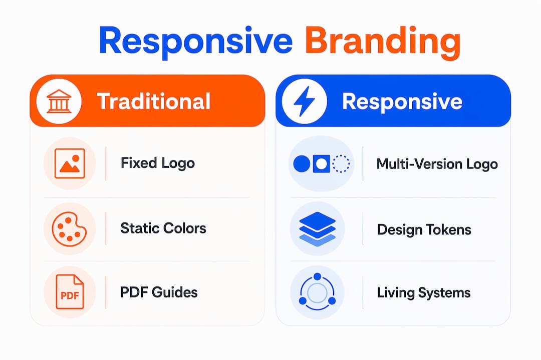
Beyond logos, responsive brand design relies on design tokens: named variables that store color values, font sizes, spacing, and motion settings. Instead of hardcoding a hex value into every asset, a design token lets your team update one value and push that change across every platform at once. This is what separates a living brand system from a static PDF style guide.
Typography and color also follow responsive rules. Scalable type systems define minimum and maximum sizes for every heading level, so text stays readable at 320px wide and at 1,440px wide. Color palettes include accessible contrast ratios tested against WCAG 2.1 standards, so your brand colors work for all users, including those with visual impairments.
Privacy-conscious personalization is the fourth pillar. Modern responsive brand systems use consented signals and edge evaluation to tailor brand experiences without invasive tracking. This means you can show a returning customer a warmer, more familiar version of your brand without violating their privacy or trust.
- Responsive logo system: Full version, simplified mark, and icon-only mark, each mapped to a specific use case.
- Design tokens: Centralized variables for color, type, and spacing that update across all platforms from one source.
- Scalable typography: Type scales with minimum and maximum sizes defined for every breakpoint.
- Accessible color palettes: Contrast ratios tested to WCAG 2.1 so your brand works for every viewer.
- Privacy-first personalization: Consent-based signals that adapt brand experience without tracking users invasively.
Pro Tip: Build your design tokens in a shared system like a Figma library or a design system file. When your brand color changes, you update one token and every asset updates automatically.
Why is responsive branding important for business success?
Consistent brand presentation across platforms directly drives revenue. Responsive branding improves brand recognition and user trust by delivering visually clear, coherent experiences everywhere a customer encounters your business. That consistency signals professionalism and reliability, two qualities that convert browsers into buyers.
The business case gets stronger when you look at engagement. A brand that looks polished on mobile but broken on a tablet loses credibility at the exact moment a customer is deciding whether to trust you. Micro-interactions and visual personalization can increase conversions by up to 15%. That number reflects what happens when small, well-designed brand moments, like a button animation or a personalized greeting, reinforce the brand promise at the right time.
“Brands that employ responsive branding maintain a cohesive and consistent image while meeting diverse platform constraints. This strategy ensures flexibility without sacrificing brand recognition or messaging clarity.”
The operational benefits are just as real. Adaptive branding reduces costs by unifying multiple logo versions into a single scalable system. Instead of commissioning new assets every time a new platform or screen format emerges, your team pulls from an existing system. That cuts design time, reduces errors, and keeps your brand coherent without constant redesigns.
Here is how the importance of responsive branding maps to specific business outcomes:
- Brand recognition: Customers recognize your brand faster when it looks consistent across every touchpoint, from Instagram to email to your website.
- User experience: A brand that adapts to the device feels native and trustworthy, reducing friction in the customer’s path to purchase.
- Omnichannel marketing: Responsive brand assets make multi-channel campaigns easier to execute because every asset already fits every format.
- Conversion rate: Micro-interactions tied to your brand identity create moments of delight that push hesitant customers toward action.
- Cost efficiency: A unified asset system means fewer one-off design requests and faster go-to-market timelines.
How does responsive branding differ from traditional branding?
Traditional branding was built for a world with two or three media formats: print, TV, and maybe a website. A single logo file, a printed style guide, and a set of fixed brand colors were enough. That model breaks down the moment your brand needs to appear on a smartwatch screen, a social media story, a digital billboard, and a mobile app simultaneously.
Static logos are insufficient in a digital environment that demands brand visuals scaling from smartwatches to outdoor LED screens. A traditional logo designed at one size and one level of detail simply cannot do that job. It either loses detail at small sizes or looks sparse and generic at large ones.
Pro Tip: Audit your current logo by placing it at 16×16 pixels (favicon size) and at 1920×1080 pixels (full-screen size). If it fails at either extreme, you need a responsive logo system.
The table below shows the key differences between traditional and responsive branding approaches:
| Dimension | Traditional branding | Responsive branding |
|---|---|---|
| Logo format | Single fixed file | System of purposeful variations |
| Brand guidelines | Static PDF document | Living documentation updated continuously |
| Asset management | One version for all uses | Assets categorized by function and context |
| Personalization | Passive, one-way messaging | Privacy-conscious, consent-based adaptation |
| Update process | Full redesign required | Token-level updates pushed across all assets |
Managing responsive branding requires shifting from static PDF-style brand guides to living documentation systems that categorize assets by function. This approach lets teams update layouts and brand elements without re-engineering the entire brand identity. That is a fundamental change in how brand teams operate, not just a design upgrade.
How to implement a responsive branding strategy
Implementation starts with an audit. Before building anything new, catalog every brand asset you currently use: logos, color codes, font files, icon sets, photography styles, and tone-of-voice guidelines. Identify which assets break at small sizes, which colors fail accessibility checks, and which guidelines have not been updated in over a year.
From that audit, you build your responsive system in layers:
- Logo system: Create at least three logo variations. Full lockup for large formats, simplified mark for medium contexts, icon-only for small screens and favicons. Experts recommend abandoning a single static logo in favor of a system of purposeful variations tailored to digital contexts.
- Design tokens: Define tokens for your primary and secondary colors, type scale, spacing units, and motion timing. Store these in a shared design system file.
- Living brand guidelines: Replace your PDF style guide with a web-based or tool-based document that your team can update in real time. Link directly to live asset libraries rather than static screenshots.
- Privacy-first personalization: Build consent flows into your brand experience from the start. Use first-party data and consented signals to personalize without tracking users across sites.
- Micro-interactions: Define small motion and feedback moments tied to your brand, such as button hover states, loading animations, and form confirmation messages, that reinforce your identity at every touchpoint.
The table below maps each implementation step to its primary business benefit:
| Implementation step | Primary benefit |
|---|---|
| Logo system audit and rebuild | Consistent recognition across all screen sizes |
| Design token setup | Faster updates, fewer errors across platforms |
| Living brand guidelines | Agile brand management without full redesigns |
| Privacy-first personalization | User trust and higher engagement |
| Micro-interaction design | Improved conversion and brand recall |
Aligning your marketing and design teams on this system is the final step. Digital branding fundamentals work best when every team member, from social media managers to web developers, pulls from the same asset library and follows the same living guidelines. Misalignment is where brand consistency breaks down, not in the design files.
Pro Tip: Schedule a quarterly brand audit. Check that your design tokens, logo variations, and guidelines still reflect your current brand direction. Brands that skip this end up with fragmented assets across teams.
Key Takeaways
Responsive branding succeeds when a business treats its identity as a living system of adaptable assets, not a fixed set of files.
| Point | Details |
|---|---|
| Define your logo system | Build at least three logo variations mapped to specific screen sizes and contexts. |
| Use design tokens | Centralize color, type, and spacing values so updates push across all platforms at once. |
| Replace static guides | Switch from PDF brand guides to living documentation your team can update in real time. |
| Prioritize privacy | Use consent-based personalization to build trust without invasive tracking. |
| Audit regularly | Review brand assets quarterly to catch inconsistencies before they reach customers. |
The shift I keep seeing brands get wrong
The most common mistake I see business owners make is treating responsive branding as a design project rather than a business system. They commission a new logo set, update the style guide once, and consider the job done. Six months later, the social media team is using an old logo file, the website has a different shade of the brand color, and the email templates look like they belong to a different company entirely.
Responsive branding is not a deliverable. It is an operating model. The living documentation piece is where most small and mid-sized businesses fall short, not because they lack design talent, but because no one owns the system after launch. Someone has to be responsible for updating the tokens, retiring old assets, and keeping the guidelines current.
Privacy is the other area I think gets underestimated. Brands spend significant effort on visual consistency and almost none on how their personalization practices affect customer trust. A brand that looks polished but feels intrusive loses the trust that visual consistency was supposed to build. Privacy and personalization are increasingly integral to responsive brand systems, and the brands that get this right will have a durable advantage.
The businesses I have seen build this well share one trait: they connect their branding to revenue outcomes explicitly. They track whether brand consistency correlates with conversion rates, customer lifetime value, and repeat purchase behavior. That accountability keeps the brand system alive and funded.
— TONY
How Ibrand helps businesses build a brand that works everywhere
Responsive branding requires the right foundation, and that foundation includes a website and digital presence that actually reflects your brand at every touchpoint.
Ibrand works with small and mid-sized businesses to build digital marketing strategies that connect brand consistency with real growth. From web design built for small businesses to SEO strategies that put your brand in front of the right audience, Ibrand handles the technical and creative work so you can focus on running your business. If your brand is ready to perform consistently across every platform, optimizing your website for search is the logical next step. Ibrand makes that process straightforward and affordable for businesses at every stage.
FAQ
What is responsive branding in simple terms?
Responsive branding is the practice of designing a brand’s logo, colors, and messaging to adapt automatically to different devices and screen sizes. The goal is consistent recognition whether a customer sees your brand on a phone, tablet, or desktop.
What are the core components of a responsive brand system?
A responsive brand system includes a multi-version logo set, design tokens for color and typography, living brand guidelines, and privacy-conscious personalization. Each component works together to keep the brand consistent and updatable across all platforms.
How does a responsive logo differ from a standard logo?
A responsive logo system includes a full version, a simplified version, and an icon-only mark, each designed for a specific size and context. A standard logo is a single file used everywhere, which often loses legibility at small sizes.
Why does responsive branding matter for small businesses?
Small businesses compete on trust and professionalism. A brand that looks inconsistent across platforms signals a lack of attention to detail, which costs customers. Responsive branding builds the visual consistency that makes a small business look credible at every touchpoint.
How often should a business update its responsive brand system?
A quarterly audit is the standard practice. Teams should check that design tokens, logo variations, and brand guidelines still reflect the current brand direction and that no outdated assets are in active use across marketing channels.
Recent Comments