
A good website footer is a short, predictable block at the bottom of every page that holds the things a visitor looks for when they are ready to act or to check you out: how to reach you, where you are, your policies and a few links to your most-used pages. Keep it organized in labeled groups, make the text readable, and leave out anything that does not earn its space. For a local business, the footer is also where your name, address and phone number should match everything else people see about you online.
This guide covers what to include, how to lay it out, how to handle color and mobile, and what to leave out, with examples for the kinds of businesses we work with: home services, dental and med spa practices, venues and local retailers.
TL;DR
- Put the essentials in every footer: business name, a tap-to-call phone number, email or contact link, service area or address, a copyright line, and privacy and terms links.
- Group links under 3 to 5 clear headings, and keep names plain. “Services” and “Contact” beat “Resources” and “More”.
- Use readable text: contrast of at least 4.5:1 for normal text and large tap targets on mobile.
- Do not mirror your header menu, pile on disclaimers or link to social accounts you do not update.
- Match your name, address and phone to your Google Business Profile exactly.
Table of Contents
- Why the footer matters more than its size suggests
- What to put in a website footer
- Examples by business type
- How big should your footer be?
- Organize links so people can find them
- Color, contrast and readability
- Footers on mobile
- Footer and local search
- What to leave out
- Test and improve
- A footer checklist you can use today
- Where we can help
- Our perspective
- FAQ
- Sources
Why the footer matters more than its size suggests
Visitors scroll to the bottom for a reason. Usability researchers at Nielsen Norman Group describe the footer as a place where people expect to find utility links, contact details and secondary tasks, and they say it should be consistent, predictable and easy to discover. They also note that the footer should never be hidden or collapsed on desktop.
Think of a homeowner with a burst pipe who has read your homepage and wants a number, or a patient who wants to confirm your hours before booking. If the footer gives the answer in two seconds, you keep the visit. If it is cluttered, they leave.
A footer also appears on every page. That makes it the one piece of your site that works for visitors who land deep inside it from a search, not only for those who start at the homepage. A federal example makes the point: the NCI Design System lists the footer as required at the bottom of all pages.
What to put in a website footer
Start with the minimum, then add only what your customers actually use. HubSpot’s list of the basics includes an About page link, contact information, a location where relevant, a copyright line, privacy and terms links, and any legally required links for your industry and place.
The must-haves
- Business name and logo. It confirms where the visitor is after a long scroll.
- Phone number. Make it a tap-to-call link so a mobile visitor can call with one touch. The U.S. Web Design System advises limiting contact information to a clickable email and phone number, with physical addresses kept on the contact page. That suits an office-based business well. If you serve customers at a location, such as a venue, a dental office or a med spa, show the address too, because customers need it.
- Contact link or short form. Not everyone wants to call.
- Service area or address. A plumber or HVAC company can list the cities served. A venue or practice should show its street address and hours.
- Copyright line with the current year. A stale year makes a site look abandoned.
- Privacy policy and terms links. If you collect names, phone numbers or emails through forms, a visitor should be able to find your privacy policy easily.
- Links to core pages. About, Services, Reviews or Gallery, Contact.
Worth adding for many local businesses
- Hours. Especially for dentists, med spas, restaurants and retailers.
- A separate emergency or after-hours number. For plumbers, HVAC and dental offices this is often the number people want most.
- Licenses and trust marks. Show a contractor license number or professional memberships if you hold them. Nielsen Norman Group lists testimonials and awards among common footer components.
- Payment methods and policies. Retailers can list accepted cards, return and shipping policies.
- Social links. Only for accounts you actually use. More on that below.
- Email signup. Only if collecting emails is a real goal.
If your footer includes an email signup
If you send marketing email, the FTC’s compliance guide says each message must include a valid physical postal address, which can be a street address, a registered post office box or a registered private mailbox. Many businesses put that address in the email template. If your footer signup promises email, make sure the emails that follow carry it. Check with a lawyer if you operate in a regulated field such as healthcare, where extra disclaimers or required notices may apply to your site.
Examples by business type
The examples below are illustrations of how the pieces combine, not copies of real sites. Use them as a starting layout.
| Business | What the footer leads with | What to add next |
|---|---|---|
| Plumber or HVAC company | Tap-to-call phone, 24/7 emergency line, cities served | License number, service links, reviews link |
| Dentist or med spa | Address, hours, booking link | Separate emergency number, insurance or financing page, privacy notice |
| Venue or banquet hall | Address with map link, “Book a tour” link | Capacity page, gallery, event inquiry form |
| Retailer | Hours, address, shipping and returns links | Accepted payments, email signup, social links |
| Home contractor | Phone, service area, estimate request link | License and insurance details, project gallery |
A published guide from We.Inc offers similar illustrations, including a plumber footer with a phone and service area and a dentist footer with a separate emergency number. It also advises choosing a pattern that fits the site type and grouping extra links into 3 to 5 labeled columns.
Large brands show the same principle at a bigger scale. Patagonia uses a dense footer with policies, newsletter signup, contact and careers, while Lulus keeps its footer simple with an email signup and social links, as Mailchimp’s examples describe. You do not need a mega footer. Most small business sites do well with a medium one.
How big should your footer be?
The U.S. Web Design System defines three footer sizes. A big footer replicates site navigation and may include a newsletter signup. A medium footer holds a few links, social icons and contact information. A slim footer holds just a few links. Its guidance is to use the big footer when you have more than five links.
In practice:
- Slim: a one-page site for a solo operator. Logo, phone, email, copyright, privacy link.
- Medium: most local service businesses. Three columns: Services, Company, Contact.
- Big: multi-location practices, retailers with many categories and venues with many event types.
When in doubt, go smaller. A short footer that is easy to scan beats a long one that nobody reads.
Organize links so people can find them
Group under clear headings
Baymard Institute’s testing found footer links are easiest to find when grouped into sections that are visually separated and semantically grouped under clear headings. It also found that 13% of the largest e-commerce sites had usability problems with their site-wide footer. Its example is a retailer footer with four areas: Customer Service, My Account, Company Information, and Tools & Resources.
For a local business, a three-column version might look like this:
- Services: Drain cleaning, Water heaters, Emergency repair
- Company: About us, Reviews, Careers
- Contact: Phone, Email, Service area
Use plain link names
Nielsen Norman Group warns against vague labels such as “Resources” and against more than two levels of hierarchy in a footer. Its guidance for teams is to show only first- and second-level categories. Its summary line is worth remembering: if everything is important, nothing is.
Good labels say what the visitor gets: “Request an estimate,” “Book a tour,” “Contact us.” The NCI Design System recommends short, verb-led button labels such as “Contact us” and “Sign up.”
Do not repeat your header
The NCI guidance says the footer should not replicate the main navigation. Use the footer for things that do not belong in the top menu: policies, hours, license details and secondary pages.
Color, contrast and readability
There is no single best footer color. Pick one that fits your brand and stays readable. Two common patterns are inverted (a dark background with light text) and tonal (the page background with a subtle top border). 1footer.ai describes both and notes that light gray text on dark gray fails contrast checks all the time.
The rule that matters is contrast. WCAG AA, the widely used accessibility standard, calls for a contrast ratio of at least 4.5:1 for normal text and 3:1 for large text. Many sites still miss it: Slider Revolution reports that WebAIM’s 2024 Million study found low-contrast text on 81% of homepages.
A few practical tips:
- Use a contrast checker on your footer link color and background before you publish.
- Underline links, or otherwise mark them, so they do not rely on color alone. The U.S. Web Design System notes that about 4.5% of the population has some form of color insensitivity.
- Make headings larger or bolder than links. LogRocket recommends headings with a larger font or different color to build a visual hierarchy, and white space to separate groups.
- Match your logo and palette so the footer looks like part of the site. Adobe’s 2024 small business branding report found that business websites favor neutral backgrounds such as white, blue and gray.
- Avoid decorative fonts. Nielsen Norman Group recommends a legible size and color with decent contrast.
Footers on mobile
Most local searches happen on phones, so the mobile footer is the one many of your customers see. Three things matter:
- Phone number first. A tap-to-call link at the top of the mobile footer is the fastest route from a visit to a call.
- Big enough tap targets. Slider Revolution recommends 44px minimum touch targets, along with keyboard navigation and semantic HTML for accessibility. Links crammed tightly together cause mis-taps.
- Collapse only when you must. The NCI Design System says that on small screens collapsed navigation should use accessible accordions with tab focus working. 1footer.ai suggests accordions only for footers with four or more columns of five or more links each. A small business footer can usually stay open.
If you want to dig further into mobile layouts, our guides on mobile-friendly website tips and responsive design go through the rest of the page.
Footer and local search
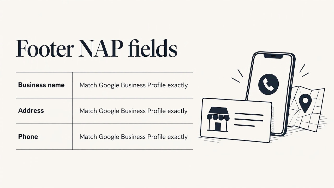
Your footer is a natural home for your business name, address and phone number, often called NAP. Keep them written exactly as they appear on your Google Business Profile. Small differences, such as “Street” in one place and “St.” in another, or a tracking number on the site and a different one on your profile, create inconsistency that confuses customers and search engines alike. We.Inc’s guide also advises keeping the footer NAP text identical to the profile and putting a tap-to-call phone link first on mobile.
Local businesses can also link to the main pages they want found: a service page for each core service and a page for each location. Keep the list short and relevant. For the wider picture of how this fits into a search plan, see our guide to SEO for small businesses.
What to leave out
The U.S. Web Design System’s usability guidance offers a good filter. Its points:
- Curate links to popular content. Look at what visitors actually click, not at what your team wants to promote.
- Minimize disclaimer bloat. A wall of small print hides the links people need. Keep required notices, and link out to longer text.
- Do not link to dead social accounts. Link only to those you update often or use to talk with customers.
- Add a newsletter box only if it is a real goal. An unused signup box is clutter.
And from Nielsen Norman Group: do not use the footer as a dumping ground for orphaned links. If a page matters, it belongs in your main navigation or a labeled group. If it does not, it may not need a link at all.
Other common mistakes:
- Copyright year left at 2019.
- Phone number that is plain text and cannot be tapped.
- Different footers on different pages, which breaks the predictability visitors rely on.
- Tiny gray text on a slightly darker gray background.
- Long lists of every city you serve in one block. Pick the main ones and link to a service area page.
Test and improve
A footer is not set once and forgotten. LogRocket suggests A/B testing footer versions by comparing click-through rates, time on page and bounce rate. Even without formal tests, check your analytics a few times a year: which footer links get clicks, and does the phone link get tapped? If nobody uses a link, remove it. If a link is heavily used, consider moving it higher on the page. Our guide on how to measure website success explains the numbers worth watching, and the conversion rate tips cover what to do with them.
A footer checklist you can use today
- Business name and logo present.
- Tap-to-call phone number, and email or contact link.
- Address or service area, matching your Google Business Profile.
- Hours, if customers visit or call in set hours.
- 3 to 5 labeled groups of links, with no more than two levels.
- Privacy policy and terms links, plus any notices your industry requires.
- Copyright line with the current year.
- Contrast of at least 4.5:1 on normal text, and underlined or otherwise marked links.
- Tap targets of at least 44px on mobile.
- Only social accounts you keep up to date.
Where we can help
A footer works best when it is designed with the rest of the site: the same colors, the same calls to action, the same local details. Our web design service builds mobile-friendly sites for small and local businesses, with a custom plan for each client. If your footer, or the site around it, needs a rebuild, you can look at our web design and marketing services and request a plan.

Our perspective
We think of the footer as the last chance on every page to help someone who is nearly ready to contact you. For the home service owners, dentists, med spas and venue managers we work with, that usually means one thing: make the phone number, location and next step impossible to miss.
The mistakes we see most are simple. Footers get built once at launch and never revisited, so the year, the hours and the links go stale. A footer should be part of the design plan from the start, tied to how the site earns leads, and checked as the business changes.
That is why our approach to web design starts with a custom plan for each business and ties the design to what the site needs to do. A well-built footer is a small piece of that, and it is one that every visitor sees.
TONY
FAQ
What should be in the website footer?
At a minimum, include your business name, contact details, a copyright line, privacy and terms links, and links to your key pages. Local businesses should add an address or service area and hours. Keep the contact details identical to your Google Business Profile.
Should every page have a footer?
Yes. Footers are meant to be consistent site-wide, and the NCI Design System lists the footer as required on all pages. A visitor who lands on any page can then reach your contact details and policies without going back to the homepage.
What is the best color for a website footer?
There is no single best color. Choose a background and text pair that meets a contrast ratio of at least 4.5:1 for normal text, and make links identifiable without relying on color alone. Dark footers with light text and light footers with dark text can both work when the contrast is strong.
How many links should a footer have?
As few as your visitors need. The U.S. Web Design System suggests a big footer once you have more than five links, and a guide from We.Inc recommends grouping extra links into 3 to 5 labeled columns. For most small businesses, a dozen well-chosen links is plenty.
Sources
- Web Page Footers 101: Design Patterns and When to Use Each (Nielsen Norman Group)
- Website footer design examples that will inspire you (HubSpot)
- Footer | U.S. Web Design System
- Footer | NCI Design System
- Using color | U.S. Web Design System
- CAN-SPAM Act: A Compliance Guide for Business (FTC)
- Footer Links Should be Divided into Distinct Semantic Groups (Baymard Institute)
- 22 Best Website Footer Design Examples (We.Inc)
- Website Footer Design Examples (Mailchimp)
- Footer design: best practices for 2026 (1footer.ai)
- Website footer design best practices (LogRocket)
- Footer Navigation Best Practices for User-Friendly Sites (Slider Revolution)
- 2024 Small business branding report (Adobe)
Recent Comments