
A good service pricing page does three jobs: it tells the visitor what they get, what it costs, and what to do next. For a plumber, a med spa or a banquet hall, that usually means three clearly named packages, a plain statement of what is included, a starting price where the job really varies, and one obvious button. If you would rather have that page designed and built around your own services, our web design work starts from the same logic: a page built to turn a visit into an inquiry.
This guide covers the layout, the table, the wording and the mobile details, with examples for service businesses rather than software companies.
TL;DR
- Show about three packages (entry, most popular, complete), each built from the same base items, with what is not included stated plainly.
- Give the outcome, scope and payment terms. Leave internal cost lines such as subcontractor markup off the page.
- Where jobs vary, show a “starting at” price and explain what moves it, then offer a quick estimate request.
- Design for the phone first: stacked cards, accordions instead of wide tables, big tap targets and one sticky button.
- Check the page with real buyers and your own inquiry data, then change one thing at a time.
Table of Contents
- What a service pricing page has to do
- Start with a package structure, not a design
- Design the comparison table so people can scan it
- Say what is included, and what is not
- Starting prices, custom estimates and add-ons
- Make it work on a phone
- One call to action, written like an instruction
- Trust signals that belong beside the prices
- Examples to learn from, and how to adapt them
- Test the page with buyers and with your own data
- Want this built for your business?
- FAQ
- Sources
What a service pricing page has to do
Software pricing pages are the ones that dominate search results for this topic, and their lessons only partly carry over. A SaaS buyer picks a plan and pays by card. A homeowner with a failing furnace or a bride booking a reception hall wants to know three things: is this in my range, what do I get, and how do I take the next step.
Figma’s pricing page guide describes an effective page as one with a simple, clear layout that tells customers what they get, what it costs and why it’s worth it. It also argues that plain language mirroring the customer’s problem, in a consistent brand tone, builds the trust that makes people engage with the page at all. For a local business, that means writing “Whole-home AC tune-up” or “Weekend wedding reception, up to 150 guests” instead of “Tier 2” or “Professional.”
The page also has a second audience: the person who is not ready to buy today. A visitor comparing three dental practices will leave a page that hides every number. We cover the trade-offs of publishing prices in our guide on whether to show prices on your website, and the short version is that a range with clear conditions earns more trust than silence.
Start with a package structure, not a design
Most weak pricing pages are weak before anyone opens a design tool. The offers behind them are a pile of line items. Fix the structure first.
BOTrento’s guide to service price lists suggests thinking in five layers: units, base items, packages, extras and rules. Here is how that translates for a local business:
- Units. How you measure the work: per visit, per room, per guest, per month, per treatment session.
- Base items. The individual services you can already price, such as a drain clearing, a duct inspection, a hall rental block or a Botox session.
- Packages. Bundles of base items, about three of them.
- Extras. Things a customer can add from a list, without you inventing a new package each time.
- Rules. Minimums, rush fees, travel zones, deposit and cancellation terms.
The same guide recommends about three package options: an entry option, the one most clients choose, and a complete option. Because every package is built from the same base items, a price change is traceable: if the cost of one base item moves, you know which packages move with it.
Worked example: an HVAC company
Suppose a heating and cooling company sells maintenance, repairs and installations.
| Essential | Comfort (most popular) | Complete | |
|---|---|---|---|
| Seasonal tune-up | 1 visit per year | 2 visits per year | 2 visits per year |
| Filter replacement | Not included | Included | Included |
| Priority scheduling | Not included | Included | Included |
| Repair discount | Not included | Not included | Included |
| Best for | Newer systems | Most households | Older systems, rental owners |
The price row sits above this table on the live page, and each column has one button. The empty cells are labeled “Not included” instead of left blank, which matches the advice to state exclusions such as delivery, travel, overtime and materials. Anything outside the three packages, such as an extra thermostat or a duct cleaning, goes into an add-on list under the table.
If you want a second look at how packages are explained to a buyer, this piece on service packages explained shows how a different kind of service business describes what each tier includes and costs.
Design the comparison table so people can scan it
Pricing table design is where most of the search interest sits, and the rules are simple.
Figma recommends a comparison table that starts with the features that drive purchase decisions, groups related features into labeled sections, and uses checkmarks, tooltips and icons instead of long text blocks. Applied to a service business:
- Lead with what the customer buys for, not what you do. A dentist’s table opens with “Cleaning and exam, X-rays, whitening,” not with the equipment used.
- Limit the rows. If a row is identical across all packages, it belongs in a sentence above the table.
- Highlight one column. The middle package is the one most clients choose, so mark it “Most popular” and give it the strongest visual weight.
- Use the same words everywhere. If the table says “visit,” do not switch to “appointment” and “service call” further down.
- Put a price and a button in each column header. A visitor should never scroll to find out what a column costs.
Say what is included, and what is not
HoneyBook’s guidance on pricing packages says tiers should state deliverable scope, features, outcomes and usage limits so customers understand what they are choosing. For service work, “usage limits” are the things that otherwise turn into arguments after the sale: how many revisions, how many visits, how many guests, how many treatment areas.
The Ququ guide to service price lists adds a useful distinction. Clients don’t need to see internal cost lines. They need the outcome, the scope and the payment terms. Listing parts cost, subcontractor markup or software fees as separate public lines invites negotiation over each one. Keep tracking those costs internally so your margin holds, but publish the price of the result.
The same source suggests rules you can write once and reuse:
- A complexity trigger that moves a job to a higher package.
- A revision limit, after which extra changes carry a fee.
- A minimum fee for small jobs.
- A rush fee for compressed timelines.
- An expiry date on quoted prices.
- Written limits on discounts.
A plumber might turn these into “Jobs under one hour are billed at the one-hour minimum” and “After-hours calls add 25%.” A banquet hall might write “Quotes are held for 14 days” and “Weekend dates require a deposit to hold.” Short, specific sentences like these do more for trust than a paragraph of reassurance.
Starting prices, custom estimates and add-ons
Many local services cannot honestly have one fixed price. A bathroom remodel, a wedding, a full-mouth treatment plan or a month of ad management depends on size, condition and goals. You still have options besides “call for a quote.”
Use “starting at” with its conditions
A “starting at” price works when it is attached to a definition: what the entry job is, and what raises the price. “Starting at [your price] for a standard water heater replacement, 40 or 50 gallon, tank in an accessible location” tells the visitor where they sit. Then list two or three factors that move the price, such as access, permits or materials. Visitors can place their own job on that scale without calling.
Make add-ons a list, not new packages
A freelance pricing grid published by ElyxAI shows the pattern clearly: a copywriter has base packages with fixed prices and add-ons such as an SEO extra, extra revisions and a percentage rush fee, and the quote is calculated from those parts. The same idea works for a contractor or a venue. Keep a short add-on list with a price or percentage next to each item. Extras are added from the list; they never become a fourth and fifth package.
Add a short estimate path
For the jobs that really are custom, put a short estimate form directly beneath the table: name, phone, service needed, ZIP code and one free-text line. Say what happens next and when (“We reply within one business day” is only worth writing if you can keep it). Our article on making marketing costs clear goes deeper on how to explain variable pricing without scaring people off.
Put FAQs on the page, near the decision
The questions that stall a purchase are predictable: “Is there a contract?” “Do you charge for estimates?” “What if the job takes longer?” “When do I pay?” Answer them in a short accordion below the table. Do not bury them on a separate page, because the visitor who has a question at the moment of decision rarely goes looking.
Make it work on a phone
Most of your visitors will see the page on a phone, often while standing in a flooded kitchen or sitting in a parking lot. Figma reports that as of July 2025 about 64% of global web traffic comes from mobile devices. The practical rules from that guide and from Mailchimp’s pricing page advice agree:
- Stack package cards vertically with clear separation instead of squeezing three columns side by side.
- Replace wide comparison tables with expandable sections or accordions, and keep prices and key features visible without extra taps.
- Make buttons, toggles and tooltips large enough for a thumb.
- Keep one call-to-action button sticky at the bottom of the screen.
- Test on actual phones, not only in a browser’s resized window, and check page speed.
LogRocket’s UX guide makes the stakes plain: a pricing page that is hard to navigate on mobile can cost a business a sale, and inaccessible experiences lead to distrust and abandoned purchases. It also points to progressive disclosure, which means showing only the information relevant to the visitor at each step. For a service page, that could be a service-type selector that reveals only the matching packages.
Accessibility belongs in the same checklist: readable text contrast, labels on every form field, buttons that say what they do, and a table that a screen reader can move through row by row. Those choices help every visitor, not only those using assistive tools.
One call to action, written like an instruction
A pricing page is a decision page, so each package needs a next step. Choose one primary action for the whole page, for example “Book a free estimate” or “Check my date,” and repeat it in each column and in the sticky mobile bar. Avoid mixing “Learn more,” “Contact us,” “Get started” and “Request a quote” on the same screen; four labels for one action makes people hesitate.
A button reading “Book my tune-up” outperforms vague wording in most tests of this kind because it names the result. For wording ideas and the reasoning behind them, see our step-by-step guide on creating calls to action that convert. Put a phone number next to the button for visitors who want to talk, and show a click-to-call link on mobile.
Trust signals that belong beside the prices
Price is easier to accept when the visitor already believes you can do the job. Place proof close to the table, not on a separate page:
- Two or three short customer reviews that mention the service on the page.
- License, insurance or certification details that apply to your trade, if you hold them.
- Before-and-after photos, or photos of your actual venue or team.
- A plain statement of payment terms: deposit, when the balance is due, accepted payment methods.
- A price-validity note, such as “Prices apply to jobs booked this season,” so an old page does not create a dispute.
Only show what is true for your business. A claim you cannot back up costs more trust than an empty space.
Examples to learn from, and how to adapt them
The pricing page examples that fill search results are mostly software pages. They still teach three things local businesses can copy: a highlighted middle plan, a short row of reassurance (cancel anytime, no setup fee) under the buttons, and a simple FAQ. What they cannot teach is how to price a service where the job differs each time. For that, borrow from your own trade’s habits:
- Home services: Flat-rate menus for common jobs (drain clearing, tune-ups, water heater swaps) plus a diagnostic fee line and a clear “we quote on site” path for the rest.
- Med spas and dental practices: Treatment menus with starting prices per session or per area, membership or package options, and a financing note if you offer one.
- Venues and banquet halls: Packages by guest count and day of week, with an add-on list for bar service, decor and extended hours.
- Agencies and consultants: Monthly packages with defined deliverables and an add-on list for extras.
What goes around the table matters as much as the table. Our guide on content that converts for home service websites shows what to put on the surrounding pages so the pricing page is not carrying the whole sale alone.
Test the page with buyers and with your own data
You do not need a research budget to improve a pricing page. Wynter’s B2B testing guidance lists the questions to ask target buyers: are the tiers and their differences clear, does the price feel fair, what would stop you choosing, and which terms are confusing. You can ask the same questions of five recent customers on a short call or in an email.
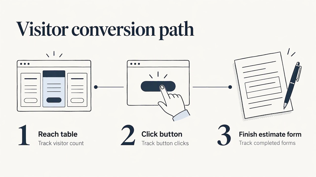
Then compare what they say with what the page does. Track how many visitors reach the table, how many click the button, and how many finish the estimate form. If people reach the table but do not click, the offer or the price framing is the issue. If they click but abandon the form, the form is too long. Change one thing at a time so you know what caused the shift. Our notes on website conversion rate tips cover the measuring side in more detail.
Our view: the page should sell the next conversation
A pricing page is rarely where a local customer pays. It is where they decide whether to call you or the next business on the list. So we build it as a short path: a clear package structure, honest starting prices, one action and proof close by.
We design every site mobile-friendly and with a plan tailored to each client, because a plumber’s pricing page and a banquet hall’s pricing page should not look alike. Transparent pricing is part of how we work with clients, and we think it earns the same trust for your business when you show it to your own customers.
The best pricing pages we see are plain: few packages, specific words, a real button. Design polish comes after that, not before.
TONY
Want this built for your business?
If your prices are scattered across a menu page, a PDF and a phone script, we can pull them into one pricing page designed for your trade and your customers. Our web design service covers mobile-friendly layouts, and our team works with local service providers, venues and small businesses on custom plans. See what we offer at IBrand Media and request a plan for your pricing page.
If you also want the page to bring in search traffic, our guide to conversion-focused web design for small businesses explains how layout and message work together.
FAQ
How many packages should a service pricing page show?
About three is a good default: an entry option, the option most clients choose, and a complete option. Three gives people a clear comparison without overload. If you have more services, group them by type and show three packages within each group.
Should I publish exact prices if every job is different?
Publish what you can: a starting price with the conditions that raise it, plus a list of add-ons. Then offer a short estimate request for the custom part. Visitors get a sense of range, and you still quote the final price once you know the scope.
What belongs in a pricing table besides the price?
The outcome the customer gets, the scope of work, usage limits such as visits, revisions or guests, what is not included, and payment terms. Keep internal costs like materials markup or subcontractor fees off the page, since customers are buying the result.
How do I make a pricing table work on a phone?
Stack the packages vertically, turn the comparison table into accordions, keep the price and main features visible, and use large buttons. A single sticky button at the bottom of the screen keeps the next step in reach. Test on real devices before you publish.
How do I know if my pricing page is working?
Track how many visitors click the main button and how many complete the estimate form, and ask a few recent customers whether the packages and terms were clear. Change one element at a time and compare results over a few weeks.
Sources
- Pricing Page Best Practices + Examples, Figma
- How to Create a Price List for Services: Structure & Rules, BOTrento
- Service Price List: How to Build One Before You Quote, Ququ
- How to Create Pricing Packages for Your Services, HoneyBook
- How to Create a Pricing Page: Examples, Tips, and Best Practices, Mailchimp
- Designing your pricing page with data-driven decisions, LogRocket
- Create a Freelance Pricing Grid in Excel, ElyxAI
- B2B pricing testing tool, Wynter
Recent Comments