
More than half of all American consumers now browse and buy from mobile devices, yet many local businesses still struggle to adjust their websites for every screen. For small and medium-sized retail owners, responsive design can mean the difference between frustrated visitors and loyal customers. This article uncovers the essential principles and clears up common misconceptions, helping you spot cost-effective ways to boost your online visibility and deliver a seamless user experience.
Table of Contents
- Responsive Design Basics And Misconceptions
- Types Of Responsive Techniques For Websites
- How Responsive Layouts Improve User Experience
- SEO Advantages For Mobile-Friendly Sites
- Cost Savings And Simplified Site Maintenance
- Common Pitfalls And How To Avoid Them
Key Takeaways
| Point | Details |
|---|---|
| Responsive Design Is Essential | Implementing responsive design is vital for small businesses to ensure optimal user experience across all devices, directly impacting engagement and conversion rates. |
| Cost Efficiency | Utilizing responsive design can streamline site maintenance, reducing development costs and effort by maintaining a single flexible website. |
| SEO Benefits | Mobile-friendly websites are prioritized by search engines, making responsive design crucial for improving online visibility and search rankings. |
| Common Pitfalls | Small businesses should be aware of potential pitfalls in responsive design, such as fixed-width layouts and poor touch targets, to ensure a seamless user experience across devices. |
Responsive design basics and misconceptions
Responsive web design (RWD) represents a critical digital strategy for small businesses seeking to create websites that adapt seamlessly across multiple devices. Web design fundamentals reveal that responsive design goes far beyond simply making a site look good on different screens – it’s about creating an optimal viewing and interaction experience.
At its core, responsive design utilizes flexible layouts, media queries, and viewport meta tags to ensure websites render perfectly whether viewed on a desktop, tablet, or smartphone. This approach eliminates the need for separate mobile and desktop versions, reducing development complexity and maintenance costs. Modern responsive design focuses on creating fluid, adaptable interfaces that automatically adjust to screen size, resolution, and device orientation.
Many small business owners harbor misconceptions about responsive design. Some believe it’s an optional feature, while others think it’s prohibitively expensive. In reality, responsive design techniques have become standard practice, with frameworks and tools making implementation increasingly accessible. Responsive design isn’t just about aesthetics – it directly impacts user experience, search engine rankings, and conversion rates.
Pro tip: Start by using free responsive design testing tools to evaluate your current website’s mobile performance and identify areas for improvement.
Types of responsive techniques for websites
Responsive website design leverages several sophisticated techniques to create flexible, adaptive digital experiences. Responsive design strategies involve multiple technical approaches that help websites function seamlessly across different devices and screen sizes.
Three primary responsive design techniques stand out as fundamental to creating adaptable web interfaces. First, fluid grids allow website layouts to proportionally resize based on screen dimensions, ensuring content maintains its relative positioning and readability. Second, flexible images automatically scale and crop to fit different viewport sizes without losing quality or causing distortion. Third, media queries enable developers to apply specific CSS styling rules that activate at predetermined screen width breakpoints, allowing precise control over how content displays on various devices.
Additional advanced techniques complement these core strategies. Website design approaches now incorporate techniques like CSS flexbox and CSS grid systems, which provide even more granular control over layout responsiveness. Responsive typography, which automatically adjusts font sizes and line heights, and responsive navigation menus that collapse or transform on smaller screens, have become standard practices for creating truly adaptive web experiences.
Pro tip: Utilize browser developer tools to test your website’s responsiveness across multiple device sizes and screen resolutions.
Here’s how the main responsive design techniques compare and impact small businesses:
| Technique | How It Works | Key Benefit | Small Business Impact |
|---|---|---|---|
| Fluid grids | Resize layouts by proportions | Consistent layout | Content always fits screen |
| Flexible images | Automatically scale/crop images | Prevents image distortion | Visuals remain high quality |
| Media queries | Apply styles at screen breakpoints | Device-specific styling | Optimized for any device |
| Responsive typography | Adjusts fonts to screen size | Maintains readability | Content is always legible |
| Responsive navigation | Adapts menus for small screens | Easier navigation | No lost customers on mobile |
How responsive layouts improve user experience
User experience optimization represents a critical consideration for small businesses seeking to create engaging digital experiences across multiple devices. Responsive layouts fundamentally transform how users interact with websites by ensuring consistent, accessible, and intuitive navigation regardless of screen size or device type.
The primary benefits of responsive design emerge through several key user experience improvements. Touch target optimization ensures that buttons, links, and interactive elements are appropriately sized for different devices, preventing frustrating click errors on mobile screens. Visual hierarchy becomes more dynamic, with content automatically reorganizing to maintain readability and importance across various display sizes. These adaptations help reduce user friction, making websites feel more natural and effortless to navigate.
Responsive design strategies go beyond simple resizing, creating holistic experiences that anticipate user needs. Performance optimizations like lazy loading images and streamlined content delivery reduce load times, which directly impacts user engagement and satisfaction. By automatically adjusting layout, typography, and interactive elements, responsive designs create a seamless experience that feels intentionally crafted for each individual user’s device.
Pro tip: Conduct regular user testing on multiple devices to identify and eliminate potential navigation or readability challenges in your responsive design.
SEO advantages for mobile-friendly sites
Mobile optimization strategies have become crucial for small businesses seeking to improve their online visibility and search engine rankings. Google’s mobile-first indexing approach means that websites optimized for mobile devices receive preferential treatment in search results, making responsive design a critical component of modern digital marketing strategies.
The technical advantages of mobile-friendly websites extend far beyond simple visibility. Page load speed emerges as a key ranking factor, with mobile-optimized sites typically experiencing faster performance and lower bounce rates. These technical improvements directly correlate with higher search engine rankings, as Google rewards websites that provide quick, accessible experiences across all device types. Reduced loading times and streamlined mobile interfaces signal to search algorithms that a website prioritizes user experience.
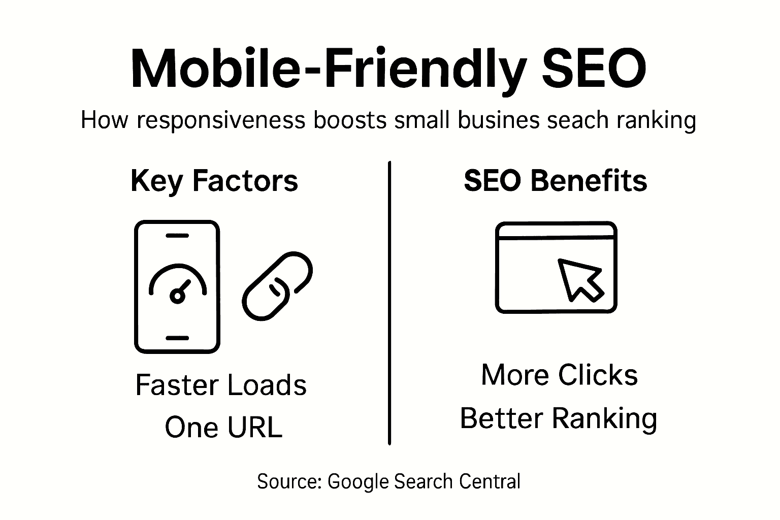
Mobile SEO techniques demonstrate that responsive design offers significant competitive advantages. By maintaining a single URL and consistent content across devices, businesses eliminate potential duplicate content issues that can negatively impact search rankings. Local search results particularly benefit from mobile optimization, as smartphone users frequently search for nearby services and products, creating immediate opportunities for small businesses to capture local market share and improve organic search performance.
Pro tip: Regularly test your website’s mobile performance using free tools like Google’s Mobile-Friendly Test to identify and quickly resolve potential optimization issues.
Cost savings and simplified site maintenance
Responsive website management offers small businesses a powerful strategy for reducing digital infrastructure costs and streamlining technical maintenance. Instead of developing and managing multiple websites for different devices, companies can now maintain a single, adaptable platform that automatically adjusts to various screen sizes and user interfaces.

The financial benefits of responsive design extend far beyond initial development. Unified content management means that updates, modifications, and content additions require only one implementation, dramatically reducing the time and labor traditionally associated with maintaining separate desktop and mobile websites. This consolidation eliminates redundant work processes, allowing businesses to allocate their technical resources more strategically and efficiently.
Website maintenance strategies demonstrate significant long-term cost advantages. By creating a single, flexible website architecture, businesses can minimize development expenses, reduce testing complexity, and simplify ongoing technical support. The unified approach means fewer potential points of failure, more consistent user experiences, and lower total cost of ownership compared to managing multiple platform-specific websites.
Pro tip: Consider using open-source responsive design frameworks to further reduce development and maintenance costs while ensuring professional-quality website performance.
Common pitfalls and how to avoid them
Responsive design challenges represent significant obstacles for small businesses seeking to create effective mobile-friendly websites. Understanding these potential issues is crucial for developing websites that function seamlessly across multiple devices and screen sizes.
Some of the most critical pitfalls emerge from technical design decisions. Fixed-width layouts remain a primary problem, preventing websites from adapting naturally to different screen sizes. Small businesses often mistakenly create designs that look perfect on their development screens but break dramatically on other devices. Inadequate touch target sizing creates another substantial challenge, with buttons and interactive elements becoming frustratingly small on mobile screens, leading to poor user experience and potential loss of customer engagement.
Responsive design best practices highlight the importance of comprehensive testing and strategic breakpoint selection. Many developers make the mistake of using device-specific breakpoints instead of content-driven responsive strategies. This approach leads to inflexible designs that fail to adapt smoothly across the increasingly diverse range of screen sizes and devices. Accessibility considerations are frequently overlooked, creating barriers for users with different abilities and potentially reducing overall website usability.
This table highlights common responsive design pitfalls and how to proactively avoid them:
| Pitfall | Description | Practical Solution |
|---|---|---|
| Fixed-width layouts | Rigid designs break on some screens | Use percentage-based layouts |
| Poor touch targets | Small buttons hard to tap | Enlarge interactive elements |
| Device-specific breakpoints | Only targets certain screens | Choose content-driven breakpoints |
| Overlooking accessibility | Barriers for users with disabilities | Test with accessibility tools |
| Incomplete device testing | Missed issues on less common devices | Test across multiple real devices |
Pro tip: Implement a mobile-first design approach and conduct systematic cross-device testing to identify and resolve potential responsive design issues before launching your website.
Enhance Your Small Business Success with Responsive Design Solutions
Struggling to create a seamless online experience that works effortlessly across all devices is a common challenge for many small businesses. This article highlights critical pain points such as fixed-width layouts, poor touch targets, and the need for mobile-first design strategies to boost user experience and SEO rankings. At ibrand.media, we understand how responsive design techniques like fluid grids and media queries directly impact your website’s performance, customer satisfaction, and search engine visibility.

Take action today by partnering with ibrand.media, where our tailored digital marketing services include affordable mobile-friendly web design that maximizes your reach and conversions. Visit our Uncategorized | Ibrandmedia page to explore real success stories that prove how responsive layouts drive growth. Ready to boost your online presence and eliminate costly maintenance hassles? Start your journey now at ibrand.media and discover personalized plans crafted specifically for your small business goals.
Frequently Asked Questions
What are the key benefits of responsive design for small businesses?
Responsive design offers numerous benefits, including improved user experience across devices, better SEO performance, cost savings on website maintenance, and increased conversion rates by creating a seamless experience for visitors.
How does responsive design improve user experience?
Responsive design enhances user experience by ensuring that websites function well on all devices. This includes touch target optimization, visual hierarchy adjustments, and a consistent layout that reduces friction for users, making navigation smoother and more intuitive.
What are some common misconceptions about responsive design?
Many small business owners mistakenly believe that responsive design is optional or too expensive to implement. However, it has become a standard practice that can greatly enhance user engagement, improve search engine rankings, and simplify website management.
How can small businesses test their website’s responsiveness?
Small businesses can evaluate their website’s responsiveness using free testing tools available online, such as Google’s Mobile-Friendly Test. Additionally, browser developer tools can help assess how the site performs across different screen sizes and resolutions.
Recommended
- Mobile-Friendly Website Design: Complete Guide | Ibrandmedia
- Understanding Mobile-Friendly Websites: Why They Matter | Ibrandmedia
- Mobile-Friendly Website Benefits: Complete Guide | Ibrandmedia
- 10 Essential Website Design Best Practices for Small Businesses | Ibrandmedia
- Cutting Edge Image-to-Video Generators for Small Businesses – ThinkZipper
Recent Comments