
Conversion-focused web design means building every page around one clear action instead of decorating it with options. The first move is simple: name the single action you want a visitor to take, then put a visible, unmistakable call-to-action above the fold. Everything else, from headline order to trust badges to page speed, exists to support that one decision.
TL;DR:
- Most small business websites underperform because they feature multiple competing CTAs, broad homepages, and buried primary actions that increase the attention ratio.
- Focusing on creating a single clear action, removing friction, and applying the seven core principles of conversion-centered design can significantly boost conversion rates.
- Speed and responsiveness, especially on mobile, have a measurable impact, with slow loading times directly reducing user engagement and sales.
- Testing one variable at a time, setting clear hypotheses, and tracking field-level metrics help small businesses optimize their pages effectively.
- Prioritizing argument clarity, messaging consistency, and speed before driving traffic yields better, more sustainable conversion improvements.
Table of Contents
- What Conversion Focused Web Design Actually Means
- The Seven Core Conversion-Centered Design Principles And How To Apply Them
- How To Design CTAs, Headlines, And Trust Signals That Convert
- Why Do Forms And Checkouts Kill Conversions?
- Do Page Speed And Core Web Vitals Really Affect Conversions?
- What Mobile-First Design Choices Increase Conversions?
- How Do You Turn Design Changes Into Measurable Tests?
- A Starter Plan For Small Businesses (And What Ibrand Sees In Practice)
- How Do You Map The Buyer Journey To Design Decisions?
- Can Personalization Actually Lift Conversion Rates?
- Does Accessibility Actually Improve Conversion Rates?
- Fix The Argument Before You Chase Traffic
- What Ibrand Media Does For Small Business Websites
- Sources
- FAQ
What Conversion Focused Web Design Actually Means
Most small business sites are built to look good, not to sell. Conversion-focused web design flips that priority. Instead of asking “does this look professional,” it asks “does this page make it obvious what to do next.” Aesthetic-focused design optimizes for brand impression. Conversion-centered design optimizes for a single action, and it treats visual polish as a means to that end, not the goal itself.
The concept behind this comes down to something called attention ratio, a term from the seven core principles of conversion-centered design. Attention ratio measures how many things a visitor can click versus how many things they actually should click. A homepage with a navigation bar, three CTAs, a newsletter signup, and a chat widget might have an attention ratio of 20 to 1. A dedicated landing page built around one offer should aim for close to 1 to 1. Pages with lower ratios convert at dramatically higher rates because the visitor isn’t stuck deciding.
Here are the mistakes that quietly drain conversion potential on small business sites:
- Multiple competing CTAs on one page (“Buy Now,” “Learn More,” and “Contact Us” all fighting for the same click)
- A homepage trying to serve every audience at once instead of routing visitors to focused landing pages
- Burying the primary action below three paragraphs of company history
- Treating the website like a brochure instead of a sales conversation
- Assuming more information always builds more trust, when it usually just adds friction
Fix the buying argument, what the visitor needs to believe before they act, before touching the visual design. A beautifully designed page with a muddled argument still underperforms a plain page with a clear one.
The Seven Core Conversion-Centered Design Principles And How To Apply Them
These seven principles, first codified by Unbounce and now standard vocabulary in conversion-centered design work, give you a checklist for auditing any page in under ten minutes.
- Create focus. Pick one goal per page and delete every CTA that competes with it. If a landing page sells a consultation, remove the blog links and the social icons.
- Build structure and visual hierarchy. Order elements so the eye moves headline, then subhead, then proof, then CTA. Skipping straight to a form before explaining the offer kills momentum.
- Stay consistent. If a Google ad promises “free shipping over $50,” the landing page headline should echo that phrase within the first five words. Mismatched messaging is one of the fastest ways to lose a paid click.
- Show benefits, not just features. “Cuts prep time by half” beats “includes automated scheduling.” Say what changes for the customer.
- Draw attention with contrast and direction. A bright button on a muted background, or a photo of a person looking toward the CTA, both pull the eye where you want it.
- Design for trust. Real customer photos, specific testimonials, security badges near payment fields, and clear guarantees all reduce hesitation at the exact moment someone is deciding.
- Reduce friction. Every extra field, extra click, or extra second of load time is a small tax on conversion. Cut it wherever it doesn’t add value.
Pro Tip: Run this seven-point checklist against your homepage and your top landing page separately. Most small business sites fail on “create focus” first, because homepages try to be everything to everyone.
None of this works if the page loads slowly on a phone. Mobile speed and simplified mobile forms should be treated as an eighth, invisible principle running underneath the other seven, because a visitor who bounces before the page finishes loading never sees any of your careful hierarchy work. Real-world case studies documented by Web show measurable revenue gains tied directly to Core Web Vitals improvements, a topic worth its own section further down.
How To Design CTAs, Headlines, And Trust Signals That Convert
The headline above the fold has one job: tell the visitor what they get and why it matters, in plain words, within about eight seconds. “Web design for small businesses” is a category label. “Get a website built to convert visitors into customers in under 30 days” states an outcome and a timeframe. Pair that with a CTA button that names the action, not a vague verb. “Get My Free Audit” outperforms “Submit” almost every time, because it removes the guesswork about what happens after the click.
Layout follows how eyes actually move. Desktop readers tend to scan in an F pattern, hitting the top line hard and trailing off down the left edge. Landing pages with a single strong message often work better with a Z pattern: headline top left, hero image top right, proof point middle, CTA bottom right. Whitespace around the CTA button matters more than its color. A button crowded by text or competing links gets ignored even when it’s technically visible.
Trust signals work best when they sit within eye range of the CTA, not buried in a footer. A few placement rules worth testing:
- Put a testimonial or star rating directly beside or below the primary CTA, not on a separate “reviews” page.
- Show real faces and first names when possible; stock photography reduces credibility rather than building it.
- Place security badges and guarantee language right next to payment or contact form fields, where hesitation peaks.
- Keep microcopy short and specific (“No credit card required” beats “Risk-free trial”) since specificity reads as more honest.
Test one variable at a time. Swap the headline first, since it usually moves the needle more than button color, then move to CTA copy, then to trust signal placement. For deeper templates on writing buttons and headlines that hold up under testing, see this step-by-step CTA guide.
Why Do Forms And Checkouts Kill Conversions?
Forms are where good intentions go to die. A visitor who was ready to buy or inquire hits a ten-field form and quietly closes the tab. The fix has a name: the EAS framework, which stands for Eliminate, Automate, and Simplify, developed through NN/g’s form usability research.
- Eliminate any field you don’t strictly need. Do you really need a phone number and an email address, or just one?
- Automate what the browser already knows. Enable autofill, and derive fields like city and state from a ZIP code instead of asking twice.
- Simplify what’s left. Use a single-column layout, group related fields, and reveal advanced options only when relevant through progressive disclosure.
The payoff for getting this right is well documented. Forms that follow basic usability guidelines have much higher one-try completion rates compared with forms that violate them, according to Nielsen Norman Group’s research on success rates. Long or overly complex checkout processes cause a significant share of cart abandonment on their own. Checkout-specific fixes carry even more weight: research from Baymard Institute suggests a meaningful average potential increase in conversions from checkout usability improvements alone, which makes checkout redesign one of the highest-ROI projects available to a small ecommerce site.
Track field-level metrics, not just overall form completion. If one field shows a spike in abandonment or error messages, that field is costing you money every day it goes unfixed. Offering guest checkout, validating input as the visitor types rather than after submission, and showing progress indicators on multi-step forms all produce quick, measurable lifts.
Pro Tip: Before redesigning a whole form, watch a session recording of five real users filling it out. The field that trips people up is almost never the one you’d guess.
Do Page Speed And Core Web Vitals Really Affect Conversions?
Yes, and the effect size is larger than most small business owners expect. Documented case studies collected by web.dev show significant mobile revenue increases and notable conversion increases tied directly to Core Web Vitals improvements. These aren’t marginal design tweaks. They’re speed and responsiveness fixes that removed friction before the visitor ever reached a CTA.
Interaction to Next Paint, or INP, is the metric that matters most for conversion because it measures how quickly a page responds after someone taps a button or fills a field. Google’s own guidance sets a target INP of 200 milliseconds or less at the 75th percentile. Anything slower and visitors start to feel like the site is broken, even if it eventually responds.
Fast wins that don’t require a developer retainer:
- Compress and resize images before upload instead of relying on the CMS to do it
- Defer noncritical JavaScript so it loads after the visible page content
- Lazy-load images and videos below the fold
- Inline critical CSS so the above-the-fold content renders immediately
- Break large event-handling scripts into smaller tasks to keep the main thread free
Measure this with real user monitoring (RUM) rather than lab tests alone, since RUM reflects actual visitor devices and networks. Track relative mobile conversion rate (Rel mCvR) alongside Core Web Vitals to connect performance work directly to revenue, and segment results by device so you’re not averaging a fast desktop experience with a slow mobile one. For a broader walkthrough of which metrics matter and how to monitor them, see this website performance metrics guide.
What Mobile-First Design Choices Increase Conversions?
More than half of most small business traffic now arrives on a phone, and mobile visitors behave differently than desktop ones. They scroll faster, tolerate less friction, and abandon forms more readily.
A few rules matter more on mobile than anywhere else:
- Make touch targets at least 44 pixels tall so thumbs hit buttons reliably, not the text link beside them
- Use full-width CTA buttons rather than small, centered ones that get missed in a quick scroll
- Set body text no smaller than 16 pixels so visitors aren’t pinch-zooming to read your offer
- Simplify mobile forms further than desktop ones; a five-field desktop form might need to become three fields on mobile
- Use a sticky CTA bar that stays visible while scrolling on long landing pages
- Reorder content so the most persuasive element appears first, since mobile visitors rarely scroll as deep as desktop ones
Test mobile and desktop separately rather than pooling results, since a change that lifts desktop conversions can flatten or hurt mobile ones. Segment A/B tests and RUM data by device and, where possible, by connection speed. For hands-on responsive layout tactics, this guide to responsive design and mobile engagement covers the layout patterns that hold up best on small screens.
How Do You Turn Design Changes Into Measurable Tests?
A redesign without measurement is a guess dressed up as a strategy. Build every meaningful change as a testable hypothesis with a defined primary metric and one or two secondary metrics, rather than changing five things at once and hoping conversions go up.
- Set primary and secondary metrics before you start. Primary might be form completion rate; secondary might be time on page or scroll depth. Decide the success threshold in advance so you’re not rationalizing a weak result afterward.
- Write a hypothesis, not just a variation. “Moving the CTA above the fold will increase clicks because visitors currently don’t scroll far enough to see it” is testable. “Let’s try a different color” is not.
- Respect sample size. Low-traffic pages need longer test windows or bigger, bolder changes to detect a real signal instead of noise. Ending a test early because the numbers look good on day three is the most common statistical mistake small business owners make.
- Instrument events properly. Track clicks, field-level form errors, and scroll depth, not just final conversions, so you know why a page underperformed, not just that it did.
- Log every result, win or loss. A prioritization matrix ranking tests by expected impact versus effort keeps you working on the changes most likely to move revenue, not the ones that are easiest to build.
Losses teach as much as wins. A failed headline test tells you what doesn’t move your specific audience, which narrows the next round of hypotheses. For a running list of tactics worth testing first, see these website conversion rate tips.
A Starter Plan For Small Businesses (And What Ibrand Sees In Practice)
You don’t need a full redesign to see movement. A phased approach keeps the work manageable on a small budget.
- Days 1 to 3, quick wins: Cut competing CTAs down to one per page, rewrite the above-the-fold headline to state an outcome, and compress your largest images.
- Weeks 2 to 4, technical fixes: Address Core Web Vitals issues, simplify your primary form using the EAS framework, and add trust signals near your main CTA.
- Ongoing, testing and measurement: Run one A/B test at a time, track field-level form metrics, and revisit your prioritization matrix monthly.
A typical small business project Ibrand handles follows roughly this order: audit the existing page for attention ratio and friction points, fix the buying argument and messaging first, then move to visual hierarchy and speed, and only then start formal A/B testing. Fixing the argument before the visuals consistently produces better early results than a full aesthetic overhaul done first.
How Do You Map The Buyer Journey To Design Decisions?
A single page rarely serves every stage of a buyer’s decision, and treating it that way is a common source of wasted traffic. Someone who just discovered your business through a search needs education and reassurance. Someone who already compared three competitors and landed back on your pricing page needs a nudge and a low-friction path to act.
Map your funnel into three rough stages: awareness, consideration, and decision. A visitor in the awareness stage arriving from a blog post or a social share needs context, a clear value proposition, and a low-commitment next step, like a newsletter signup or a resource download, not an immediate hard sell. A visitor in the consideration stage, often arriving from a search for your specific service plus “reviews” or “pricing,” needs comparison content, specific proof, and answers to objections. A visitor in the decision stage, frequently arriving from a branded search or a retargeting ad, needs the CTA front and center with minimal friction between click and completion.
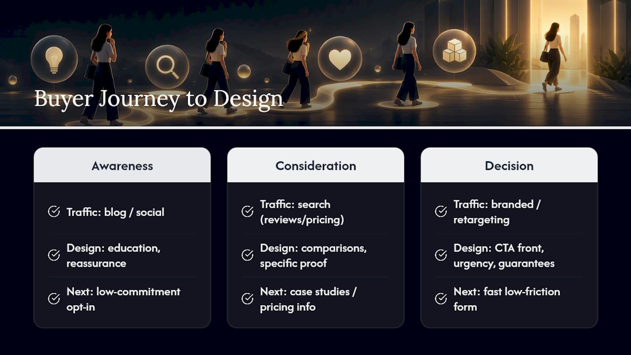
Design elements should shift accordingly. Awareness-stage pages lean on storytelling and education. Decision-stage pages lean on urgency, guarantees, and a form that takes under thirty seconds to complete. Sending decision-stage traffic to a generic homepage, or awareness-stage traffic straight to a hard-sell landing page, wastes both the traffic and the design work behind each page.
Look at your analytics by entry page and traffic source before assuming every visitor wants the same experience. A visitor clicking a LinkedIn ad after reading about a specific service, the kind of qualified traffic covered in this breakdown of LinkedIn marketing’s B2B conversion impact, already knows more than a cold organic visitor and should land somewhere that matches that context, not a one-size-fits-all homepage.
Can Personalization Actually Lift Conversion Rates?
Personalization works when it removes a decision the visitor would otherwise have to make themselves, and it backfires when it feels intrusive or inaccurate. For most small businesses, personalization doesn’t require complex software. It starts with matching what the visitor already told you, through their search term, referral source, or location, to what the page shows them.
A landing page that dynamically swaps its headline to match the search query someone typed (“Plumbing Repair in [City]” instead of a generic “Our Services”) consistently outperforms a static page, because it confirms the visitor landed in the right place within the first second. Returning visitors can see a different CTA than first-time ones; someone who already downloaded a guide doesn’t need to see that offer again and should instead see a next-step CTA like booking a call.
Simple, achievable personalization tactics for a small business site include:
- Swapping headline or hero copy based on the referral source or ad campaign
- Showing location-specific content for businesses serving multiple areas
- Using behavioral triggers, like an exit-intent offer for visitors who scrolled past the pricing section without clicking
- Remembering returning visitors and adjusting the CTA to reflect where they left off
Avoid over-personalizing on assumptions you can’t verify. Guessing at a visitor’s industry or budget and guessing wrong erodes trust faster than generic copy ever would. Start with the personalization signals you already have for certain, like traffic source and page history, before investing in anything more elaborate.
Does Accessibility Actually Improve Conversion Rates?
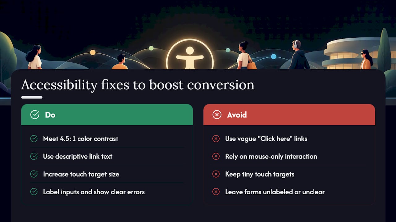
Accessible design and conversion-focused design solve overlapping problems, because both are ultimately about removing friction. A visitor using a screen reader who can’t identify your CTA button loses the sale just as surely as a sighted visitor who can’t find it. Roughly one in four American adults lives with some form of disability, which means an inaccessible site isn’t a niche concern. It’s a direct cap on how many potential customers can even complete your funnel.
Practical fixes double as conversion improvements. Sufficient color contrast between text and background, a standard the Web Content Accessibility Guidelines set at a 4.5 to 1 ratio for normal text, makes your headline and CTA easier to read for everyone, not just visitors with low vision. Descriptive link text (“Get My Free Audit” instead of “Click Here”) helps screen reader users navigate and gives sighted visitors clearer signals about what happens next. Larger touch targets, already recommended for mobile conversion, are also an accessibility requirement for visitors with limited fine motor control.
Form accessibility matters just as much. Labels tied directly to input fields, clear error messages that explain what went wrong and how to fix it, and keyboard navigability all reduce abandonment for every visitor, not only those using assistive technology. A form that only works with a mouse silently excludes a meaningful slice of your traffic before they ever reach checkout.
Treat accessibility fixes as conversion fixes with a wider reach. The overlap is large enough that most accessibility audits double as friction audits, and the same checklist that improves your Lighthouse accessibility score usually tightens your form completion rate too.
Fix The Argument Before You Chase Traffic
The conventional advice tells small business owners to drive more traffic first and worry about the site later. That order is backwards. A page with a muddled buying argument converts the same small percentage of visitors no matter how much traffic you throw at it, which means every dollar spent on ads before fixing the page is a dollar spent amplifying a leak.
Working with limited budgets means picking the fix with the best ratio of effort to impact, not the fix that feels most exciting. Simplifying a form usually beats a full visual redesign. Rewriting a headline to state an outcome usually beats a new photo shoot. Small businesses that get this sequencing right, argument first, then visuals, then traffic, tend to see steadier gains than those that reverse it.
— TONY
What Ibrand Media Does For Small Business Websites
Ibrand is the practical alternative to hiring a specialized conversion consultant and a separate performance agency for a small business site. Instead of paying for two engagements, you get web design, performance optimization, and analytics setup handled as one connected project, built around the same principles covered above rather than a generic template.
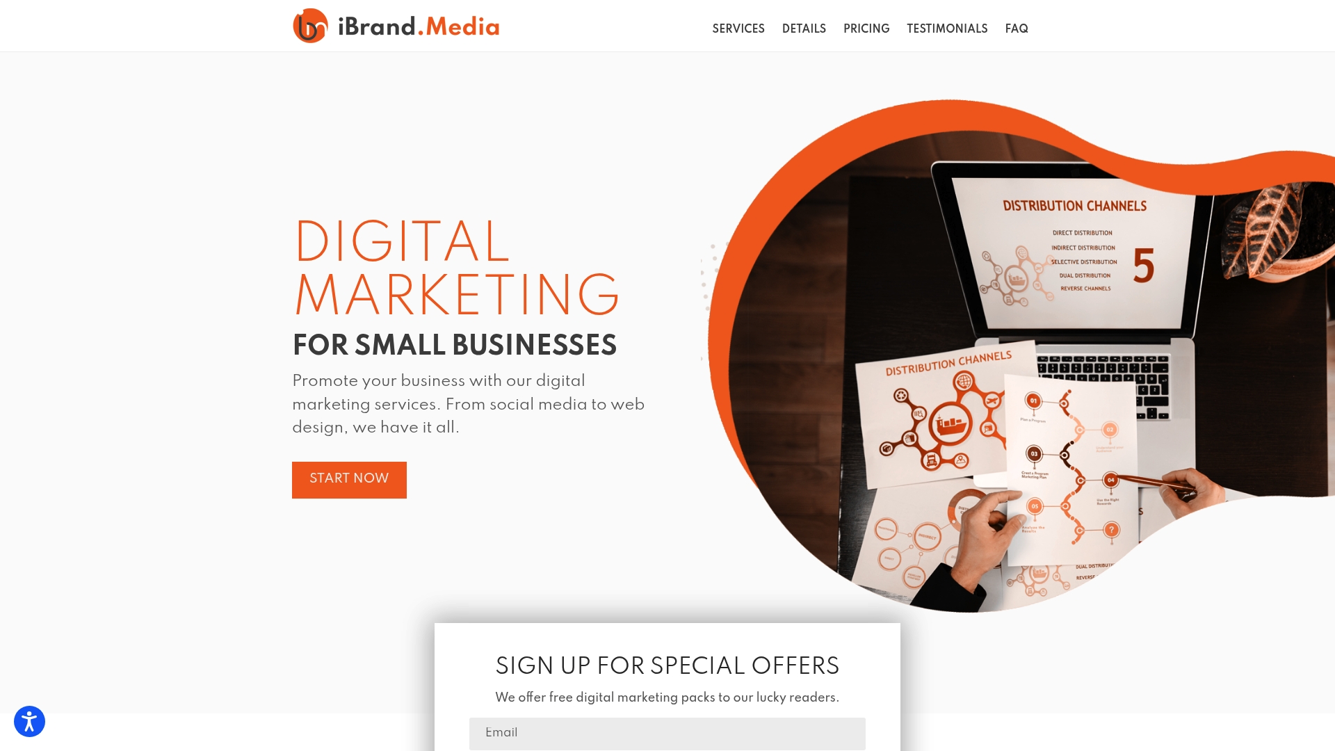
A typical engagement starts with an audit of your current site’s attention ratio, form friction, and speed, then moves to prioritized fixes, tracking setup, and a testing plan you can run going forward. Ibrand’s services relevant to this work include web design, local marketing, real-time performance tracking, and social media management, all built around custom plans with transparent pricing rather than one fixed package forced onto every business. If you want a second set of eyes on where your site is leaking conversions, start with a request through Ibrand’s main site to get a plan scoped to your pages, your traffic, and your budget.
Sources
- Web
- Baymard Institute — checkout usability report and benchmark
- Unbounce — The 7 Principles of Conversion-Centered Design
FAQ
What Is A Conversion-Focused Website?
A conversion-focused website is designed around a single primary action per page, rather than trying to showcase everything a business offers at once. It applies principles like focus, clear hierarchy, and reduced friction so visitors know exactly what to do and can do it easily.
What Is Conversion-Centered Design?
Conversion-centered design (CCD) is a framework built on seven principles, create focus, build structure, stay consistent, show benefits, draw attention, design for trust, and reduce friction, used to design pages around one specific goal, as outlined by Unbounce. It differs from general web design by treating every visual choice as a decision that either helps or hurts the target action.
What Is A Conversion In Web Design?
A conversion is any specific action a website wants a visitor to complete, such as making a purchase, submitting a contact form, or booking a consultation. What counts as “the” conversion depends entirely on the page’s purpose, which is why naming that one action first is the starting point for any redesign.
How Much Does Conversion-Focused Web Design Cost With Ibrand?
Pricing depends on the scope of the audit and fixes needed for your specific site, so current rates and custom plans are available directly through Ibrand’s site rather than a fixed public rate. Engagements are typically scoped after a review of your existing pages and traffic.
How Long Does It Take To See Results From Conversion Design Changes?
Quick wins like simplifying a form or rewriting a headline can show measurable movement within a couple of weeks of traffic. Larger structural changes, like a full checkout redesign, tend to need a longer testing window to reach a statistically reliable result, especially on lower-traffic sites.
Recent Comments