
Mobile traffic now accounts for over 60% of all web browsing, yet many small business owners still treat mobile optimization as an afterthought. This oversight costs real money. Customers who land on slow, clunky mobile sites abandon them within seconds, taking their business to competitors with smoother experiences. A mobile-friendly website isn’t just about looking good on smartphones. It’s about creating seamless user journeys that turn casual browsers into paying customers. This guide reveals why mobile optimization matters for your bottom line, explores proven design approaches, and provides actionable steps to transform your mobile presence into a revenue driver.
Table of Contents
- Key takeaways
- Why mobile-friendly websites matter for SMBs
- Common mobile website issues and their impact on business
- Design approaches: mobile-first, responsive, and adaptive explained
- Practical steps to create and maintain a mobile-friendly website
- Enhance your online presence with expert mobile website solutions
- Frequently asked questions
Key Takeaways
| Point | Details |
|---|---|
| Mobile traffic dominates | Mobile traffic now accounts for the majority of web activity, making mobile optimization essential for small and medium sized businesses. |
| Speed kills conversions | Mobile pages that load in three seconds or less dramatically reduce abandonment, since 53 percent of users leave sites that load slower. |
| Mobile optimization boosts conversions | Mobile friendly sites see higher purchase rates and measurable sales increases compared with frustrating experiences. |
| Responsive design improves UX | Responsive and adaptive design approaches improve the mobile user experience by making navigation easier. |
Why mobile-friendly websites matter for SMBs
Your customers live on their phones. Mobile accounts for 60-75% of web traffic globally, and that percentage keeps climbing. When someone searches for your services while standing in line at the coffee shop or sitting in their car between appointments, they’re using a smartphone. If your site doesn’t work smoothly on that device, you’ve lost them before they even see what you offer.
The numbers tell a compelling story. Users are 67% more likely to purchase from mobile-friendly sites compared to those that frustrate them with tiny text, awkward navigation, or endless scrolling. Even more striking, 62% of companies with mobile-optimized sites report measurable sales increases. This isn’t correlation. It’s causation.
Think about your own behavior. When you land on a website that forces you to pinch and zoom just to read the menu, do you stick around? Most people don’t. They hit the back button and try the next result. Your competitors who invested in understanding mobile-friendly websites are capturing those abandoned visitors.
Small and medium-sized businesses face unique pressure here. You’re competing against larger companies with bigger budgets, but mobile optimization levels the playing field. A fast, intuitive mobile experience can make your small business feel more professional and trustworthy than a corporate giant with a clunky mobile site. The mobile-friendly website benefits extend beyond just aesthetics. They fundamentally change how customers perceive your brand and whether they choose to do business with you.
“Mobile optimization isn’t a nice-to-have feature anymore. It’s the baseline expectation for any business serious about growth.”
Businesses ignoring mobile risk becoming invisible. Search engines prioritize mobile-friendly sites in rankings. Social media traffic arrives primarily on mobile devices. Email opens happen on phones. Every customer touchpoint now assumes mobile compatibility. Without it, you’re essentially closing your doors to the majority of potential customers before they ever walk in.
Common mobile website issues and their impact on business
Speed kills conversions. When a mobile page takes longer than three seconds to load, 53% of users abandon it entirely. Three seconds sounds generous until you realize most modern users expect instant gratification. Every extra second of load time chips away at your potential revenue.

The abandonment problem compounds when users have bad experiences. 50% of mobile users who encounter problems immediately visit a competitor’s site instead. They don’t give you a second chance. They don’t bookmark your page to try later on desktop. They move on, and they rarely come back.
Common culprits behind these failures include:
- Uncompressed images that take forever to download on cellular connections
- Navigation menus designed for mouse cursors, not thumbs
- Text sized for 24-inch monitors that becomes microscopic on phones
- Pop-ups that cover entire mobile screens with no clear way to close them
- Forms requiring precise typing in tiny input fields
- Buttons placed too close together, causing accidental taps
These aren’t minor annoyances. They’re business killers. Each friction point represents a moment where customers decide whether you’re worth their time. Most conclude you’re not.
Mobile e-commerce represents a $6.5 trillion global market opportunity. Businesses with slow, clunky mobile experiences are locked out of this massive revenue stream. Meanwhile, companies investing in responsive design mobile engagement see conversion increases of 11% or more. That’s not a small improvement. For a business doing $500,000 in annual revenue, an 11% boost means an extra $55,000 without spending a dollar on advertising.
The technical issues often stem from websites built years ago when desktop dominated. These legacy sites use fixed-width layouts that break on smaller screens. They load massive files suitable for broadband connections but torture mobile data plans. They assume users have keyboards and mice, not touchscreens and thumbs.
Pro Tip: Test your website on an actual smartphone using a cellular connection, not wifi. Load times and usability issues that seem minor on your office computer become glaring problems on a real mobile device.
Even businesses that recognize mobile importance sometimes implement half-measures. They create separate mobile sites (the old m.domain.com approach) that offer stripped-down experiences or fall out of sync with the main site. Users notice. They feel like second-class customers, and they respond by shopping elsewhere.
The stakes extend beyond immediate sales. Poor mobile experiences damage your brand reputation. Customers remember frustration. They share bad experiences with friends. They leave negative reviews mentioning your terrible mobile site. Why responsive design matters becomes clear when you calculate the long-term cost of these reputation hits.
Design approaches: mobile-first, responsive, and adaptive explained
Three main philosophies dominate modern mobile web design, each with distinct advantages for small businesses. Understanding these approaches helps you make informed decisions about your website strategy.
Mobile-first design starts by building the mobile experience, then expands to desktop. This sounds ideal given mobile’s dominance, but desktop still converts better for complex tasks like filling out detailed forms or comparing multiple products side-by-side. Strict mobile-first can sacrifice desktop functionality that drives revenue. Progressive enhancement, which prioritizes mobile while preserving desktop capabilities, often works better for businesses serving both audiences.
Responsive design adjusts fluidly to any screen size using flexible grids and CSS media queries. Your site automatically reformats itself whether viewed on a phone, tablet, or desktop. This approach dominates modern web development because it provides consistent experiences across devices with a single codebase. Maintenance stays simple. Updates apply everywhere simultaneously.
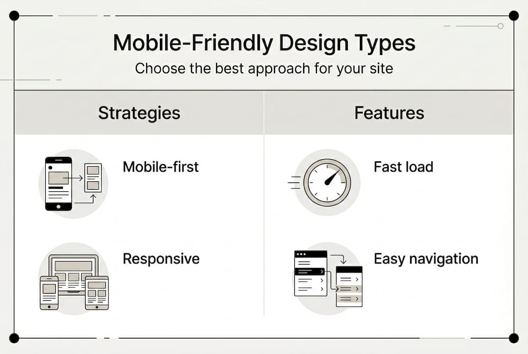
Adaptive design creates distinct layouts for different device categories. Your server detects the user’s device and delivers the appropriate version. This works well when your mobile and desktop audiences have genuinely different needs, like a restaurant where mobile users want quick access to hours and menus while desktop users browse catering options and make large orders.
| Approach | Best For | Key Advantage | Consideration |
|---|---|---|---|
| Mobile-first | Content-focused sites | Ensures core mobile experience | May limit desktop features |
| Responsive | Most small businesses | Single codebase, universal compatibility | Requires careful planning for complex layouts |
| Adaptive | Split audience needs | Tailored experiences per device | More development and maintenance |
| Progressive enhancement | Businesses serving both mobile and desktop | Balances mobile priority with desktop functionality | Requires strategic feature planning |
For most small businesses, responsive design offers the best balance of effectiveness and practicality. It works across all devices without requiring separate codebases or complex server logic. Mobile optimization for business becomes manageable even with limited technical resources.
Pro Tip: Don’t assume mobile users want less content. They want the same information in a more accessible format. Hiding features or content on mobile often frustrates users rather than helping them.
The choice between these approaches depends on your specific business model and customer behavior. A local service business where customers primarily book appointments via phone might prioritize mobile differently than a B2B company where desktop users complete complex quote requests. Analyze your analytics to understand where your conversions actually happen, then design accordingly.
Many modern frameworks like Bootstrap or Foundation provide responsive design capabilities out of the box. These tools handle much of the technical complexity, letting you focus on content and user experience rather than wrestling with code. The mobile-friendly website design guide explores these frameworks in detail, helping you choose the right foundation for your site.
The key insight is that mobile-friendly design isn’t about shrinking your desktop site. It’s about reimagining how users interact with your business on smaller screens with touch interfaces. Navigation that works with a mouse often fails with a thumb. Content that reads well in three columns becomes unreadable in one. Successful mobile design requires rethinking the entire user journey, not just applying responsive CSS.
Practical steps to create and maintain a mobile-friendly website
Transforming your website into a mobile powerhouse requires systematic attention to speed, usability, and ongoing optimization. Start with these proven steps that deliver measurable results.
-
Audit your current mobile performance. Use Google’s Mobile-Friendly Test and PageSpeed Insights to identify specific problems. These free tools pinpoint exactly what’s slowing your site or frustrating mobile users. Don’t guess. Measure.
-
Compress and optimize images. Photos are usually the biggest bandwidth hogs. Tools like TinyPNG or ImageOptim reduce file sizes by 70% or more without visible quality loss. Implement lazy loading so images only download when users scroll to them.
-
Minimize code bloat. Remove unused CSS and JavaScript. Combine files to reduce server requests. Enable compression on your web server. These technical optimizations often cut load times in half.
-
Implement responsive design frameworks. Bootstrap, Foundation, or Tailwind CSS provide tested, reliable responsive components. You don’t need to reinvent the wheel. Use proven tools that handle cross-device compatibility automatically.
-
Redesign navigation for thumbs. Place important links within easy reach of thumbs (bottom third of the screen). Make tap targets at least 48 pixels square. Add spacing between clickable elements to prevent accidental taps.
-
Increase font sizes and line spacing. Body text should be at least 16 pixels. Line height should be 1.5 times the font size. These seemingly small changes dramatically improve readability on small screens.
-
Test across real devices. Simulators help, but nothing replaces testing on actual smartphones and tablets. Borrow devices from friends or visit a store to test on display models. Your site might look perfect on your iPhone but break on Android.
-
Simplify forms ruthlessly. Every field you remove increases completion rates. Use autofill attributes. Implement appropriate keyboard types (numeric for phone numbers, email for email addresses). Consider alternatives like click-to-call buttons instead of contact forms.
-
Monitor real user data. Google Analytics shows mobile bounce rates, load times, and conversion rates. If mobile users leave faster than desktop users, you’ve got problems to fix. Track these metrics monthly.
-
Iterate based on feedback. Ask customers about their mobile experience. Watch real users navigate your site. The issues that seem minor to you might be deal-breakers for customers.
Pro Tip: Implement a content delivery network (CDN) to serve your site from servers geographically close to users. This single change can cut load times by 40% or more for distant visitors.
The small business web design research confirms that responsive design increases conversions by 11% while fast load times prevent the abandonment that kills sales. These aren’t theoretical benefits. They’re proven outcomes you can measure in your own analytics.
Maintenance matters as much as initial implementation. Browsers update. Devices change. User expectations evolve. Schedule quarterly mobile audits to catch problems before they cost you customers. The mobile-friendly website tips provide ongoing guidance for keeping your site competitive.
Content strategy deserves special attention on mobile. Break long paragraphs into shorter chunks. Use subheadings frequently. Add white space generously. Mobile users scan rather than read, so make your content scannable. Bullet points, numbered lists, and bold text help users find information quickly.
Finally, prioritize above-the-fold content. The first screen users see determines whether they stay or leave. Put your most compelling value proposition, clearest call to action, and most important information right at the top. Don’t make users scroll to understand what you offer or how to take the next step. The best website design practices for business emphasize this principle because it directly impacts conversion rates.
Enhance your online presence with expert mobile website solutions
Building a mobile-friendly website that actually drives sales requires both technical expertise and strategic thinking. Ibrand.media specializes in creating mobile-optimized websites tailored specifically for small and medium-sized businesses like yours. Our team understands that you need more than just responsive design. You need a complete digital presence that turns mobile visitors into customers.

We combine mobile-friendly web design with SEO optimization to ensure your site not only works beautifully on phones but also ranks well in search results where customers find you. Our approach focuses on measurable results like increased conversions, lower bounce rates, and higher revenue. Whether you’re starting from scratch or fixing an existing site, we provide the guidance and implementation you need.
Explore our comprehensive resources on optimizing websites for small businesses and SEO for small businesses 2026 to understand how mobile optimization fits into your broader digital strategy. Our web design for small businesses 2026 guide walks you through every consideration for building a site that works hard for your business. Partner with professionals who understand your challenges and deliver solutions that actually work.
Frequently asked questions
What is a mobile-friendly website?
A mobile-friendly website is designed to display and function smoothly on smartphones and tablets. It ensures easy navigation, quick loading, and readable content without requiring users to zoom or scroll horizontally. Understanding mobile-friendly websites involves recognizing that mobile optimization adapts your site’s layout, images, and interactions specifically for smaller touchscreens. This creates seamless experiences that keep visitors engaged rather than frustrated.
How does page load speed affect mobile user experience?
Page load speed directly determines whether mobile users stay or leave. 53% abandon sites taking longer than 3 seconds to load, making speed critical for keeping potential customers engaged. Fast loading improves engagement, reduces bounce rates, and increases the likelihood of conversions. Every second of delay costs you real revenue as impatient users move to faster competitors. Check out mobile-friendly website tips for specific ways to improve your load times.
Which design approach is best for small businesses?
Responsive design suits most small businesses because it provides broad compatibility across all devices with a single codebase. Adaptive design helps if your audience devices vary greatly and require distinctly different experiences. While mobile-first prioritizes mobile experience, remember that desktop still converts better for complex tasks, so progressive enhancement often balances both needs effectively. The mobile-friendly website design guide helps you evaluate which approach matches your specific business model and customer behavior.
Can a mobile-friendly website increase sales?
Absolutely. Mobile-optimized companies see 62% sales increases on average, while responsive design leads to 11% higher conversion rates. Users are 67% more likely to purchase from sites that work well on their phones compared to frustrating experiences that drive them away. The correlation between mobile optimization and revenue growth is clear and measurable. When you remove friction from the mobile buying process, more visitors complete purchases, leading to direct bottom-line improvements that justify the investment in proper mobile design.
Recommended
- Mobile-friendly website tips to boost your business in 2026 | Ibrandmedia
- Responsive Design: Boost Mobile Engagement and Leads | Ibrandmedia
- Mobile Optimization: Unlocking Sales for Small Businesses | Ibrandmedia
- Mobile-Friendly Website Benefits: Complete Guide | Ibrandmedia
- Performance Marketing Team | Multi‑Channel Paid Ads
Recent Comments