
TL;DR:
- Optimizing images for the web involves choosing modern formats like AVIF and WebP, combined with proper compression and responsive delivery techniques. Implementing loading attributes, explicit dimensions, and fallback strategies significantly enhances page speed and user experience. Regular audits and automation via CDNs ensure images support Core Web Vitals and maintain optimal site performance.
Optimizing images for web means delivering the highest visual quality at the lowest possible file size, and it is the single most impactful change most websites can make to improve loading speed. Images account for 50 to 70% of a webpage’s byte weight, making them the dominant factor in Core Web Vitals scores like Largest Contentful Paint (LCP) and Cumulative Layout Shift (CLS). Tools like TinyPNG, Cloudinary, and Adobe Photoshop, combined with modern formats like AVIF and WebP, give webmasters and digital marketers a clear path to faster pages and better user experience. The techniques in this guide cover format selection, responsive image setup, compression methods, and loading strategies that work in 2026.
Which image formats provide the best optimization for web use?
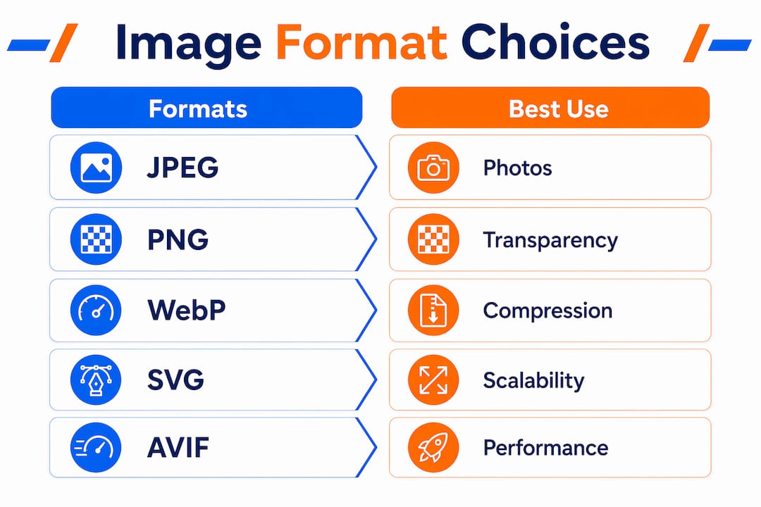
Format selection is the foundation of web image optimization, and choosing wrong costs you file size before compression even begins. Each format serves a distinct purpose, and mixing them strategically produces the best results across your site.
JPEG remains the workhorse for photographs and complex visuals. JPEG quality between 75 and 85 delivers the best balance between file size and visual fidelity. Drop below 70 and visible artifacts appear. Push above 90 and file sizes balloon with no meaningful quality gain.
PNG is the right choice when you need pixel-perfect transparency, such as logos on colored backgrounds or UI elements with soft edges. PNG files are larger than JPEG for photographs, so never use PNG for full-color images without transparency.
WebP cuts file sizes by 25 to 35% compared to JPEG while maintaining comparable quality. Browser support is now universal across Chrome, Firefox, Safari, and Edge, making WebP a safe default for most web images. AVIF goes further, reducing file sizes by roughly 50% compared to JPEG. AVIF is the recommended primary format for photographs in 2026, with fallback to WebP for older browsers using the HTML "
SVG is the correct format for logos, icons, and illustrations. SVG files are resolution-independent, scale perfectly on retina displays, and are often just a few kilobytes.
| Format | Best use case | Compression vs. JPEG | Browser support |
|---|---|---|---|
| JPEG | Photos, no transparency | Baseline | Universal |
| PNG | Transparency, UI elements | Larger | Universal |
| WebP | General web images | 25 to 35% smaller | Universal |
| AVIF | Photos, high compression | ~50% smaller | Chrome, Firefox, Safari 16+ |
| SVG | Logos, icons, illustrations | Vector (no raster) | Universal |
Pro Tip: Use the <picture> element with AVIF as the first source and WebP as the fallback. Browsers that support AVIF will use it; others will fall back gracefully without any JavaScript required.
How to implement responsive images for different devices
Responsive images are the mechanism that prevents a desktop-sized file from loading on a mobile phone. Without them, a browser assumes every image fills 100% of the viewport width and fetches an unnecessarily large file. Proper use of srcset and sizes attributes reduces mobile image downloads by 50 to 70%, which directly improves LCP on mobile devices where most web traffic originates.
Here is how to set up responsive images correctly:
-
Generate multiple image sizes. Create versions at common breakpoints: 400px, 800px, 1200px, and 1600px wide. Tools like Sharp, Cloudinary, or Imgix can automate this during build or on request.
-
Add the
srcsetattribute with width descriptors. List each image file alongside its pixel width. Example:srcset="image-400.webp 400w, image-800.webp 800w, image-1200.webp 1200w". The browser uses this list to pick the most appropriate file. -
Add the
sizesattribute to describe layout width. This tells the browser how wide the image will appear at each breakpoint before it downloads anything. Example:sizes="(max-width: 600px) 100vw, (max-width: 1200px) 50vw, 33vw". Skipping this attribute forces the browser to assume 100vw, which causes over-fetching on desktop and mobile alike. -
Set explicit
widthandheightattributes. These values let the browser reserve the correct space before the image loads, preventing layout shift. This is a CLS prevention requirement for Core Web Vitals compliance. -
Test on real devices. Use Chrome DevTools device emulation and throttle the network to 3G to confirm the correct image size is being served at each breakpoint.
Pro Tip: For retina screens, include a 2x version in your srcset at double the CSS pixel width. A 400px display slot should have a 400w and an 800w version available so high-DPI screens get sharp images without serving oversized files to standard displays.
Responsive image setup pairs directly with mobile-first web design, where layout decisions at small screen sizes drive the entire image delivery strategy.
What are the best compression techniques and tools for optimizing images?
Compression is where file size reductions become concrete. The two methods, lossy and lossless, serve different purposes and should not be applied interchangeably.
Lossy compression permanently removes image data that the human eye cannot easily detect. It produces the largest file size reductions and works best for photographs. Lossy JPEG quality should stay between 75 and 85 for web delivery. WebP and AVIF also support lossy compression at equivalent or better quality-to-size ratios.
Lossless compression removes metadata and redundant data without discarding any visual information. It is the right choice for PNG files, screenshots, and images where pixel accuracy matters. File size reductions are smaller, typically 10 to 30%, but quality is preserved exactly.
Here are the tools that produce consistent results:
- TinyPNG and TinyJPG: Browser-based tools that apply smart lossy compression to PNG and JPEG files. Free for up to 20 images per session and reliable for manual workflows.
- Imagify: A WordPress plugin that automates compression on upload with configurable quality levels. It supports WebP conversion and bulk optimization of existing media libraries.
- Adobe Photoshop: The “Export As” dialog gives precise control over format, quality, and metadata stripping. Use it for hero images and brand photography where quality control matters most.
- Cloudinary, Imgix, and Cloudflare Images: Image CDNs automate format conversion, resizing, and caching at the edge. They serve AVIF to supported browsers and WebP to others without any manual intervention. These are the most scalable solution for sites with large image libraries.
| Tool | Type | Best for | Cost |
|---|---|---|---|
| TinyPNG | Web tool | Manual, small batches | Free tier available |
| Imagify | WordPress plugin | Automated on upload | Freemium |
| Photoshop | Desktop app | Brand and hero images | Subscription |
| Cloudinary | Image CDN | Large sites, automation | Free tier available |
Batch processing is worth prioritizing. Running Imagify or a build-time Sharp script across an entire media library in one pass eliminates the performance debt that accumulates when images are uploaded without optimization.
How to use loading strategies and HTML attributes to improve page speed
Loading attributes are the most underused performance lever in image optimization. Setting them correctly can improve LCP by 500ms or more, which is the difference between passing and failing Core Web Vitals thresholds.
Follow this priority framework for every image on a page:
-
Hero and LCP images get eager loading and high fetch priority. Set
loading="eager",fetchpriority="high", anddecoding="sync"on the image that appears first in the viewport. The hero image requires these three attributes together to signal maximum urgency to the browser’s resource scheduler. -
Below-the-fold images get lazy loading and async decoding. Set
loading="lazy"anddecoding="async"on every image that does not appear in the initial viewport. Lazy loading reduces initial page weight and speeds up time to first byte for above-the-fold content. The browser will fetch these images only when they approach the viewport during scrolling. -
Preload the LCP image in the
<head>. Add a<link rel="preload" as="image">tag pointing to the LCP image source. This instructs the browser to fetch it before the HTML parser reaches the<img>tag, shaving additional milliseconds off LCP. -
Always declare
widthandheighton every image element. Missing dimensions cause the browser to recalculate layout after the image loads, producing layout shifts that hurt CLS scores. If CSS controls the display size, use theaspect-ratioproperty as an alternative.
One-size-fits-all loading strategies degrade performance. LCP images need priority treatment while every other image should load lazily. Applying
loading="lazy"to your hero image is one of the most common and damaging mistakes a webmaster can make.
Image decoding also affects Interaction to Next Paint (INP), the Core Web Vital that measures responsiveness. Synchronous decoding on large images blocks the main thread and delays user interactions. Reserve decoding="sync" strictly for the LCP image and use decoding="async" everywhere else.
What are common mistakes that hurt image performance?
Even technically skilled teams make image optimization errors that quietly drain performance scores. Recognizing these patterns is the fastest way to recover lost speed.
-
Lazy loading the LCP image. Setting
loading="lazy"on the hero image delays the most important visual element on the page. This single mistake can add hundreds of milliseconds to LCP and is frequently the root cause of failing Core Web Vitals audits. -
Serving desktop-sized images to mobile devices. Without
srcsetandsizes, a 2400px wide banner image loads on a 390px phone screen. The excess pixels are discarded by the browser after download, wasting bandwidth and slowing load time. -
Omitting
widthandheightattributes. Pages without declared image dimensions experience layout shifts as images load and push content down. This directly harms CLS scores and frustrates users who lose their reading position. -
Ignoring modern formats. Serving JPEG when AVIF or WebP is supported leaves significant file size savings on the table. Both formats are now broadly supported and should be the default for new image uploads.
-
Writing empty or generic alt text. Descriptive alt text improves SEO by helping Google understand image content and satisfies WCAG accessibility requirements. “image1.jpg” as alt text provides no value to search engines or screen reader users.
-
Skipping diagnostic tools. Google PageSpeed Insights, Lighthouse, and WebPageTest all flag image-specific issues with actionable recommendations. Running these audits monthly catches regressions before they compound. Avoiding common marketing mistakes includes treating image performance as a one-time fix rather than an ongoing practice.
Key takeaways
Optimizing images for web requires the right format, correct compression settings, responsive delivery via srcset, and precise loading attributes to maximize LCP, minimize CLS, and reduce bandwidth.
| Point | Details |
|---|---|
| Format selection matters first | Use AVIF for photos, WebP as fallback, PNG for transparency, and SVG for icons. |
| Compression has a quality floor | Keep JPEG and lossy WebP quality between 75 and 85 to avoid visible artifacts. |
| Responsive images cut mobile bandwidth | Implement srcset and sizes to reduce mobile downloads by up to 70%. |
| Loading attributes control LCP | Set eager, fetchpriority="high", and decoding="sync" only on the LCP image. |
| Alt text serves both SEO and accessibility | Write descriptive alt text for every image to satisfy WCAG and improve image search rankings. |
Why image optimization is still the most overlooked performance win
I have audited hundreds of websites for digital marketing clients, and image issues appear on nearly every single one. Not because webmasters do not care, but because image optimization feels like a solved problem once you install a compression plugin. It is not.
The shift to AVIF is the biggest opportunity most sites are ignoring right now. WebP adoption took years to become universal, and AVIF is following the same curve. Sites that adopt it today are banking 50% file size reductions on their most bandwidth-heavy assets while competitors are still serving JPEG. That gap shows up directly in LCP scores and, by extension, in organic search rankings.
The other pattern I see constantly is misapplied loading attributes. A developer adds loading="lazy" to all images for a quick performance win, accidentally lazy-loading the hero image in the process. LCP collapses. The fix takes five minutes once you know what to look for, but the damage can persist for months before anyone notices.
My honest recommendation: automate what you can with an image CDN like Cloudinary or Imgix, then manually audit your LCP image on every key page template. Automation handles the volume. Manual checks catch the edge cases that automation misses. That combination, not one or the other, is what produces consistently fast pages.
— TONY
How Ibrand can help you get faster, better-performing pages

Image optimization is one piece of a larger website performance puzzle, and Ibrand specializes in putting all the pieces together for small and medium-sized businesses. From technical SEO audits that surface image bottlenecks to full web design builds with performance baked in from day one, Ibrand’s team handles the details that move the needle on search rankings and user experience. If you are ready to turn your site’s images from a liability into a performance asset, the website optimization guide for small businesses is the right starting point. You can also explore SEO for small businesses to see how image strategy fits into a broader growth plan.
FAQ
What is the best image format for web performance in 2026?
AVIF is the best format for photographs, offering roughly 50% smaller file sizes than JPEG. Use WebP as a fallback for browsers that do not yet support AVIF, and SVG for all logos and icons.
How does image optimization affect Core Web Vitals?
Images directly impact LCP, CLS, and INP. Unoptimized images delay LCP, missing dimensions cause CLS layout shifts, and synchronous decoding on large images can block interactions measured by INP.
What quality setting should I use for JPEG compression?
Set JPEG quality between 75 and 85 for web delivery. Quality below 70 produces visible compression artifacts, while quality above 90 increases file size without a meaningful visual improvement.
Do I need srcset if I already compress my images?
Yes. Compression reduces file size at a fixed resolution, but srcset and sizes serve the correctly sized image for each device. A compressed 2400px image is still oversized on a 390px phone screen.
Does alt text affect image SEO?
Descriptive alt text helps Google understand image content, which improves rankings in image search and contributes to overall page relevance signals. It is also a WCAG accessibility requirement for all non-decorative images.
Recent Comments