
A high-converting CTA follows one simple recipe: goal + benefit + action verb + low friction. That formula is the difference between a button readers skip and one they click. Get it right and your CTR climbs; get it wrong and even a great offer dies on the page.
Here are three ready-to-use examples you can drop in today:
- Ecommerce: “Get 20% Off My First Order” (microcopy below: “No code needed. Discount applied at checkout.”)
- Lead gen: “Send Me the Free Guide” (microcopy: “No spam. Unsubscribe anytime.”)
- Demo/event: “Book My Free 15-Minute Demo” (microcopy: “No credit card required.”)
Place your primary CTA above the fold on every key page. Use a secondary, lower-commitment CTA at the end of the content for readers who need more time. Before you publish, confirm three things:
- The landing page delivers exactly what the CTA promises.
- The button is at least 44×44 px and easy to tap on mobile.
- A tracking event or UTM parameter is attached so you can measure clicks.
Key Takeaways
A high-converting CTA requires the right copy, the right placement, and a landing page that delivers exactly what the button promises.
| Point | Details |
|---|---|
| Use the CTA recipe | Combine goal + benefit + action verb + low friction in every button you write. |
| Place above the fold | Put the primary CTA where visitors see it without scrolling; add a secondary CTA at page end. |
| Align the landing page | The landing page headline must echo the CTA text word for word to prevent drop-off. |
| Test one variable at a time | Run A/B tests for at least two weeks and 100 conversions per variant before deciding. |
| Ibrand for SMB support | Ibrand handles CTA copywriting, design, tracking setup, and testing for small businesses. |
Table of Contents
- What is a call to action and why does it drive conversions?
- Which CTA type fits your goal and channel?
- How to create a CTA step by step
- Copy and design best practices every SMB should follow
- CTA copy bank: templates by goal and channel
- How do you test CTAs and which metrics actually matter?
- Ibrand’s SMB-ready CTA checklist
- Common CTA mistakes and how to fix them fast
- What most SMBs get wrong about CTAs
- Ibrand can build and test your CTAs for you
- Sources
- FAQ
What is a call to action and why does it drive conversions?
A call to action (CTA) is a short, direct prompt that tells your audience the single next step you want them to take. According to Salesforce, the best way to think about it for small businesses is as a “gentle nudge” that guides someone from interest to action without pressure. Without one, visitors leave without converting, even when they like what they see.
CTAs appear everywhere: website hero sections, product pages, landing pages, email campaigns, social ads, YouTube end screens, podcast show notes, and pop-ups. Each placement is a conversion opportunity. The role of calls to action is not just to generate clicks; it’s to reduce friction at the exact moment a visitor is ready to act.
Three measurable benefits make CTAs worth the attention:
- Higher click-through rate (CTR): A clear, specific CTA gives visitors a reason to click instead of scroll past.
- Better conversion rate: Matching the CTA to the visitor’s intent removes hesitation.
- Guided user journey: A well-placed CTA moves visitors through the funnel without requiring them to figure out the next step themselves.
A/B testing and conversion rate tracking are the standard tools for measuring whether a CTA is doing its job. Even a small improvement in CTR compounds quickly across thousands of monthly visitors.
Which CTA type fits your goal and channel?
Not every CTA is a “Buy Now” button. The type you choose should match both your goal and where the visitor is in their decision process. Forbes Communications Council members are clear on this: urgent CTAs work for impulse purchases, while value-led, nurturing language works better for consultative services.
- Direct purchase CTA (“Shop the Sale,” “Add to Cart”): Bottom-of-funnel. Best on product pages, ecommerce ads, and promotional emails. High urgency, short copy.
- Lead capture CTA (“Get the Free Checklist,” “Download the Report”): Mid-funnel. Works on blog posts, landing pages, and social ads. Offer must be specific and immediately useful.
- Demo or consultation booking (“Book a Free Call,” “See It in Action”): Bottom-of-funnel for service businesses. Best on pricing pages, case study pages, and retargeting ads.
- Content download (“Read the Full Guide,” “Watch the Tutorial”): Top-to-mid funnel. Builds trust before asking for a purchase commitment.
- Social engagement (“Follow for Weekly Tips,” “Tag a Friend”): Top-of-funnel. Grows audience on social platforms; low commitment, high volume.
- Secondary/tertiary CTA (“Learn More,” “See How It Works”): Catches visitors who aren’t ready for the primary action. Pair it with your main CTA to capture more of the audience without diluting the primary offer.
Device matters too. On desktop, you have room for a button plus a line of supporting microcopy. On mobile, the button itself carries most of the weight, so the copy needs to be even tighter. Sticky CTAs (a fixed bar at the bottom of the screen) perform well on mobile because they stay visible as users scroll without blocking content.
How to create a CTA step by step
Follow this sequence every time you build a new CTA. Skipping steps, especially steps 6 and 7, is where most small teams lose conversions they’ve already earned.
-
Define your goal and success metric. What action do you want the visitor to take? What number tells you it worked? (CTR, form submissions, purchases, bookings.) One goal per CTA.
-
Identify your audience segment. A returning customer and a first-time visitor need different language. A visitor from a paid ad is in a different mindset than someone who found you through a blog post. Segment when you can.
-
Choose your CTA type and placement. Match the type to the funnel stage (see the section above). Place the primary CTA above the fold; add a secondary CTA at the end of the page for readers who scroll all the way through.
-
Write benefit-led copy using the recipe. Lead with what the visitor gets, not what they have to do. “Get My Free Report” beats “Submit.” Keep it to 2–5 words for buttons; up to 8 words for text links. Shopify’s CTA guide confirms that short, scannable copy is a core design best practice because most users leave a page quickly.
-
Design the button. Use a color that contrasts with the page background. Make the button look clickable (slight shadow or border works). Minimum size: 44×44 px for mobile tap targets. Leave whitespace around it so it doesn’t compete with surrounding content.
-
Align the landing page. The headline on the landing page must echo the CTA’s promise. If the button says “Get the Free Pricing Guide,” the landing page headline should confirm that’s exactly what they’re getting. HubSpot’s optimization checklist lists this alignment as one of the most critical steps, and it’s the one most teams skip.
-
Add tracking. Tag every CTA with a UTM parameter or a named conversion event in Google Analytics 4, Meta Pixel, or whatever analytics tool you use. Without this, you’re guessing. Conversion tracking for small businesses is simpler than most owners think once you have a system.
-
Run a pre-launch QA check. Test on mobile and desktop. Click through to confirm the landing page loads correctly. Check that the form or checkout works. Confirm the tracking fires.
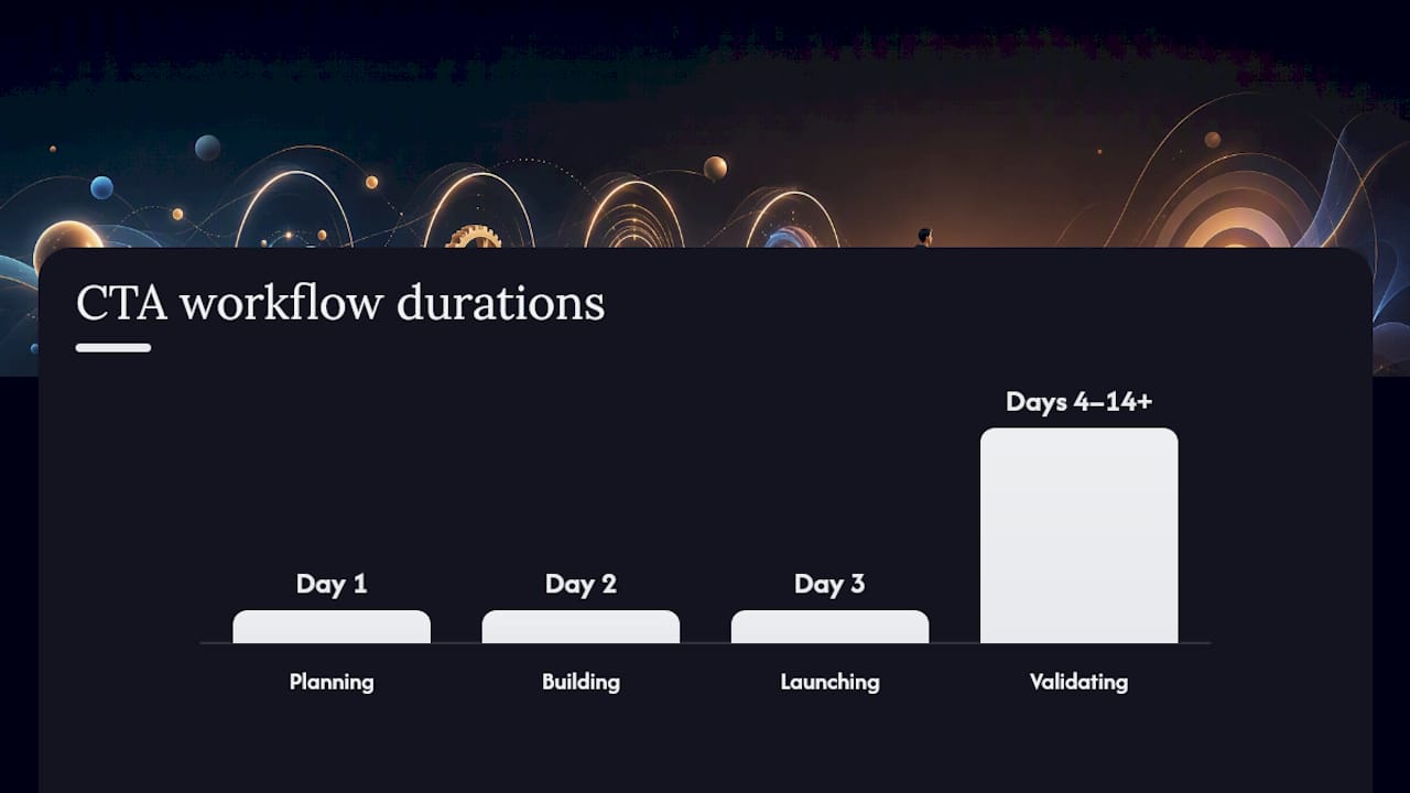
Launch timeline for a single CTA: Day 1: write and design. Day 2: QA and tracking setup. Day 3: launch. Days 4–14: let it run before drawing conclusions.
Copy and design best practices every SMB should follow
Do these:
- Open with a strong verb: “Get,” “Start,” “Book,” “Claim,” “Download,” “Try.”
- State the benefit, not the action: “Save My Spot” beats “Register.”
- Keep button text to 5 words or fewer when possible.
- Use one primary CTA per screen view. Two competing CTAs split attention and reduce both.
- Match the CTA’s visual weight to its importance. The primary action gets the filled button; secondary actions get an outline button or text link.
- Add microcopy directly below the button to handle the most common objection. “No credit card required” removes the biggest barrier for free trials. “Ships free over $50” removes hesitation on product pages. Canva’s CTA guide specifically calls out this supporting text as a friction reducer.
Avoid these:
- Vague text like “Click Here” or “Submit.” They tell the visitor nothing about what happens next.
- More than two CTAs on a single page view. Every additional option reduces the chance any one gets clicked.
- Sending CTA traffic to your homepage. Always link to a page built for that specific offer.
- Burying the CTA below three scrolls on mobile. If it’s not visible without effort, most visitors won’t find it.
Accessibility notes: Minimum tap target of 44×44 px (Apple’s Human Interface Guidelines and Google’s Material Design both recommend this). Color contrast ratio of at least 4.5:1 between button text and background, per WCAG 2.1 AA. If your CTA is an image rather than a button, include descriptive alt text. Check that keyboard users can tab to the CTA and activate it with Enter.
Pro Tip: Switch from second-person to first-person button copy and test the result. “Start My Free Trial” consistently outperforms “Start Your Free Trial” in split tests across SaaS and ecommerce categories because it puts the reader mentally inside the action before they click.

CTA copy bank: templates by goal and channel
Use these as starting points. Swap in your specific offer, product name, or timeframe where noted.
- Sales: “Shop [Product Category] Now” / “Claim My [X]% Discount”
- Lead gen: “Send Me the Free [Resource]” / “Get My Custom Quote”
- Content download: “Download the [Guide/Checklist/Template]” / “Read the Full Report”
- Event or demo: “Book My Free Demo” / “Reserve My Spot for [Event Name]”
- Trial: “Start My Free [X]-Day Trial” / “Try [Product] Free”
| Goal | CTA Text | Supporting Microcopy | Best Channel |
|---|---|---|---|
| Sales | “Shop the Sale” | “Free shipping on orders over $50” | Product page, email |
| Lead gen | “Send Me the Free Guide” | “No spam. Unsubscribe anytime.” | Blog, landing page |
| Content download | “Download the Checklist” | “Instant access. No sign-up required.” | Social ad, blog |
| Demo booking | “Book My Free 15-Min Demo” | “No credit card. Cancel anytime.” | Pricing page, retargeting ad |
| Free trial | “Start My Free Trial” | “14 days free. No credit card needed.” | Homepage hero, email |
For ad copy on paid channels, the CTA text in the ad and the headline on the landing page should be near-identical. Any gap between the two creates a moment of doubt that costs you the conversion.
Channel-specific notes:
- Email button: Keep to 3–5 words. The email body does the persuasion work; the button just needs to confirm the action.
- Social ad: The CTA button is platform-controlled (Facebook’s “Learn More,” “Shop Now,” etc.), so put your real CTA in the first line of the ad copy.
- Mobile sticky bar: One line of copy plus a short button. “Limited spots left — Book Now” fits the format well.
- Video end screen: Verbal CTA in the audio plus an on-screen button. Repeat the URL or offer name twice.
How do you test CTAs and which metrics actually matter?
A/B testing is the most reliable way to improve a CTA, and it doesn’t require a large traffic volume to get started. The principle is simple: change one variable at a time, run both versions simultaneously, and let the data pick the winner. UserTesting’s optimization research confirms that even small changes to copy, color, or placement can produce material differences in performance.
What to test first (in order of typical impact):
- Button copy (the highest-leverage variable)
- Button color and contrast
- Placement on the page (above the fold vs. mid-page vs. sticky)
- Supporting microcopy
- CTA type (button vs. text link vs. inline form)
Core metrics for small teams:
- CTR (click-through rate): Clicks divided by impressions or page views. The first signal that copy and design are working.
- Conversion rate: Completed goals (purchases, form fills, bookings) divided by CTA clicks. Tells you whether the landing page is doing its job.
- Bounce rate on the landing page: High bounce after a CTA click usually means a message mismatch between the CTA and the page.
- Revenue per visitor or lead quality: Useful once you have enough volume. Tells you whether the conversions are worth the effort.
Testing checklist for small teams:
- Run each test for at least two full weeks to account for day-of-week variation.
- Aim for a minimum of 100 conversions per variant before declaring a winner.
- Test one variable at a time. Changing copy and color simultaneously makes it impossible to know which drove the result.
- Segment by device. A CTA that wins on desktop sometimes loses on mobile.
Personalized CTAs targeted to specific audience segments can produce substantially higher engagement than generic versions. Even a simple segmentation, like showing different CTAs to new vs. returning visitors, is worth testing once you have the traffic to support it.
For lightweight tools: Google Optimize was sunset, but Google Analytics 4 supports basic experiments. Page builders like Unbounce, Leadpages, and Webflow have built-in A/B testing. Hotjar and Microsoft Clarity provide heatmaps that show where users click and where they stop scrolling, which is useful for placement decisions. Tracking campaign performance across these tools is easier when you set up a consistent UTM naming convention from day one.
Ibrand’s SMB-ready CTA checklist
This is the workflow Ibrand uses with small and medium business clients. It fits a one-person marketing team and a one-week timeline.
Planning (Day 1)
- Write down the single goal for this CTA (one goal only).
- Identify the audience segment and where they are in the funnel.
- Choose the CTA type and the page or channel where it will live.
- Draft three versions of the button copy using the recipe: goal + benefit + action verb + low friction.
Building (Day 2)
- Design the button: contrasting color, 44×44 px minimum, whitespace around it.
- Write the supporting microcopy (one line, addresses the top objection).
- Confirm the landing page headline matches the CTA promise.
- Set up tracking: UTM parameters and a named conversion event.
Launching (Day 3)
- QA on mobile and desktop: click through the full path.
- Confirm the form, checkout, or booking system works end to end.
- Publish and note the launch date.
Validating (Days 4–14+)
- Check CTR after 48 hours. If it’s near zero, the CTA may not be visible or the copy isn’t compelling.
- After two weeks, compare conversion rate against your baseline.
- If CTR is strong but conversion rate is low, the problem is the landing page, not the CTA.
- Run your first A/B test on button copy after the baseline period.
When to escalate: If you’ve run two rounds of tests and conversion rate hasn’t moved, or if your monthly traffic is under 500 visitors (too low for reliable A/B data), it’s time to bring in outside help. Ibrand’s SMB digital marketing services include CTA copywriting, design, and measurement setup as part of a broader campaign build.
Common CTA mistakes and how to fix them fast
Low CTR
The copy is probably too vague or the button is hard to find. Fix: rewrite using a strong verb and a specific benefit. Move the CTA higher on the page. Check that the button color contrasts with the background.
High drop-off after the click
The landing page isn’t delivering what the CTA promised. Fix: align the landing page headline with the CTA text word for word. Remove distractions (nav links, unrelated offers) from the landing page.
Mobile taps that misfire
The button is too small or placed too close to other tappable elements. Fix: increase tap target to at least 44×44 px. Add padding around the button. Test on an actual phone, not just a browser preview.
CTA buried below the fold
Visitors who don’t scroll never see it. Fix: add a second instance of the CTA above the fold, or use a sticky bar on mobile.
Too many CTAs competing for attention
When everything is a priority, nothing is. Fix: pick one primary CTA per page view. Demote secondary options to text links or smaller buttons.
Diagnostic questions to run through before calling for help:
- Is the CTA visible without scrolling on the most common device your visitors use?
- Does the button text tell the visitor exactly what they get?
- Does the landing page confirm the promise within the first five seconds?
- Is there a tracking event firing on every click?
If you answer “no” to any of these, fix that item first. Most CTA problems are copy or placement issues, not technical ones. When the basics are solid and performance still doesn’t move, the issue is usually traffic quality or funnel depth, which is where an agency adds the most value.
What most SMBs get wrong about CTAs
The conventional wisdom says “test everything.” That’s true, but it’s also the advice that paralyzes small teams. Most SMBs don’t have the traffic to run statistically meaningful tests on five variables at once, and chasing marginal gains on a CTA that’s fundamentally misaligned with the offer is a waste of time.
The bigger issue is almost always message match. A CTA that says “Get a Free Quote” and lands on a generic homepage is broken at the foundation, no matter how good the button color is. Fix the alignment first. Then test.
The second thing most teams underestimate is microcopy. The one line below the button, “No credit card required” or “Ships free over $50,” often does more conversion work than the button text itself. It’s the objection handler. Most SMBs skip it entirely because it feels like a small detail. It isn’t.
Ibrand can build and test your CTAs for you
Small business owners who know their offer but aren’t sure why their CTAs aren’t converting have a specific problem: the gap between a good product and a page that communicates it clearly. Ibrand closes that gap.
Ibrand works with SMBs to write CTA copy, design buttons and landing pages, set up conversion tracking, and run the first round of A/B tests, all without a long-term retainer. You get copy that’s matched to your funnel stage, design that meets mobile and accessibility standards, and measurement that tells you what’s actually working. The local SMB growth guide on the Ibrand site is a good place to start if you want to see how CTA strategy fits into a broader digital campaign.
Ready to stop guessing and start measuring? Contact Ibrand to book a free CTA review and get a specific recommendation for your highest-traffic page.
Sources
- What Is a Call to Action? How to Create One that Converts – Salesforce
- The Complete Checklist for Creating Compelling Calls-to-Action – HubSpot
- How to Write a Call to Action That Drives Conversions | PayPal US
- 18 Tips For Crafting Compelling Calls To Action – Forbes (Forbes Communications Council)
FAQ
How do I create a call to action?
Use the recipe: goal + benefit + action verb + low friction. Write 2–5 words for the button (“Get My Free Guide”), add one line of supporting microcopy below it, place it above the fold, and link it to a landing page that matches the promise exactly.
What is a call to action statement example?
“Book My Free 15-Minute Demo” is a strong example: it names the action (book), the cost (free), and the time commitment (15 minutes), removing the three most common objections in six words.
What should you say in a call to action?
Lead with what the visitor gets, not what they have to do. Use a strong verb (“Get,” “Start,” “Download,” “Book”), state the specific benefit, and keep it under five words for buttons. Add a one-line reassurance below the button to handle the top objection.
What is a CTA template I can use right now?
A reliable template: “[Verb] My [Specific Benefit]” for the button, plus “[Objection handler]” as microcopy. Examples: “Send Me the Free Checklist” / “No sign-up required.” or “Start My Free Trial” / “No credit card needed.”
Recent Comments