
Every event landing page has one job: turn a visitor into a registrant. The single metric that tells you whether your page is doing that job is registration conversion rate, calculated as registrations divided by unique visitors. Aim for a strong conversion rate on a warm audience (email list, retargeted traffic) and a lower conversion rate on cold paid traffic.
Run this 90-second audit before you build or rebuild:
- Load the page on your phone. Can you see the event name, date, location, price, and a register button without scrolling?
- Count your form fields. More than four? You’re losing registrants.
- Click away from the page. Is there a navigation menu giving visitors an easy exit?
If you answered “no,” “yes,” or “yes” to those three questions, the sections below will fix each problem.
Must-have elements checklist:
- Hero headline (benefit-first, eight words or fewer)
- Date, time, location, and format visible above the fold
- Clear value proposition (one sentence: who this is for and what they’ll get)
- Primary CTA button visible without scrolling
- Ticket or pricing options with fees shown up front
- Short registration form (four fields or fewer for free events)
- Social proof: testimonials, speaker bios, past attendance numbers
- At-a-glance logistics box (scannable table or highlighted block)
- FAQ section or checkout clarity note
- No navigation menu, only legally required links (privacy policy, terms)
Table of Contents
- What do proven event landing page templates look like?
- How do you build an event landing page step by step?
- How do you design registration forms and CTAs that actually convert?
- Does your event page design hold up on mobile?
- How do you promote an event landing page across channels?
- How do you measure and improve your event page conversion rate?
- What does the research say about event page conversion killers?
- What legal and privacy rules apply when collecting registrant data?
- How do you handle landing pages for international or multi-language audiences?
- What post-registration engagement should your landing page trigger?
- Key Takeaways
- The fastest wins are the ones organizers keep skipping
- Ibrand builds event pages that convert, not just look good
- Useful sources
- FAQ
What do proven event landing page templates look like?
The fastest way to build a high-converting page is to start from a template that already matches your event type. Each event category has a different conversion priority, and the template should reflect that.
| Template type | Primary goal | Best fit | Required assets | Recommended CTA |
|---|---|---|---|---|
| Webinar | Email capture | Free, single-session online events | Speaker headshot, topic, date/time | “Save My Spot” |
| Virtual summit | Multi-session registration | Multi-day online events | Speaker lineup, schedule, sponsor logos | “Register Free” |
| One-day conference | Ticket sales | In-person single-day events | Venue, agenda, speaker bios | “Get Your Ticket” |
| Multi-day conference | Early-bird ticket sales | Annual or flagship events | Full agenda, hotel info, sponsor tier | “Buy Early-Bird Tickets” |
| Paid workshop | Revenue + quality filter | Skill-based, limited seats | Instructor credentials, outcomes list | “Reserve My Seat” |
| Free meetup | Headcount management | Community, networking events | Location map, host bio, topic | “RSVP Now” |
What each template prioritizes
Webinar templates keep the form above the fold and strip everything else. The only decision the visitor makes is whether the topic is worth 60 minutes of their time, so the headline does the heavy lifting. Lead with the outcome (“How to Cut Your Ad Spend by 30% Without Losing Leads”), not the format.
Virtual summit templates need a speaker grid early. Attendees register because of who is speaking, not the event brand. Put four to six speaker headshots with one-line credentials directly under the hero, then the schedule, then the registration form.
Paid workshop templates function closest to a sales page. The instructor’s credentials, a clear list of what attendees will be able to do afterward, and a visible seat count (“Only 12 spots left”) all reduce hesitation. Ticket cards that show what each tier includes and display fees before checkout cut chargeback risk and last-minute confusion.
Free meetup templates can be minimal: event name, date, location, a two-sentence description, and an RSVP form. Overbuilding a free meetup page signals that the organizer doesn’t know their audience.
Pro Tip: Write your hero headline before you open any page builder. The headline is the single highest-leverage copy element on the page. Once it’s locked, every other section becomes easier to write because you’re just supporting that one promise.
How do you build an event landing page step by step?
The build sequence
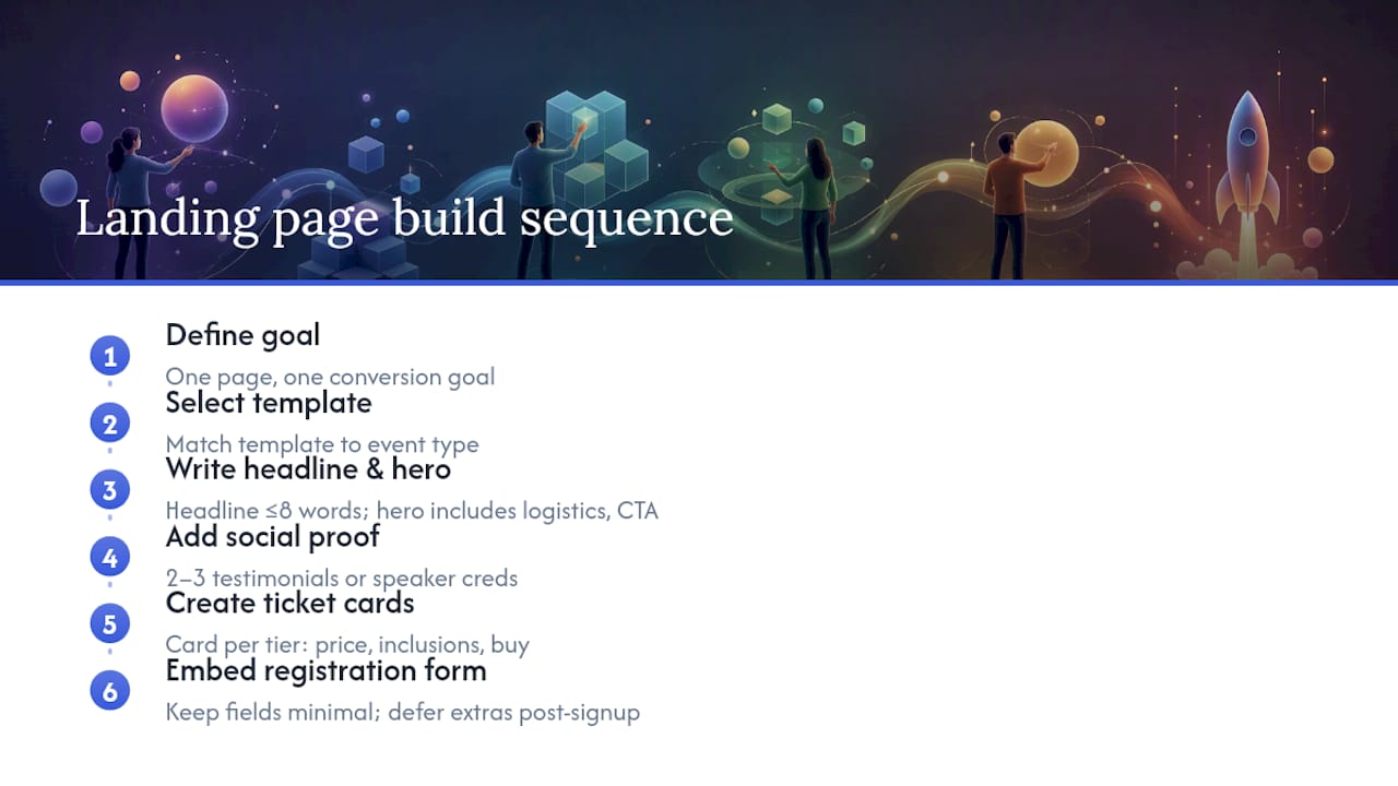
1. Define your conversion goal. Decide whether you’re collecting emails, selling tickets, or driving app downloads. One page, one goal. Everything else is a distraction.
2. Select a template. Match the template to your event type using the table above. Don’t customize until the structure is right.
3. Write the headline and subheadline. Keep the headline to eight words or fewer and state the primary benefit, not the event name. The subheadline (one sentence, 15–20 words) answers “who is this for and what will they walk away with?” A fill-in-the-blank formula: “[Event name] is the [format] for [audience] who want to [outcome] on [date].”
4. Build the hero section. The hero is everything visible before the visitor scrolls. It must contain: headline, subheadline, at-a-glance logistics box (date, time, location or platform, price), and the primary CTA button. Nothing else. A Z-pattern layout places the headline top-left, the hero image top-right, the logistics box bottom-left, and the CTA button bottom-right, which mirrors natural eye movement and gets visitors to the button faster.
5. Add social proof. Directly below the hero, place two or three short testimonials from past attendees, speaker credentials, or a past-event metric (“1,200 attendees in 2024”). Speaker bios with headshots work especially well here because they answer “why should I trust this event?” before the visitor has to ask.
6. Build the ticket section. Use card-style layout, one card per tier. Each card shows: tier name, price (with any fees), what’s included, availability or deadline, and a buy button. Showing fees up front on the ticket card prevents the checkout-surprise abandonment that inflates your cart-abandon rate.
7. Embed the registration form or checkout. Keep the form as short as the event type allows. For free events: first name, email, maybe company. For paid events: name, email, payment. Defer everything else (dietary preferences, T-shirt size, session selection) to the post-registration confirmation flow.
8. Set up the thank-you page and tracking. The thank-you page is not a dead end. It should confirm registration, offer a calendar add link, link to a pre-event resource, and fire your conversion pixel. Set up UTM parameters on every inbound link before launch so you know which channel drove each registration.
Integration checklist before launch
- Ticketing or payment processor connected and tested (Stripe, Eventbrite, or your platform of choice)
- Email confirmation triggered on form submit, with calendar (.ics) attachment
- Google Analytics 4 conversion event firing on thank-you page load
- Meta Pixel or Google Ads tag firing on the same thank-you page
- UTM parameters on all campaign links
- Page title tag includes event name and date (for event page SEO)
- Alt text on all images
- Semantic heading structure (H1 for event name, H2 for sections)
- No navigation menu, only privacy policy and terms links
How do you design registration forms and CTAs that actually convert?
The form is where most event pages lose registrations they already earned. A visitor who scrolled to the form was interested. A long or confusing form is the only thing standing between them and a confirmation email.
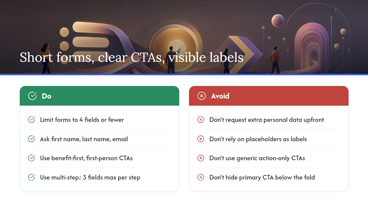
Forms with four fields or fewer consistently outperform longer ones for registration completion. For free events, three fields is the target: first name, last name, email. For paid events, add payment fields but keep the personal data fields to the same three. Defer anything else.
Multi-step forms work well for higher-value events (conferences, paid workshops) where you need more information. Show a progress indicator (“Step 1 of 2”) and keep each step to three fields or fewer. The first step should be the easiest (name and email), so the visitor commits before they see the harder questions.
The CTA button is not a label, it’s a promise. “Register” tells the visitor what they’re doing. “Get My Free Ticket” tells them what they’re getting. Benefit-first copy on the button consistently outperforms action-only copy. Keep it to four words or fewer, use first-person (“My” instead of “Your”), and make the button large enough to tap with a thumb on mobile.
For CTA placement, the primary button must be visible without scrolling on both desktop and mobile. On long pages, repeat the CTA after the speaker section and again at the bottom. On mobile, a sticky bottom bar with the CTA button is one of the highest-lift changes you can make to a page that already has decent traffic.
Microcopy matters more than most organizers realize. A one-line note under the form (“No spam. Unsubscribe anytime.”) reduces email hesitation. “Fees included in price shown” under the ticket price reduces checkout abandonment. An inline error message that says “Please enter a valid email address” is less frustrating than a generic red border.
Pro Tip: Use visible labels above each field, not placeholder text inside the field. Placeholder text disappears when the visitor starts typing, which forces them to remember what the field was asking. On mobile, this causes more errors and more form abandons than almost any other design choice.
Does your event page design hold up on mobile?
A majority of event page traffic comes from mobile devices., which means a page that looks great on a 27-inch monitor but breaks on a phone is failing the majority of your audience.
Mobile-first design checklist:
- CTA button is at least 44px tall and full-width on small screens
- Font size is 16px minimum for body text (prevents iOS auto-zoom on form fields)
- Hero headline is 28px or larger and wraps cleanly at 375px viewport width
- No horizontal scrolling at any breakpoint
- Images are compressed (WebP format, under 150KB for hero images)
- Page loads in under three seconds on a 4G connection
- Tap targets (buttons, links) have at least 8px of spacing between them
- Sticky CTA bar visible on scroll for mobile users
Page speed directly affects conversion. A page that takes more than three seconds to load on mobile loses a measurable share of visitors before they ever see the headline. Compress images, defer non-critical JavaScript, and use a CDN if your platform supports it.
Accessibility on event pages is often treated as an afterthought, but it affects a real portion of your audience and has SEO implications too. Specific techniques that matter for events:
- Write alt text that describes the event context, not just the image (“Speaker Jane Doe presenting at the 2024 Chicago Marketing Summit” rather than “woman at podium”)
- Use semantic heading structure so screen readers can navigate the page by section
- Ticket cards need ARIA labels if they use icon-only buttons (“Buy General Admission ticket” not just a cart icon)
- Color contrast ratio of at least 4.5:1 for body text and 3:1 for large text (WCAG AA standard)
- Keyboard navigation must reach every interactive element, including the registration form and CTA button
A clean Z-pattern or F-pattern layout also helps visitors on mobile because it puts the most important information where the eye naturally lands first, reducing the cognitive load of scanning a small screen.
How do you promote an event landing page across channels?
Getting the page right is half the job. Sending the right traffic to it is the other half. The most common promotion mistake is running ads that promise one thing and landing on a page that says something slightly different. Message match between your ad and your landing page is the fastest free conversion lift available.
Channel comparison
| Channel | Best use | Message-match tip | Recommended CTA variant |
|---|---|---|---|
| Paid social (Meta, LinkedIn) | Warm and cold audience reach | Mirror the ad headline exactly on the page hero | “Save My Spot” / “Get Tickets” |
| Search ads (Google) | High-intent, event-name searches | Match the keyword in the page title and H1 | “Register Now” / “Buy Tickets” |
| Email (owned list) | Highest-converting channel | Use the same subject line language in the hero | “Claim Your Ticket” / “RSVP” |
| Partner/affiliate | Reach new audiences | Provide partners a co-branded URL with UTM | “Register via [Partner]” |
| Organic social | Awareness and retargeting pool | Use event visual assets consistently | “Link in bio” → landing page |
Six-week promotion timeline
| Week | Focus | Key actions |
|---|---|---|
| Week 1 | Build and soft-launch | Publish page, send to email list, post organically |
| Week 2 | Seed and test | Run small paid social test ($50–$100), check message match |
| Week 3 | Scale what works | Increase budget on winning ad sets, partner outreach |
| Week 4 | Mid-campaign push | Urgency messaging (early-bird deadline), retarget page visitors |
| Week 5 | Remarket and recover | Cart-abandon email sequence, retarget non-converters |
| Week 6 | Final push | Last-chance messaging, waitlist if sold out |
UTM parameters are non-negotiable for attribution. Use a consistent naming convention: utm_source (facebook, google, email), utm_medium (paid, organic, newsletter), utm_campaign (event-name-year). Every link to the page from every channel gets its own UTM. Without this, you won’t know which $500 ad spend drove registrations and which drove nothing.
For remarketing, show a different creative to visitors who landed but didn’t register. The most effective message is a direct objection-handler: “Still thinking about it? Here’s what past attendees said.” Pair it with a testimonial and a deadline. Cart-abandon emails (for paid events) sent within one hour of the abandoned checkout recover a meaningful share of lost revenue.
How do you measure and improve your event page conversion rate?
Measuring the right things prevents you from optimizing the wrong ones. These are the KPIs worth tracking:
- Unique visitors: total traffic to the page
- CTA click-through rate: percentage of visitors who click the register/buy button
- Form completion rate: percentage of visitors who start the form and finish it
- Ticket conversion rate: registrations divided by unique visitors (your primary metric)
- Cost per registration: total ad spend divided by registrations from paid channels
- Post-registration attendance rate: how many registrants actually show up
A low CTA click-through rate points to a headline or value proposition problem. A low form completion rate points to a form problem. Knowing which one is broken tells you exactly where to test.
A/B test priority order
Test headline first, then form length, then CTA copy. This order compounds results because a better headline brings more qualified visitors to the form, which makes every downstream test more meaningful.
- Headline test: benefit-focused vs. curiosity-driven vs. social-proof-led (“Join 1,200 marketers who…”)
- Form length test: three fields vs. five fields (for events where you currently collect more)
- CTA copy test: “Register Now” vs. “Save My Spot” vs. “Get My Free Ticket”
- Ticket layout test: card layout vs. table layout vs. single-option focus
- Hero media test: static image vs. short video (15–30 seconds) vs. speaker headshot
Run one test at a time. Wait until you have at least 200 conversions per variant before calling a winner. For lower-traffic events, focus on qualitative testing: recruit someone unfamiliar with the event to complete registration on their phone while you watch, and note every hesitation point.
Post-registration flow
The confirmation page and email are part of the conversion funnel, not the end of it. A strong post-registration flow includes:
- Immediate confirmation email with event details and a calendar add link
- A thank-you page that offers a pre-event resource (speaker deck preview, prep checklist) to increase engagement
- A reminder sequence: 1 week before, 1 day before, 1 hour before
- A post-event survey link sent within 24 hours of the event ending
Track no-show rates by comparing registrations to actual attendance. A high no-show rate on a free event usually means the registration barrier was too low (no confirmation email, no calendar add). For improving overall conversion rates, the post-registration sequence is one of the most underinvested areas.
What does the research say about event page conversion killers?
A large share of visitors abandon an event landing page within 10 seconds if they can’t immediately find the date, price, and register button. That’s not a design preference. That’s the cost of burying your logistics.
The five most common conversion killers, in order of impact:
- No visible CTA above the fold. The register button is below the speaker bios, the agenda, or a long event description. Visitors who can’t find the action within seconds leave.
- Missing basic logistics. Date, time, location, and price are not visible without scrolling. Visitors won’t hunt for this information.
- Forms that are too long. Every field beyond four reduces completion rate. Collecting T-shirt size at registration is a real example of this mistake.
- Navigation leaks. A full site navigation menu gives paid traffic 10 ways to leave the page without registering. Remove the navigation entirely and keep only legally required links.
- Poor mobile experience. Buttons too small to tap, text too small to read, forms that break on small screens. With over 60% of event traffic on mobile, a broken mobile experience is a broken page.
Pro Tip: Before you run a single paid ad, recruit someone who has never seen your event page and ask them to register on their phone. Don’t help them. Watch where they hesitate, where they tap the wrong thing, and where they stop. Those three moments are your highest-priority fixes, and they’ll tell you more than any analytics dashboard.
For on-page SEO, event pages frequently make the same mistakes as e-commerce pages: missing meta descriptions, duplicate title tags, and unoptimized image file names. Fix these before launch, not after.
What legal and privacy rules apply when collecting registrant data?
Collecting names and email addresses from registrants triggers data protection obligations, even for free events. In the United States, the primary federal framework is the CAN-SPAM Act for email communications, but state laws add requirements. California’s CCPA (California Consumer Privacy Act) applies to events that collect data from California residents, regardless of where the organizer is based.
If your event attracts international attendees, the EU’s GDPR applies to any EU resident whose data you collect. GDPR requires a lawful basis for processing (typically consent or legitimate interest), a clear privacy notice at the point of collection, and the ability to honor deletion requests.
Practical steps for compliance:
- Add a checkbox (unchecked by default) at the form level: “I agree to receive event updates and communications. View our Privacy Policy.” Link to your actual privacy policy.
- State clearly how you’ll use the data: event confirmation, reminders, and (if applicable) future marketing.
- Don’t pre-check marketing consent boxes. Pre-checked boxes don’t constitute valid consent under GDPR or most state frameworks.
- Store registrant data securely and delete it after the retention period stated in your privacy policy.
- If you use a third-party ticketing or registration platform, confirm their data processing terms and whether they act as a data processor on your behalf.
This is general information, not legal advice. Confirm your specific obligations with a qualified attorney or your state’s consumer protection office.
How do you handle landing pages for international or multi-language audiences?
A single English-language page works for most U.S.-based events. When your audience spans multiple countries or languages, a few decisions become critical.
The most common mistake is running Google Translate on a single page and calling it localized. Machine translation handles words but misses tone, urgency, and cultural context. For high-ticket events, a human translator reviewing the CTA copy and headline is worth the cost.
For multi-language pages, the practical options are:
Separate URLs per language (e.g., /en/, /es/) with hreflang tags in the HTML. This is the cleanest SEO approach and lets you tailor the page fully per audience. It also means maintaining two pages, so it’s best reserved for events where a specific language audience is a meaningful share of expected registrations.
Language toggle on a single page works for smaller events. Keep the toggle visible in the header. Make sure the form labels, error messages, and CTA button text all switch with the toggle, not just the body copy.
For international events, display the time zone explicitly in the at-a-glance logistics box (“2:00 PM ET / 7:00 PM GMT”) and show the ticket price in the registrant’s local currency if your payment processor supports it. Ambiguity about time zones is a real reason people don’t register for virtual events.
What post-registration engagement should your landing page trigger?
The landing page’s job doesn’t end at the confirmation screen. The pages and emails that follow registration determine whether your registrant actually shows up, tells a friend, or becomes a repeat attendee.
The thank-you page is the most underused real estate in event marketing. After a registrant converts, they’re at peak engagement. Use that moment to:
- Confirm the registration with a clear summary (event name, date, time, location or link)
- Offer a one-click calendar add (Google Calendar, Apple Calendar, Outlook)
- Present a referral prompt: “Know someone who’d love this? Share your personal invite link.”
- Link to a pre-event resource (speaker bio page, prep guide, community Slack or Discord)
The referral prompt alone can meaningfully extend your reach without additional ad spend. Tools like SparkLoop or ReferralHero integrate with most email platforms and can automate the tracking.
Your email confirmation sequence should include at minimum: an immediate confirmation, a one-week reminder, a one-day reminder, and a one-hour reminder. Each reminder should include the event link or location, the calendar add, and one piece of value (a speaker preview, a relevant article, a question to think about before the event). The role of testimonials in these reminder emails is underestimated: a short quote from a past attendee in the one-week reminder reinforces the decision to attend.
For paid events, add a post-event survey within 24 hours. The response rate drops sharply after 48 hours. Use the survey data to build testimonials for next year’s landing page.
Key Takeaways
A high-converting event landing page requires visible logistics above the fold, a form with four fields or fewer, no navigation menu, and a post-registration sequence that drives actual attendance.
| Point | Details |
|---|---|
| Above-the-fold logistics | Date, time, location, price, and CTA button must be visible without scrolling on mobile. |
| Short registration forms | Keep forms to four fields or fewer; every extra field reduces completion rate. |
| Remove navigation | Strip the nav menu entirely; only legally required links (privacy policy, terms) should remain. |
| Test headline first | Run your first A/B test on the headline before touching form length or CTA copy. |
| Ibrand for event page growth | Ibrand builds and optimizes event landing pages with SEO, paid ads, and conversion-focused design for U.S. event organizers. |
The fastest wins are the ones organizers keep skipping
The most consistent pattern in event page work is that organizers spend hours on design and almost no time on the three things that actually move registrations: the headline, the logistics box, and the form length.
A page with a mediocre design and a clear headline, visible date and price, and a three-field form will outperform a beautifully designed page that buries the register button below the speaker bios. Every time. The research on 10-second abandonment isn’t surprising to anyone who has watched a real person try to register for an event on their phone. They tap around for a few seconds, don’t immediately see what they need, and close the tab.
The second pattern: organizers treat the thank-you page as a receipt. It’s actually the highest-engagement moment in the entire funnel. A registrant who just committed to attending is more likely to share, refer, and engage with pre-event content than at any other point. A referral prompt on the thank-you page costs nothing to add and can drive a meaningful share of total registrations for community-driven events.
For ticketed events specifically, showing fees on the ticket card rather than at checkout is the single change that most consistently reduces cart abandonment. Surprise fees at checkout are the number-one reason people abandon paid event registrations. Put the fee on the card. It doesn’t reduce purchases; it reduces abandonment.
Ibrand builds event pages that convert, not just look good
Most event organizers build a page, run some ads, and wonder why registrations are slow. The problem is usually one of three things: the page isn’t converting the traffic it’s getting, the ads aren’t sending the right traffic, or both. Ibrand addresses all three.
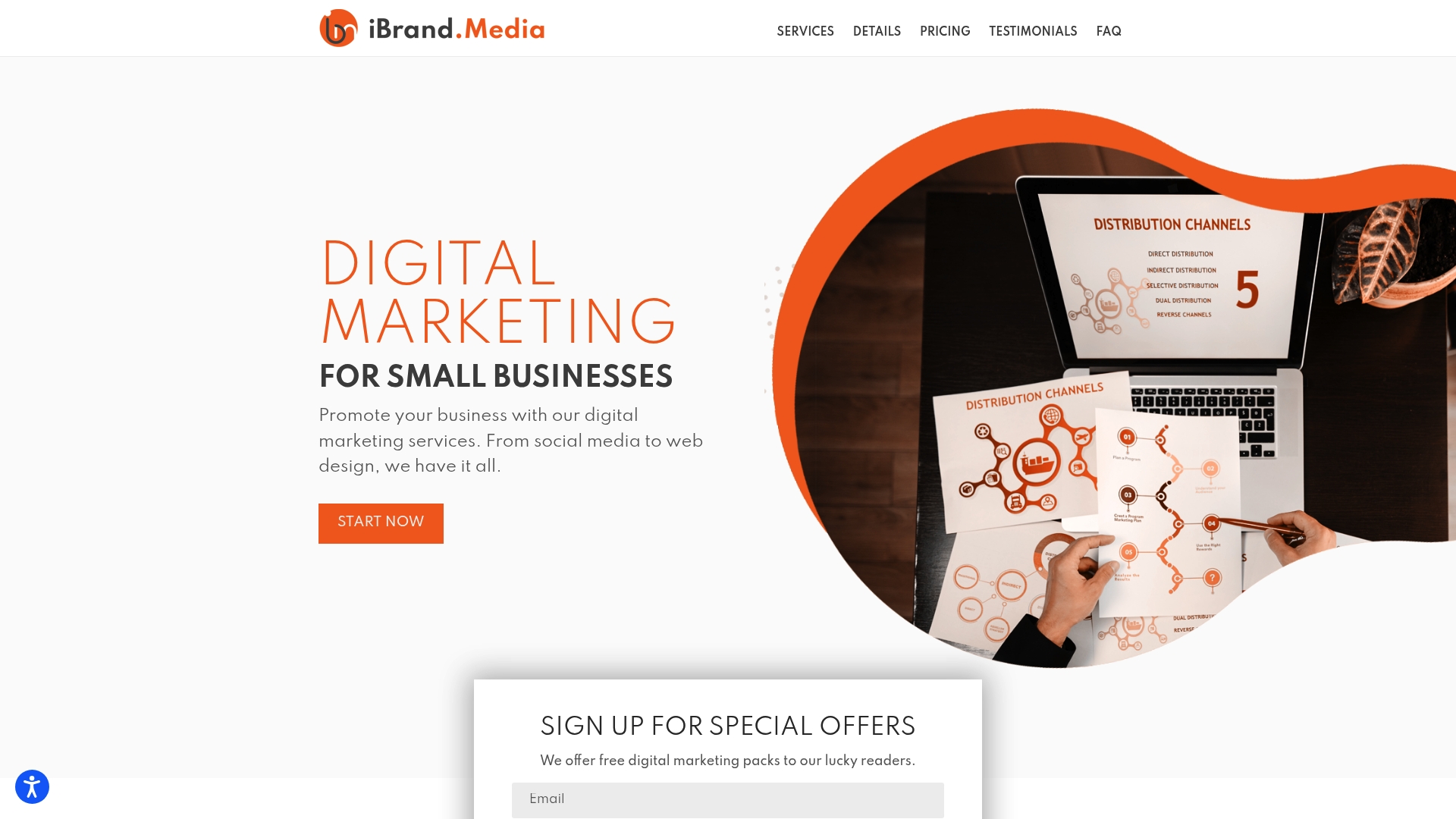
Ibrand’s team builds conversion-focused event landing pages with SEO baked in from day one, paid social and search campaigns that match the page’s messaging exactly, and analytics setup so you know which channel is driving registrations and which is burning budget. For event organizers who want a page that performs rather than one that just exists, that combination of design, SEO, and paid traffic is what separates a 4% conversion rate from a 22% one.
To get started, visit ibrand.media and share your event details, timeline, and registration goal. The more specific you are, the faster the team can put together a plan.
Useful sources
- Event Landing Page: Structure That Sells Tickets Fast (Fanz) — covers the 10-second abandonment rule, navigation removal, and above-the-fold logistics requirements.
- How to Build an Event Landing Page, No Code (AddEvent) — mobile traffic statistics and mobile-first testing methodology.
- Event Landing Page: How to Build a Page That Actually Sells Tickets (Tickera) — ticket card design, fee transparency, and the sales-page framing for event pages.
- 6 Must-Have Features for Effective Event Web Page Design (Results at Hand) — Z/F-pattern layout, at-a-glance logistics box design, and visual hierarchy rules.
- Design Effective Event Landing Pages (Harvard Design System) — institutional guidance on event page structure, audience clarity, and next-step design.
- On-Page SEO Mistakes Ecommerce Blogs Must Fix (BlockPress) — on-page SEO checklist applicable to event landing pages.
- SEO Optimization for Venues: Boost Event Bookings (Ibrand) — Ibrand’s guide to SEO and conversion tactics for event organizers and venues.
FAQ
What is the best platform to create an event landing page?
The right platform depends on your event type. Unbounce and Webflow give the most design control for custom pages. Eventbrite and Splash include registration and ticketing built in, which reduces integration work. For organizers who want a no-code option with calendar add and reminder automation, AddEvent is a practical choice.
How do you structure an event landing page?
Start with a hero section containing the headline, at-a-glance logistics (date, time, location, price), and a CTA button above the fold. Follow with social proof, speaker or host information, ticket options, a short registration form, and an FAQ. Remove the navigation menu entirely.
Are landing pages still effective for event promotion?
Yes. A dedicated landing page with no navigation menu and a single conversion goal consistently outperforms a general website event page because it removes every exit point except the register button. The page’s only job is to convert the visitor, and that focus shows in the numbers.
How many fields should an event registration form have?
Four fields or fewer is the standard for maximizing completion rates. For free events, three fields (first name, last name, email) is the target. Defer additional data collection to the post-registration confirmation flow.
How do you drive traffic to an event landing page?
Email to your owned list is the highest-converting channel. Paid social (Meta for consumer events, LinkedIn for professional events) scales reach quickly. Search ads capture high-intent traffic searching for the event by name. Use UTM parameters on every link so you can attribute registrations by channel and cut spend on what isn’t working.
Recommended
- Top Venue Email Marketing Tips for Local Businesses 2025 | Ibrandmedia
- Creating calls to action that convert: a step-by-step guide | Ibrandmedia
- Preventing Common Website Mistakes: 8 Fixes for Small Businesses – Ibrandmedia
- Increase Website Conversions: Proven Strategies for 2025 Success | Ibrandmedia
Recent Comments