
A landing page is a one goal conversion page; a homepage is your site’s front door. Send campaign traffic (ads, email offers, promotions) to a landing page, and send branded search or curious first time visitors to your homepage. Get this wrong and you can significantly reduce your conversion rate. Read the sections below to see the numbers, then apply the checklist to your next campaign.
TL;DR:
- Sending paid search or social traffic directly to a homepage reduces conversions because it introduces distractions and unrelated navigation options.
- Dedicated landing pages optimized for message match and minimal navigation have median conversion rates of around 4.02%, nearly double the rate of general pages.
- Use landing pages for paid campaigns, email offers, event promotions, gated content, and limited-time deals, while the homepage suits branded search and general exploration.
- Testing should prioritize headline and message match first, followed by CTAs and form length, as these have the highest impact on conversion improvements.
- Routing traffic correctly before redesigning pages significantly boosts campaign effectiveness and ensures ad spend achieves better results.
Table of Contents
- Landing Page vs Homepage: What Each One Actually Is
- The Measurable Differences Between a Landing Page and a Homepage
- When to Use a Landing Page vs a Homepage
- Landing Page and Homepage Optimization Checklist
- How Ibrand Media Approaches This Decision With SMB Clients
- Why the “Just Improve the Homepage” Advice Usually Misses the Point
- How You Can Build the Right Page for Every Campaign
- Sources
- FAQ
Landing Page vs Homepage: What Each One Actually Is
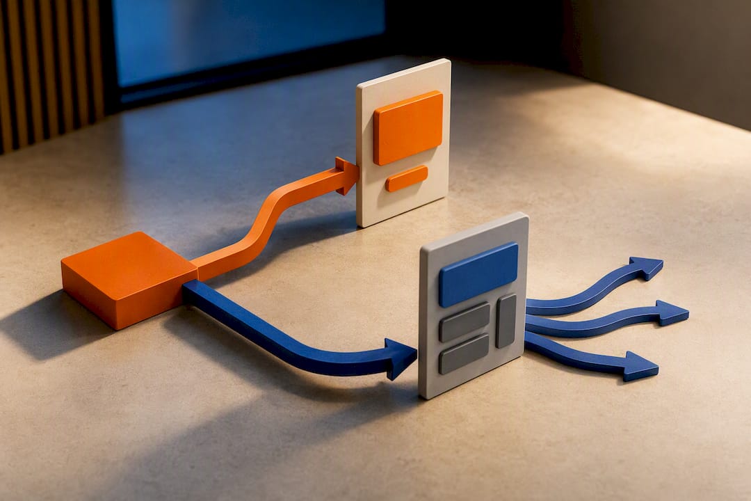
A landing page is a standalone page built to convert one specific audience on one specific offer. It usually strips out the main navigation, kills the footer links, and points every element on the page toward a single call to action, whether that’s “book a demo,” “download the guide,” or “claim 20% off.” That definition comes straight from the standard usage tracked on Wikipedia’s landing page entry, and it’s the term you’ll hear used identically across every major marketing platform.
A homepage plays a completely different role. It’s the front door of your website, built to serve dozens of different visitor intents at once. Someone might land there looking for your pricing, your contact page, your latest blog post, or just to confirm you’re a real business before they buy. Shopify’s comparison of the two page types puts it plainly: homepages help customers explore many parts of a business, while landing pages exist to drive one conversion with minimal distraction.
That difference in job description drives everything else. A homepage carries your logo, your main menu, a search bar, maybe a chat widget, and links to five or six different sections of your site. A landing page carries none of that. It has a headline, some proof, a form or a button, and almost nothing else to click.
Here’s how the two compare at a glance:
- Landing page: one offer, one audience, minimal or no navigation, built for a specific campaign.
- Homepage: many offers, many audiences, full navigation, built to represent your whole brand.
- Product page: a hybrid that lives inside your main site but focuses on converting one item, similar in spirit to a landing page but without the isolation.
- Microsite: a small standalone site (often just a handful of pages) built around one campaign, event, or product line, distinct from your main domain.
- Squeeze page: a stripped down landing page with almost nothing but a headline and an email capture form, used purely to build a list.
Once your team agrees on these terms, the rest of the decision making gets a lot easier. Confusion about “landing page vs homepage” usually isn’t a design problem.
The Measurable Differences Between a Landing Page and a Homepage
The gap between these two page types isn’t just conceptual. It shows up directly in your analytics, and the numbers are stark enough to change how you allocate ad spend.
Primary goal and metric. A landing page has exactly one job: convert. Its success metric is conversion rate, full stop. A homepage has to balance several jobs at once, so its success metrics spread across bounce rate, average session duration, pages per visit, and branded search volume. Trying to judge a homepage by conversion rate alone misreads what it’s actually built to do.
Traffic source and intent. This is where most SMB marketers trip up. Paid search, paid social, and email campaign clicks arrive with high intent and low patience. The visitor already saw your offer; they want to see it confirmed, not go hunting for it in a nav menu. Organic branded search and word of mouth traffic behaves the opposite way. Someone typing your business name into Google is often just checking you exist, browsing your services, or looking for your phone number. Send that visitor to a stripped down landing page with no menu and you’ll frustrate them.
Navigation and exit links. Every link on a page is an invitation to leave before converting. Homepages need that openness because exploration is the point. Landing pages remove it deliberately. Instapage’s research on landing page structure found that cutting competing links and focusing the whole page on a single offer improves persuasion and makes performance far easier to measure, because you’re not trying to untangle which of eleven possible paths a visitor took before bailing.
Message match and above the fold design. A landing page should mirror the exact language of the ad or email that brought the visitor there. If your Facebook ad says “50% off your first month,” the landing page headline should say roughly the same thing within the first three seconds of load. A homepage can’t do this because it’s serving too many entry points at once, so it defaults to a broader value statement and a handful of CTAs instead of one.
Testing and attribution. This is the difference that matters most for a busy SMB team with limited time to run experiments. Because a landing page isolates one goal and one audience, you can test a single variable, measure the result cleanly, and know exactly what caused the change. Leadpages’ breakdown of landing page purpose makes the same point: fewer competing links and a single measurable goal make A/B testing and attribution dramatically more straightforward than on a multipurpose homepage.
Pro Tip: If you’re currently sending Google Ads or Facebook Ads traffic straight to your homepage, that’s usually the single fastest conversion fix available to you. Redirect it to a dedicated landing page that matches the ad copy word for word, and measure the change over two weeks before touching anything else.
The conversion rate gap between the two is where this stops being theoretical. A recent industry median found dedicated landing pages converting at 4.02%, compared to a 2.35% median for general website pages. That’s not a marginal edge. It’s the difference between a $1,000 ad spend generating 40 leads versus 23.
When to Use a Landing Page vs a Homepage
Most of the confusion around “landing page vs homepage” disappears once you match the page to the traffic source, not the other way around. Here’s the practical breakdown.
Situations that call for a landing page:
- Any paid campaign (Google Ads, Meta Ads, LinkedIn Ads) where you’re paying per click and want every visitor focused on one offer.
- Email marketing sends promoting a specific deal, webinar, or piece of content.
- Event promotion, where a dedicated event page can hold all the registration details without competing with your regular site navigation. A well built event landing page can carry the date, speaker list, and registration form without a single distracting link.
- Gated content offers like an ebook, template, or checklist where the entire goal is capturing an email address.
- Limited time promotions or seasonal sales where you want zero friction between the offer and the form.
Situations where the homepage is the right call:
- Branded search traffic, someone typing your company name directly into Google.
- Visitors clicking through from a business directory, review site, or a partner’s “who we recommend” page.
- Returning customers who already know your offerings and are checking for updates, new services, or contact details.
- General site exploration where a visitor wants to compare multiple products or services before deciding.
Hybrids and exceptions worth knowing. Ecommerce brands often run “homepages” that behave more like landing pages during a major sale, temporarily stripping navigation down to a single promoted collection. Personalized homepages, where returning visitors see different content based on past behavior, blur the line further. And a microsite built for a product launch can function as an entire landing page experience spread across three or four pages instead of one.
The decision checklist boils down to one question: did this visitor arrive already knowing what they want, or are they still figuring that out? Already decided (clicked an ad, opened an email, scanned a QR code at an event) means landing page. Still exploring means homepage.
Landing Page and Homepage Optimization Checklist
Once you’ve routed traffic to the right page type, the next fifteen minutes of work should go into tightening what’s already there. These are the levers that move conversion rate the fastest, ranked by typical impact.
Landing page checklist:
- Message match: headline echoes the exact ad copy or email subject line that brought the visitor in.
- Single CTA: one button, repeated if the page is long, never two competing offers.
- Minimal navigation: remove the main menu, footer links, and social icons that lead away from the page.
- Short forms: keep it to four fields or fewer (name, email, phone, and maybe one qualifier) unless you’re selling something high ticket that justifies more friction.
- Load speed: aim for under two seconds on mobile. Every extra second of load time bleeds conversions before the visitor even sees your offer.
- Trust signals above the fold: a review count, a security badge, a client logo strip, or a specific guarantee placed where the visitor sees it without scrolling.
These recommendations track closely with what LanderLab’s landing page guide and Instapage’s design comparison both point to as the highest leverage fixes for small business campaigns.
Homepage checklist:
- Clear value statement: a visitor should understand what you do and who you serve within five seconds, without scrolling.
- Primary CTA visible without digging: even with broad navigation, one obvious next step should sit above the fold.
- Discoverable navigation: organize menu items the way your customers think about your business, not the way your org chart is structured.
- Solid SEO structure: proper heading hierarchy, fast load times, and internal links that help both visitors and search engines understand your site.
Usability research on layout preference backs up why this matters. Studies on visual hierarchy and page layout show that people gravitate toward familiar structures, which is exactly why a homepage that buries its main CTA in a cluttered layout underperforms one with a clean, predictable hierarchy.
What to test first. If you only have time to run one experiment this month, run it on your landing page, not your homepage, because the isolated goal means you’ll get a clean read on results faster. The sequence that tends to produce the fastest wins runs in this order: headline and message match first, then CTA copy and button color, then hero image versus no image at all, then form length. That order isn’t arbitrary. It moves from the highest impact variable to the smallest, so you spend your limited testing time on the changes most likely to matter.
For homepages, testing runs slower because you’re watching softer metrics like bounce rate and time on page rather than a single conversion number, so budget more patience there. A realistic target for a new landing page in its first month is a conversion rate somewhere close to that 4.02% industry median mentioned earlier.
How Ibrand Media Approaches This Decision With SMB Clients
The question a small business owner actually asks isn’t “landing page vs homepage.” It’s “where do I put my ad budget this month, and what page do I send it to?” That’s the practical version of the same problem, and it’s the one Ibrand walks through with every client before a campaign goes live.
The first question is always about traffic source. If the budget is going toward Google Ads, Meta Ads, or a promotional email blast, the answer is almost always a dedicated landing page built to match that specific offer. If the goal is improving how the business shows up for its own brand name or general local searches, the homepage gets the attention instead, usually paired with local SEO work rather than a standalone page build.
Three scenarios come up constantly with small business clients. A local service business running a seasonal promotion (say, a landscaping company promoting spring cleanup packages) needs a landing page, not a homepage update, because the traffic is coming from a paid campaign with one specific offer attached. A retail store trying to rank for its own name and general category terms needs homepage and local SEO work instead, since that traffic is exploratory. A business launching a webinar or downloadable guide needs a landing page built purely around that lead capture form, separate from anything else on the site.
The businesses that waste the most ad budget aren’t the ones with bad ads. They’re the ones sending great ad clicks to a homepage that makes the visitor hunt for the offer they already clicked to see.
Why the “Just Improve the Homepage” Advice Usually Misses the Point
Most generic advice on this topic treats the decision as a design question: which page looks better, converts more visitors, or ranks higher. That framing misses what actually drives the outcome, which is matching page structure to visitor intent before a single pixel gets designed.
The conventional wisdom oversells homepage redesigns as a fix for weak ad performance. I’ve seen the same mistake play out repeatedly: a business spends real money rebuilding its homepage, then wonders why campaign conversion rates barely move. The homepage was never the problem. The traffic routing was.
If you take one thing from this article, prioritize this: audit where your paid traffic currently lands before you touch design at all. A landing page with an ugly button but perfect message match will usually beat a beautifully designed homepage with the wrong content for that visitor. Fix the routing first, then optimize what’s on the page. Most SMB marketers do it backwards, and it costs them conversions every single day the campaign runs.
— TONY
How You Can Build the Right Page for Every Campaign
A practical alternative to hiring an in house designer or guessing your way through page builders is to get a landing page built to match that specific offer, plus conversion tracking to prove it worked.
Every client engagement starts with a quick audit of where current traffic lands and why conversions might be stalling, whether that’s a mismatched homepage, a slow load time, or a form asking for too much information. From there, Ibrand can build a dedicated landing page for your next campaign, set up the tracking to measure it against your homepage baseline, and hand you a clear before and after comparison. If your core issue is closer to home, meaning your actual homepage needs work to convert branded and local search traffic, Ibrand’s website optimization services for small businesses cover that side of the equation too, alongside broader SEO support built for small business budgets.
If you’re planning a launch, a seasonal promotion, or a lead generation push in the next few weeks, get in touch for a quick audit of your current setup and a plan for what to build next.
Sources
The comparisons and figures in this article draw on guidance from Shopify’s landing page versus homepage breakdown, Instapage’s design research, Leadpages’ guide to landing page purpose, and LanderLab’s 2026 best practices guide, all of which track conversion benchmarks and design standards across live campaigns. For readers looking to sharpen ad copy that matches landing page messaging, tools like the AI ad generator from AmmarAI offer a faster starting point for message match testing.
- Landing Page Best Practices: The Complete 2026 Guide – LanderLab
- Landing page vs. homepage: key differences – Shopify
- Landing Page vs. Homepage – Instapage
- What Is the Purpose of a Landing Page? – Leadpages
FAQ
What Is the Main Difference Between a Landing Page and a Homepage?
A landing page focuses on one conversion goal for one specific audience, while a homepage serves many visitor intents at once with full site navigation.
Should I Send Facebook Ads Traffic to My Homepage?
No. Paid ad traffic converts better on a dedicated landing page that matches the ad’s exact offer and headline, since homepages introduce distracting navigation and competing calls to action.
How Many Form Fields Should a Landing Page Have?
Keep it to four fields or fewer for most offers; longer forms are only justified for high ticket products where extra qualifying information earns its place.
Can a Homepage Ever Work as a Landing Page?
Occasionally, during a major sitewide sale or single product launch a homepage can strip down to one offer temporarily, but this works best as a short term exception, not a permanent structure.
What Conversion Rate Should I Expect From a New Landing Page?
Industry data puts the median dedicated landing page conversion rate around 4.02%, compared with a 2.35% median for general website pages, so that figure is a reasonable early benchmark.
Does Ibrand Build Both Landing Pages and Homepages?
Yes, Ibrand builds campaign specific landing pages and improves existing homepages depending on whether the traffic in question is paid or branded, starting with a quick audit of current performance.
Recent Comments