
Every small business owner knows the frustration when a website looks perfect on a computer but becomes a headache on a phone. With so many customers relying on smartphones across the United States, delivering a smooth online experience on every device is more crucial than ever. Discover how adopting responsive design ensures your business stays visible, builds trust, and provides a professional look that adapts automatically for mobile, tablet, or desktop visitors.
Table of Contents
- What Is Responsive Design and How It Works
- Key Features of Responsive Websites
- Impact on SEO and Search Rankings
- Customer Experience Across Devices
- Cost Savings and Maintenance Advantages
- Risks of Ignoring Mobile Responsiveness
Key Takeaways
| Point | Details |
|---|---|
| Responsive Design Enhances User Experience | It provides seamless navigation and readability across all devices, ensuring a consistent user experience. |
| Improves SEO and Search Rankings | Mobile-friendly design positively impacts search rankings, increasing visibility and traffic potential. |
| Cost-Effective Maintenance | Utilizing a single responsive site reduces development complexity and ongoing maintenance costs. |
| Avoids Competitive Disadvantages | Non-responsive websites risk losing potential customers and damaging brand credibility in a mobile-first environment. |
What Is Responsive Design and How It Works
Responsive design is a strategic web development approach that enables websites to dynamically adjust and display perfectly across different devices and screen sizes. At its core, responsive design ensures that whether a user visits your site from a smartphone, tablet, laptop, or desktop computer, they experience a seamless and user-friendly interface. Responsive web design techniques enable websites to automatically resize, reposition, and reformat content to match each device’s unique screen dimensions.
The magic of responsive design happens through several technical components. Flexible grid layouts form the foundation, allowing content to resize proportionally. CSS media queries act like intelligent switches, detecting the current device’s screen width and applying appropriate styling rules. Responsive images automatically scale without losing quality, ensuring visual elements look crisp on any display. This approach means small business websites can now look professional and function smoothly across Android phones, iPhones, tablets, and desktop computers without needing separate design versions.
Implementing responsive design involves strategic planning and technical execution. Web developers use flexible percentage-based layouts instead of fixed pixel measurements. They employ CSS Grid and Flexbox technologies to create adaptable page structures that can reorganize content intelligently. For instance, a three-column desktop layout might transform into a single-column format on mobile devices, maintaining readability and user experience. These techniques ensure that navigation menus, images, text blocks, and interactive elements adjust seamlessly across different screen sizes.
Pro tip: Test your website’s responsiveness using free online tools like Google’s Mobile-Friendly Test to identify and fix potential design issues before launching.
Key Features of Responsive Websites
Responsive websites are characterized by their ability to dynamically adapt to different screen sizes and device types. Fluid layouts and flexible design elements are the foundational components that enable websites to provide optimal viewing experiences across smartphones, tablets, laptops, and desktop computers. These design approaches ensure that content remains readable, navigation stays intuitive, and visual elements maintain their aesthetic appeal regardless of screen dimensions.
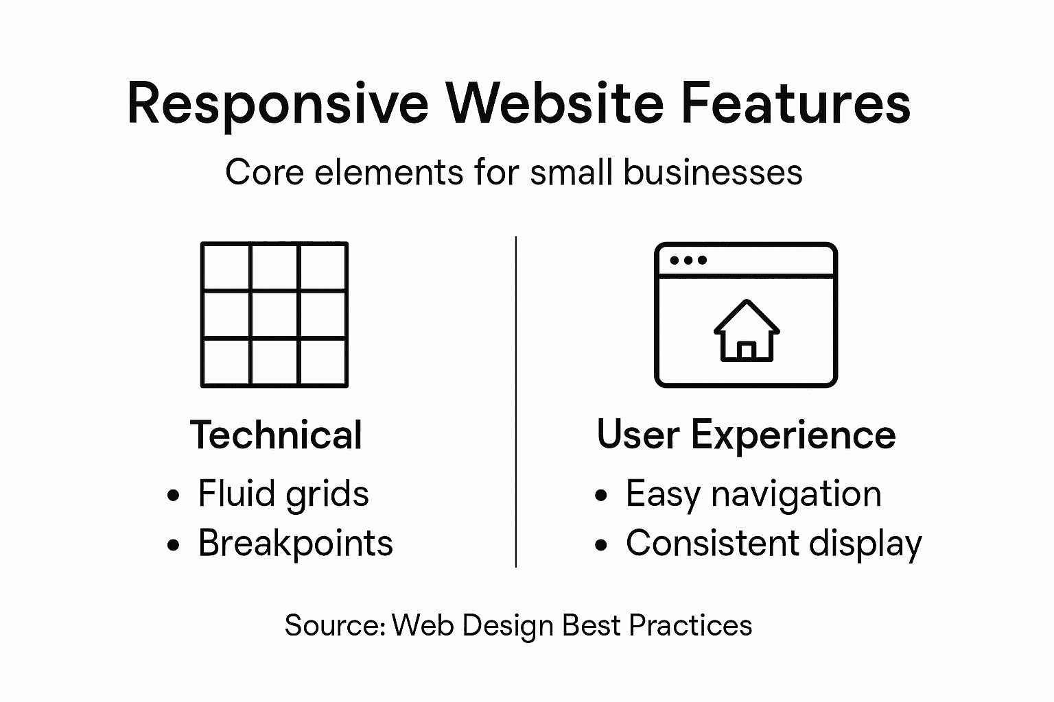
The key technical features of responsive websites include several sophisticated design strategies. Fluid Grid Systems allow page elements to resize proportionally using percentage-based measurements instead of fixed pixels. CSS Media Queries act as intelligent switches, detecting device characteristics and applying specific styling rules dynamically. Responsive Images automatically scale and crop without losing quality, ensuring visual content looks sharp on any display. These techniques enable small business websites to create a unified design that looks professional and functions smoothly across multiple platforms without requiring separate mobile and desktop versions.
Breakpoint management is another critical aspect of responsive design. Web developers strategically define specific screen width thresholds where layout and design elements will automatically rearrange. For example, a three-column desktop layout might transform into a single-column format on mobile devices, maintaining content hierarchy and readability. Navigation menus intelligently collapse into hamburger-style icons, form inputs resize for touch interaction, and text reflows to ensure optimal legibility. By implementing these responsive design principles, businesses can create websites that provide consistent, user-friendly experiences across all digital devices.
Pro tip: Conduct regular cross-device testing using tools like Browser Stack to identify and resolve any responsive design issues before launching your website.
Impact on SEO and Search Rankings
Responsive design has become a critical factor in search engine optimization, directly influencing how websites perform in search rankings. Mobile-friendly website performance is now a key metric that search engines like Google use to determine a website’s visibility and search positioning. Small businesses that implement responsive design gain a significant advantage, as their websites can effectively reach and engage users across multiple devices, which search engines reward with higher search result placements.
The technical aspects of responsive design directly impact SEO performance through several crucial mechanisms. Page Loading Speed becomes dramatically improved when a website uses responsive design, as it eliminates the need for separate mobile and desktop versions. Search engines prioritize faster-loading websites, particularly on mobile devices, which means responsive sites naturally receive higher ranking considerations. Additionally, having a single URL for all device types prevents content duplication issues, consolidates page authority, and simplifies search engine indexing processes. This unified approach means that all user interactions and link-building efforts contribute to a single, stronger search ranking profile.
Search engines like Google have explicitly stated their preference for responsive websites, making this design approach more than just a visual enhancement. Websites that adapt seamlessly across different screen sizes demonstrate superior user experience, which is a critical ranking factor. Mobile traffic now represents over 50% of global web browsing, meaning businesses without responsive design are essentially invisible to a massive potential customer base. By implementing responsive design, small businesses can ensure their website remains accessible, readable, and functional regardless of the device, thereby improving user engagement metrics that search engines use to determine search rankings.
Pro tip: Use Google’s Mobile-Friendly Test tool to regularly check and optimize your website’s responsive design performance.
Here’s a comparison of the impact responsive design has on SEO and user experience:
| Aspect | With Responsive Design | Without Responsive Design |
|---|---|---|
| Search Engine Ranking | Higher placement on Google | Penalized or lowered rank |
| Page Load Speed | Fast across all devices | Slower, multiple site versions |
| User Experience | Seamless navigation, easy reading | Frustrating layouts, high bounce rate |
| Traffic Potential | Captures both mobile and desktop users | Misses mobile majority, lower reach |
Customer Experience Across Devices
Responsive design fundamentally transforms how customers interact with small business websites by creating seamless experiences across different devices. User-friendly navigation strategies ensure that customers can easily access information whether they’re using a smartphone during their morning commute or browsing on a desktop computer at the office. This adaptability means customers no longer struggle with tiny unreadable text, awkward zoom requirements, or complicated navigation menus that don’t work on mobile devices.

The technical sophistication of responsive design directly impacts customer satisfaction through intelligent content adaptation. Touch-Friendly Interfaces automatically resize buttons and interactive elements to be easily tappable on smartphone screens, preventing frustrating misclicks. Adaptive Typography ensures text remains readable across different screen sizes, with fonts automatically adjusting their size and line spacing. Intelligent Content Prioritization means that on smaller screens, the most critical information becomes prominently displayed, allowing customers to quickly find what they need without excessive scrolling or searching.
Beyond technical features, responsive design communicates professionalism and customer care. When a website looks polished and functions smoothly on any device, it builds trust and credibility with potential customers. Small businesses that invest in responsive design demonstrate they understand modern digital expectations and are committed to providing excellent user experiences. This approach reduces customer friction, decreases bounce rates, and increases the likelihood of converting website visitors into actual customers. The seamless experience across devices essentially becomes a silent marketing tool, showing that the business is modern, tech-savvy, and customer-focused.
Pro tip: Regularly test your website on multiple devices and screen sizes to ensure a consistently smooth user experience.
Cost Savings and Maintenance Advantages
Responsive design offers small businesses a cost-effective solution for maintaining a professional online presence without breaking the bank. Development and maintenance strategies dramatically reduce the expenses associated with creating and managing multiple website versions. Instead of developing separate sites for desktop and mobile users, businesses can invest in a single, adaptive website that automatically adjusts to different screen sizes, saving both time and financial resources.
The financial benefits of responsive design extend far beyond initial development costs. Single Codebase Management means businesses avoid the complex and expensive process of maintaining multiple website versions. Web developers only need to update one set of code, which automatically applies changes across all device types. This approach significantly reduces ongoing maintenance expenses, eliminates the need for duplicate content creation, and streamlines the entire web development workflow. Small businesses can redirect the money saved from reduced technical complexity toward other critical marketing and growth initiatives.
Beyond direct financial savings, responsive design provides substantial indirect economic advantages. Reduced development time means lower hourly costs for web professionals, faster time to market, and more efficient content updates. The unified approach minimizes potential errors that can occur when managing multiple website versions, reducing troubleshooting and technical support expenses. Additionally, a responsive website improves customer engagement and conversion rates, potentially generating more revenue while simultaneously cutting web development and maintenance costs. This makes responsive design not just a technical solution, but a strategic business investment that delivers measurable financial benefits.
Pro tip: Calculate your potential savings by comparing the costs of maintaining separate mobile and desktop websites versus a single responsive design.
This table highlights the cost and maintenance benefits of using responsive web design:
| Benefit Area | Responsive Design | Separate Desktop/Mobile Sites |
|---|---|---|
| Development Cost | One optimized build | Two distinct projects |
| Maintenance Effort | Single codebase, easy updates | Duplicated fixes and changes |
| Content Management | Centralized updates | Multiple content versions |
| Time to Market | Fast deployment | Slower, more complex launches |
Risks of Ignoring Mobile Responsiveness
Small businesses that neglect mobile responsiveness face significant digital marketing challenges in an increasingly mobile-first world. Mobile user experience strategies reveal that non-responsive websites can dramatically reduce online visibility and customer engagement. With over 60% of internet traffic now originating from mobile devices, businesses without mobile-friendly designs risk becoming virtually invisible to potential customers who quickly abandon websites that don’t function smoothly on their smartphones.
The technical and financial consequences of ignoring mobile responsiveness are substantial and multifaceted. Search Engine Penalties mean that Google and other search platforms actively downgrade non-mobile-friendly websites in search rankings, effectively hiding them from potential customers. User Experience Degradation occurs when visitors encounter difficult-to-read text, impossible-to-click buttons, and awkward horizontal scrolling. This creates immediate user frustration, leading to high bounce rates that can reach 70% or more. Small businesses might lose thousands of dollars in potential revenue simply because their website doesn’t adapt to different screen sizes.
Beyond immediate financial losses, non-responsive websites damage brand perception and long-term business credibility. Customers interpret a poorly functioning mobile website as a sign of unprofessionalism or technological incompetence. In competitive markets, where first impressions matter immensely, a non-responsive design can cause potential clients to choose more technologically advanced competitors. The reputation damage extends beyond immediate lost sales, potentially creating lasting negative perceptions that are difficult and expensive to overcome. Small businesses cannot afford to be perceived as out of touch in today’s digital landscape, where mobile responsiveness is no longer a luxury but a fundamental expectation.
Pro tip: Regularly test your website on multiple devices and screen sizes to identify and address potential responsiveness issues before they impact your business.
Empower Your Small Business with Responsive Design Solutions
The challenge of creating a seamless and professional online presence across all devices is real for many small businesses. Responsive design is no longer optional if you want to stay competitive and visible in search rankings while delivering a user-friendly experience. If you are facing issues like slow page loads, complicated navigation on mobile devices, or high bounce rates due to poor mobile responsiveness, it is time to take action. Our team at Ibrandmedia understands these pain points and specializes in crafting websites that flawlessly adapt to smartphones, tablets, and desktop screens using the latest fluid grid systems and CSS techniques.

Ready to boost your search engine ranking and customer engagement? Explore our expert web design and SEO services on the Uncategorized | Ibrandmedia page where you can find tailored strategies for improving mobile-friendliness and reducing maintenance costs through responsive design. Don’t let your business lose potential revenue by ignoring mobile users. Visit Ibrandmedia today, and partner with us to create a powerful online presence that converts visitors into loyal customers with a modern, responsive website tailored to your unique needs.
Frequently Asked Questions
What is responsive design?
Responsive design is a web development approach that allows websites to adapt dynamically to different devices and screen sizes, ensuring a user-friendly experience across smartphones, tablets, and desktops.
Why is responsive design important for small businesses?
Responsive design is crucial for small businesses as it enhances user experience, improves search engine rankings, and consolidates website maintenance, ultimately leading to better engagement and potential revenue.
How does responsive design impact SEO?
Responsive design impacts SEO positively by improving page load speeds, avoiding content duplication, and enhancing user experience, which search engines prioritize for higher rankings.
What are the key features of responsive websites?
Key features of responsive websites include fluid grid layouts, CSS media queries, responsive images, and intelligent content prioritization that adapt to different screen sizes while maintaining readability and usability.
Recent Comments