
You know the frustration of losing new leads simply because your website looks cluttered or hard to use on a phone. For service businesses across the United States, a site that adapts to every device is no longer just a bonus—it is a necessity. A strong focus on responsive design creates websites that adjust automatically for smartphones, tablets, and desktops, helping more customers connect with you wherever they search. Discover what makes this approach so effective for growing your business.
Table of Contents
- Defining Responsive Design And Key Concepts
- Responsive Websites Vs. Adaptive Layouts
- How Responsive Design Improves Search Visibility
- Mobile User Experience And Engagement Benefits
- Costs, Risks, And Common Implementation Mistakes
Key Takeaways
| Point | Details |
|---|---|
| Importance of Responsive Design | A responsive design ensures a consistent and optimized experience across devices, crucial for capturing mobile traffic. |
| Cost-Effectiveness of Responsive Sites | Maintaining a single responsive site is generally more affordable than managing multiple adaptive layouts. |
| Impact on Search Rankings | Google prioritizes responsive websites for mobile searches, improving visibility and potentially increasing leads. |
| User Engagement Benefits | A mobile-friendly site enhances user experience, leading to higher engagement and lower bounce rates. |
Defining responsive design and key concepts
Responsive design is a practical approach to building websites that work seamlessly across every device your customers use to find you. Whether a potential client is browsing on their smartphone while standing in line, checking you out on their tablet at home, or viewing your site on a desktop computer at their office, responsive design ensures they get a quality experience every single time. This matters because most local service businesses now receive over 60 percent of their website traffic from mobile devices, and a site that doesn’t work well on phones will lose you leads before they even get to your contact form.
At its core, responsive design means creating one website that automatically adjusts its layout, images, and text based on the screen size viewing it. Rather than building separate websites for desktop and mobile users (which costs more and creates maintenance headaches), responsive design uses flexible layouts, media queries, and viewport settings to adapt intelligently to whatever device is accessing your site. When a customer visits on their iPhone, the layout stacks vertically with larger touch targets for easy navigation. When they pull up your site on a desktop, the same content spreads across columns and includes more detailed information. The content remains optimized for viewing no matter the screen size.
Think of it like having a shop sign that adjusts itself based on whether someone is walking past on foot, driving by in a car, or viewing it from across the street. The message stays the same, but how it presents itself changes to match the viewer’s situation. For your service business, this means a customer searching for “plumbing near me” on their phone at 2 AM sees a clean, readable page with easy access to your phone number and booking button. That same site, when opened on a desktop computer, might display your service areas, customer testimonials, and detailed pricing without feeling cramped. The key principles that make this work include flexible grids that resize proportionally, images that scale appropriately without becoming distorted or loading slowly, and responsive images that serve different versions based on the device requesting them. Responsive images and CSS media queries define breakpoints where the layout shifts to better suit different screen widths, ensuring every visitor gets an optimized viewing experience.
For local service businesses specifically, responsive design directly impacts your bottom line. Mobile responsive sites load faster on slower connections (common on cellular networks), which means less bounce and more people staying on your page long enough to see your services and contact information. Google prioritizes mobile responsive websites in search results, meaning a properly responsive site ranks better for those “near me” searches where customers are most likely to actually call and book your services. A customer who can easily find your phone number, hours, service area, and testimonials on their phone is significantly more likely to convert into a paying customer than one struggling with a site designed only for desktops.
Pro tip: Ask your web designer or agency (like iBrand.media) to test your site on actual phones and tablets, not just the desktop preview tools, because what looks responsive in a browser preview might still have usability issues on real devices where people actually navigate with their thumbs.
Responsive websites vs. adaptive layouts
When you start looking into web design options for your service business, you’ll hear two terms thrown around: responsive design and adaptive design. While they sound similar and both aim to work across devices, they take fundamentally different approaches. Understanding the difference matters because it affects your costs, how fast your site loads, and how well it performs as your business grows. Responsive design uses a single flexible website that stretches and squeezes to fit any screen size, like water filling whatever container it pours into. Adaptive design, by contrast, detects what device someone is using and then serves them a completely different layout specifically built for that screen size. Think of it this way: responsive is like having one pair of elastic pants that fit whether you’re sitting down or standing up. Adaptive is like having five different outfits pre-made for different occasions and changing into the right one when you arrive.
Responsive websites use fluid grids, flexible images, and CSS media queries to continuously adjust their appearance as the screen size changes. This means your plumbing company’s website looks perfect whether someone views it on a 6-inch phone screen, a 10-inch tablet, or a 27-inch monitor. The layout flows naturally, text size adjusts for readability, and images scale appropriately. With responsive design, you build one website and maintain one code base. When you want to add a new service or update your testimonials, you change it once and it automatically appears correctly on every device. Adaptive design works differently: your development team creates multiple fixed layouts in advance. If they design for phones, tablets, and desktops, they actually build three separate layouts. When someone visits your site, their device gets detected and the appropriate pre-built layout loads. This gives you more precise control over exactly how your site looks on each specific device, but it comes with real costs.
For local service businesses working with agencies like iBrand.media, responsive design typically makes far more sense. Adaptive design requires maintaining multiple versions of your site, which means higher development costs upfront and ongoing maintenance expenses. If you want to change your contact form or update your service areas, you’re paying for changes across multiple layouts instead of one. Responsive design is also more future-proof because new devices launch constantly with different screen sizes, and your responsive site automatically adapts to them. With adaptive design, when a new device size becomes popular, you might need to build yet another layout. Additionally, responsive sites generally load faster on mobile connections because they serve lighter versions of images and content optimized for the viewport, whereas adaptive sites sometimes load desktop-level resources that users don’t need. Most importantly, Google favors responsive design for mobile search rankings, which directly impacts whether potential customers find you when searching for services in your area. The time you invest now in a responsive design pays dividends through better performance, lower maintenance costs, and improved search visibility.
Here’s a quick comparison of responsive and adaptive design approaches:
| Aspect | Responsive Design | Adaptive Design |
|---|---|---|
| Layout Approach | Flexible, single layout | Multiple fixed layouts |
| Maintenance Effort | Lower, one codebase | Higher, multiple versions |
| Device Coverage | Adapts to any screen size | Predefined devices only |
| Update Process | Change once for all devices | Change each layout separately |
| Cost Over Time | More affordable long term | More expensive due to upkeep |
Pro tip: When talking with a web designer, ask specifically whether they build responsive sites using modern CSS frameworks, not adaptive sites with multiple code bases, because responsive sites cost less to maintain and perform better as your business grows and you need frequent updates.
How responsive design improves search visibility
Google’s search algorithm has fundamentally shifted how it treats websites, and the change comes down to one critical factor: responsive design. When Google crawls and ranks your service business website, the search engine now prioritizes mobile responsiveness as a significant ranking factor. This means that having a responsive website directly impacts whether potential customers see your plumbing business, HVAC company, or landscaping services when they search for those services in your area. The reason is straightforward from Google’s perspective: users get frustrated with sites that don’t work well on their phones. They bounce back to search results and try a competitor’s website instead. Google tracks this behavior through metrics like bounce rate and time on page, and when your site performs poorly on mobile, these signals tell Google your site is not delivering a quality experience. A responsive site fixes this problem by automatically providing an optimal viewing experience regardless of device, which keeps visitors engaged and signals to Google that your site deserves higher search rankings.

The technical advantages of responsive design also matter tremendously for search visibility. Rather than building separate websites for mobile and desktop users, responsive design uses a single URL and the same HTML content that adapts across all devices. This simplifies how Google crawls and indexes your site. When Google’s crawler visits your responsive site, it sees one version of your content, not multiple versions competing for ranking authority. There’s no confusion about which version to rank or which one is the main site. This unified approach concentrates all your search authority in one place, making your site more powerful in search results. Additionally, responsive sites typically load faster on mobile connections because they serve optimized images and streamlined code sized specifically for phones and tablets. Loading speed directly affects your search rankings because Google rewards sites that load quickly, especially on mobile devices where connections are often slower. A plumbing company’s responsive site that loads in 2 seconds will rank higher than a desktop-only site that takes 8 seconds to load on a phone, even if both sites have identical content.
Beyond the technical side, responsive design improves the user engagement metrics that Google measures. When someone searches for “emergency plumber near me” on their phone and your responsive website loads with a large, easy-to-tap phone number and a simple contact form, they’re more likely to call or submit their information immediately. That engagement signals to Google that your site provided exactly what the searcher wanted. Your lower bounce rate, higher time on page, and more conversions all feed back into Google’s algorithm as positive ranking signals. Compare this to a desktop-only site that forces mobile users to pinch and zoom, hunting for your contact information on a cramped layout. Those frustrated visitors bounce back to search results within seconds, sending a negative signal to Google. Over time, sites with better mobile experiences accumulate more positive engagement signals and climb higher in search results. This creates a snowball effect where your responsive website gets more visibility, more traffic, more leads, and ultimately more business. Local service businesses that invest in responsive design now gain a compounding advantage as Google increasingly prioritizes mobile experiences in its ranking algorithm.
Pro tip: Check your current Google Search Console to see if Google has flagged any mobile usability issues on your site, then prioritize fixing those problems because removing mobile errors directly improves your search visibility in local search results where your customers are actively looking.
Mobile user experience and engagement benefits
When a potential customer finds your service business on Google and clicks through to your website from their phone, they have roughly three seconds to decide whether to stay or leave. That tiny window is where responsive design proves its worth. A responsive website delivers what mobile users actually want: a clean interface, readable text without zooming, buttons they can tap without accidentally clicking the wrong thing, and fast loading times. These elements combine to create a positive mobile user experience, which directly translates into higher engagement and more leads for your business. When visitors can easily navigate your site, find your phone number, read your service offerings, and submit a contact form without frustration, they’re far more likely to take action. Non-responsive sites force users to pinch, zoom, and scroll horizontally, creating friction at every step. That friction costs you leads because people simply abandon the experience and call your competitor instead.
Engagement metrics tell the real story. Understanding how user experience factors affect website performance reveals that mobile responsive sites see dramatically higher engagement rates. When your HVAC company’s website loads instantly on a customer’s phone and presents your service areas in an easy-to-scan layout, visitors spend more time exploring your offerings. They read more of your content, view more of your past projects, and scroll through more customer testimonials. This extended engagement time signals quality to both visitors and search engines. Users who stay on your site longer are also far more likely to convert into actual customers. Consider the experience difference: a contractor searching for electricians on their phone can either tap your number instantly on a responsive site or spend two minutes trying to locate it on a cramped desktop layout. Which business do you think gets the call? Responsive design removes barriers between the customer’s need and their ability to contact you. It also significantly reduces bounce rates because visitors aren’t immediately leaving in frustration. Lower bounce rates improve your search rankings and increase the percentage of visits that turn into leads.
The mobile experience advantage extends to how customers perceive your business. A responsive website signals professionalism and trustworthiness. When someone sees that your site works flawlessly on their phone, they mentally categorize you as a modern, competent business worth hiring. The opposite is also true: a site that’s broken on mobile tells potential customers you don’t care about their experience or haven’t invested in your online presence. For local service businesses competing in crowded markets, responsive design becomes a basic expectation, not a feature. Customers comparing three plumbing companies in their area will naturally favor the one whose website works perfectly on their phone. Additionally, responsive sites enable better use of mobile features like click-to-call buttons, location maps, and appointment booking forms optimized for touch interaction. These mobile-specific features reduce friction in the customer journey and often increase conversion rates by 20 to 40 percent compared to desktop-only sites. When a customer can tap your address to get directions, tap your phone number to call immediately, or tap a form to request an estimate without typing on a tiny keyboard, the entire experience feels streamlined and professional.
The engagement benefits compound over time. As your responsive website collects more visitor interactions, more conversions, and more positive signals, Google rewards it with better search rankings. Better rankings bring more organic traffic. More traffic means more opportunities to convert visitors into customers. Meanwhile, your competitors with non-responsive sites continue losing mobile traffic to poor experiences. This creates a powerful long-term advantage where your investment in responsive design keeps paying dividends through improved visibility, higher engagement, and consistent lead generation. Your mobile users become happier, more engaged customers who are more likely to leave positive reviews and refer others to your business.
Pro tip: Test your website on actual smartphones right now by visiting your site on your personal phone and a friend’s phone with different screen sizes and carriers, then note any issues like text that’s too small, buttons hard to tap, or forms that don’t submit properly, because these real-world experience problems directly cost you customer leads.
Costs, risks, and common implementation mistakes
Responsive design offers tremendous benefits, but it comes with real costs and potential pitfalls that local service business owners need to understand before committing. The upfront investment in responsive web design typically ranges from $2,000 to $15,000 depending on the complexity of your site, the features you need, and the experience level of your designer or agency. This is significantly more than building a basic desktop-only website, but it’s still far more affordable than maintaining separate desktop and mobile sites over time. What matters is understanding where that money goes and whether you’re getting value. A quality responsive redesign involves proper planning, testing across multiple devices, optimizing images and code, and ensuring all functionality works smoothly on screens from 320 pixels wide to 4K monitors. Cheap redesigns that cut corners on testing or use pre-built templates without customization often create more problems than they solve. You’ll end up paying again to fix issues, which defeats the purpose of choosing an affordable solution in the first place.
Common implementation mistakes can derail even well-intentioned responsive projects. One major mistake is designing for desktop first and trying to squeeze the design down to mobile afterwards. This approach typically results in cluttered mobile experiences because desktop layouts don’t naturally compress. The better approach, called mobile-first design, starts with the mobile experience and builds upward to larger screens. Another frequent error is ignoring touch interactions. Desktop websites use hover effects and small clickable targets that work fine with a mouse cursor. On mobile, those same elements become frustrating because there’s no hover state and fingers are much larger than cursors. Buttons need to be at least 44 by 44 pixels, spacing between clickable elements matters, and forms should minimize typing on tiny keyboards. Many budget web designers skip these details because they take extra time to implement properly. You also see businesses make the mistake of not testing their responsive site on actual devices. Browser preview tools show how a site looks at different widths, but they don’t reveal real-world issues like how forms work on an actual phone keyboard, how images load on slower cellular networks, or how touch interactions feel on a real screen. Testing only in browser previews creates blind spots that cost you leads.
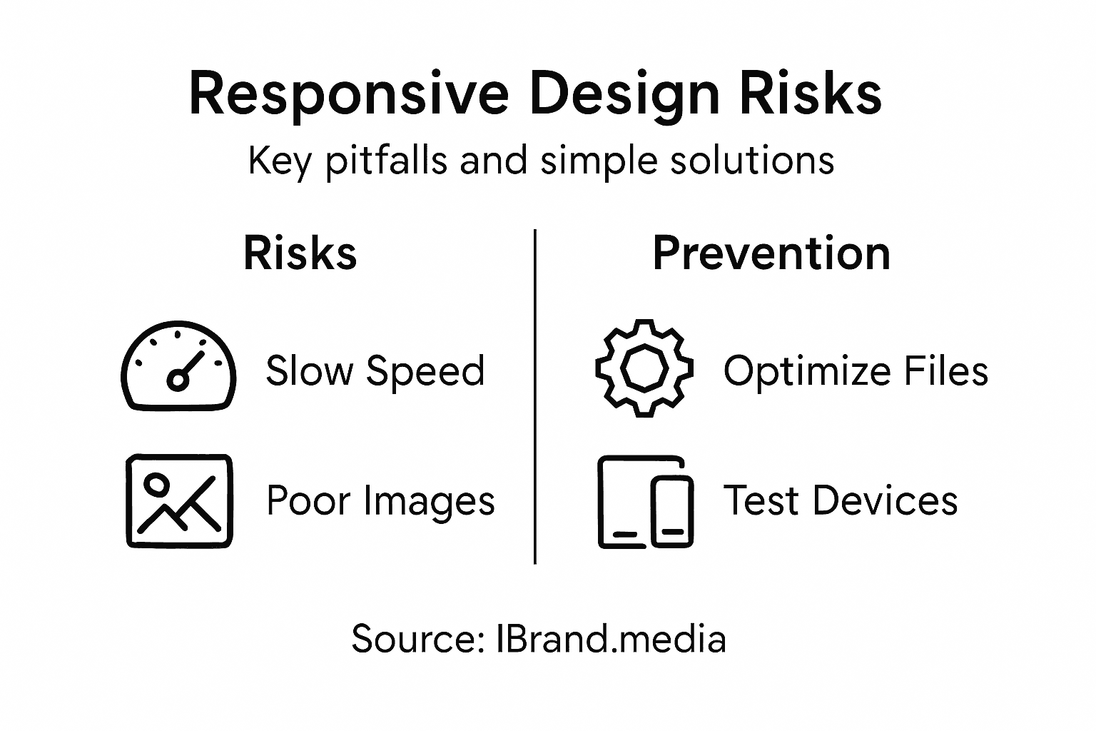
Technical risks require attention during implementation. Mobile-specific performance issues can tank your search rankings and user engagement. A responsive site that loads slowly on mobile defeats the purpose because you lose the speed advantage. Image optimization is critical because unoptimized images can be 10 times larger than necessary, destroying mobile load times. CSS and JavaScript bloat creates similar problems. Lazy loading, where images load only when users scroll to them, helps significantly. Another risk is breaking functionality during the transition to responsive design. Contact forms that don’t submit properly, broken phone number links, or payment systems that crash on mobile all directly cost you revenue. This is why thorough testing across browsers, devices, and operating systems matters before launch. Many service businesses rush their responsive redesign and go live with issues still present. You should plan for at least two weeks of testing on real devices before launching any responsive redesign. Additionally, responsive redesigns sometimes lose important SEO rankings if URLs change, redirects aren’t set up correctly, or content gets accidentally modified during the process. Working with an agency that handles these technical details properly prevents costly mistakes that damage your search visibility.
Risk mitigation starts with choosing the right partner. Cheap website builders and inexperienced designers create more problems than they solve because responsive design requires genuine technical skill, not just visual design ability. Look for agencies like iBrand.media that specialize in responsive design for local service businesses and can provide examples of similar projects they’ve completed successfully. Ask specifically about their testing process, their approach to image optimization, and how they handle the transition from your old site to the new one without losing search rankings. Avoid anyone who promises to complete a responsive redesign in less than three weeks because proper implementation takes time. Also establish clear performance metrics before starting. You should expect to see improved mobile traffic, reduced bounce rates from mobile users, and increased lead generation within 60 days of launch. If those metrics aren’t improving, you either have a technical issue or the redesign wasn’t done properly.
Key risks and mitigation strategies for responsive web design projects:
| Risk | Impact on Business | Prevention Strategy |
|---|---|---|
| Slow mobile performance | Higher bounce rate | Optimize images and code |
| Poor touch targets | Missed conversions | Design mobile-first layouts |
| Testing only on desktop | User frustration | Test on real mobile devices |
| SEO ranking loss | Lower search visibility | Proper redirects and planning |
| Inexperienced agencies | Costly mistakes | Choose proven responsive experts |
Pro tip: Request a detailed proposal that shows which specific devices and browsers your designer will test on, ask them to provide their average mobile load time target in seconds, and get a written guarantee that your site will rank no lower than your current rankings 30 days after launch so you have accountability for SEO preservation.
Transform Your Mobile Presence with Expert Responsive Web Design
Struggling with a website that looks great on desktop but fails to engage mobile users? The article highlights a crucial challenge for local service businesses today: losing valuable leads due to non-responsive websites that frustrate mobile visitors. Your customers expect fast-loading pages, easy navigation, and seamless touch interactions on any device. Without a mobile-first, responsive design approach, your competitors are capturing those searches for “near me” services and turning clicks into calls.
At iBrand.media, we specialize in crafting truly responsive websites that scale effortlessly across smartphones, tablets, and desktops alike. We understand the importance of mobile user experience, fast loading, and Google-friendly design. Our tailored web design services include mobile-first layouts, optimized images, and thorough real-device testing to eliminate bounce rates and maximize engagement. Our transparent pricing and collaborative approach mean your investment directly pays off with better search rankings and more inbound leads.
Ready to turn your mobile visitors into loyal customers with a website built for all screens? Visit iBrand.media now to get a custom plan designed for your local business. Don’t let a poor mobile experience cost you another lead. Contact us today to start your responsive web design journey and watch your online visibility and sales grow.
Frequently Asked Questions
What is responsive design?
Responsive design is a web design approach that ensures a website automatically adjusts its layout, images, and text based on the screen size. This means users have a quality experience whether they’re accessing the site on a smartphone, tablet, or desktop computer.
How does responsive design improve mobile engagement?
Responsive design enhances mobile engagement by providing a clean interface, readable text, and easy navigation, all of which lead to a better user experience. When visitors can effortlessly access information and contact options, they are more likely to stay on the site and convert into leads.
What are the key benefits of responsive design for local service businesses?
For local service businesses, responsive design can lead to increased search visibility, improved user engagement, and higher conversion rates. A mobile-responsive site loads faster on mobile devices, which can decrease bounce rates and encourage more visitors to reach out.
Why should I choose responsive design over adaptive design?
Responsive design uses a single flexible layout that adapts to any screen size, simplifying maintenance and updates. In contrast, adaptive design requires multiple fixed layouts for different devices, which can increase costs and complicate ongoing management.
Recent Comments