
More than half of all American web traffic now comes from smartphones and tablets, yet many business sites still fall short on mobile usability. This trend matters because every tap, swipe, or second of delay can cost a potential customer. Understanding what truly makes a website mobile-friendly helps American businesses keep visitors engaged by delivering smooth, frustration-free experiences that actually encourage action and boost results.
Table of Contents
- What Makes A Website Mobile-Friendly
- Types Of Mobile-Friendly Web Design Approaches
- SEO Advantages Of Mobile-Optimized Sites
- Impact On User Engagement And Conversions
- Common Mistakes When Going Mobile-First
Key Takeaways
| Point | Details |
|---|---|
| Mobile Optimization is Essential | Over 50% of web traffic comes from mobile devices; a mobile-friendly design enhances user engagement and reduces bounce rates. |
| Responsive vs. Adaptive Design | Choose between responsive design for fluid scaling or adaptive design for tailored layouts based on device types, depending on your specific needs. |
| SEO Importance | Mobile-friendly websites benefit from improved search rankings, faster page load speeds, and reduced bounce rates, making mobile optimization crucial for visibility. |
| Common Design Mistakes | Avoid cluttered layouts, hidden call-to-action buttons, and slow loading speeds to improve user experience and increase conversions. |
What Makes a Website Mobile-Friendly
Understanding the core characteristics of a mobile-friendly website requires more than just making a site look good on smaller screens. Successful mobile design involves creating an intuitive, responsive experience that adapts seamlessly to different devices. Mobile-friendly websites prioritize user experience through strategic design elements that enhance navigation, readability, and interaction.
Key elements of mobile-friendly design include prominent and easily tappable call-to-action buttons, streamlined navigation menus, and content that adjusts automatically to screen sizes. According to research from IACIS, effective mobile websites avoid horizontal scrolling, provide visible search functionality, and minimize intrusive promotional elements. These principles ensure users can quickly find information and complete desired actions without frustration.
The technical foundation of a mobile-friendly website involves several critical components:
- Responsive Design: Automatically adjusts layout and content across different screen sizes
- Fast Loading Speed: Optimized images and minimal scripts for quick performance
- Touch-Friendly Interface: Large buttons and ample spacing between interactive elements
- Readable Typography: Legible fonts and appropriate text sizes for mobile screens
- Simplified Navigation: Condensed menus and easy access to primary website functions
Small business owners and entrepreneurs must recognize that mobile-friendly design is no longer optional. With over 50% of web traffic now coming from mobile devices, a well-designed mobile website can dramatically improve user engagement, reduce bounce rates, and potentially increase conversions by providing a smooth, accessible digital experience.
Types of Mobile-Friendly Web Design Approaches
Business owners navigating the digital landscape encounter multiple strategies for creating mobile-friendly websites. Two primary approaches dominate the mobile web design landscape: Responsive Web Design and Adaptive Web Design, each offering unique solutions for delivering optimal user experiences across diverse devices.
Responsive Web Design represents a fluid approach where websites dynamically adjust their layout and content based on screen size. This method uses flexible grids, scalable images, and CSS media queries to ensure seamless adaptation across smartphones, tablets, and desktop computers. By implementing responsive techniques, websites can maintain consistent visual design and functionality regardless of device specifications.

Adaptive Web Design takes a more structured approach by creating multiple predefined layouts specifically tailored for different device categories. Unlike responsive design’s continuous scaling, adaptive design detects the user’s device characteristics and serves a precisely optimized version. This method allows for more precise control over user experience but requires developing distinct layouts for various screen sizes.
Key differences between these approaches include:
-
Responsive Design:
- Fluid, continuous scaling
- Single layout that adapts dynamically
- Lower development complexity
- Better performance across devices
-
Adaptive Design:
- Fixed layouts for specific device types
- More precise user experience control
- Higher development effort
- Potentially faster loading on targeted devices
Small business owners should carefully evaluate their specific needs when choosing a mobile web design strategy. Website design practices that prioritize user experience and technical efficiency will ultimately determine the most suitable approach for their digital presence.
SEO Advantages of Mobile-Optimized Sites
Search engine optimization represents a critical battleground for small businesses seeking online visibility, and mobile-friendly websites have become a fundamental strategy for achieving higher search rankings. On-page SEO techniques now heavily prioritize mobile optimization as a key ranking factor, compelling businesses to adapt their digital presence to mobile-first standards.
Google’s search algorithms explicitly reward websites that deliver exceptional mobile experiences by boosting their search results positioning. This means mobile-optimized sites enjoy significant advantages, including faster page load speeds, reduced bounce rates, and improved user engagement metrics. Websites that load quickly and display correctly on smartphones automatically signal to search engines that they provide high-quality, accessible content.
The specific SEO advantages of mobile-optimized sites include:
- Improved Search Rankings: Higher visibility in mobile search results
- Enhanced User Experience: Lower bounce rates and longer site interactions
- Faster Page Speed: Quicker loading times across mobile devices
- Reduced Technical Penalties: Avoiding mobile-unfriendly site warnings
- Expanded Audience Reach: Connecting with mobile-first internet users
Small business owners must recognize that mobile optimization is no longer optional but a fundamental requirement for digital success. Optimizing websites for search demands a comprehensive approach that considers mobile users as the primary audience, not an afterthought.
Impact on User Engagement and Conversions
Mobile-friendly websites represent a critical turning point for businesses seeking to transform casual visitors into committed customers. Website user experience strategies demonstrate that mobile optimization directly correlates with increased user engagement and higher conversion rates across digital platforms.
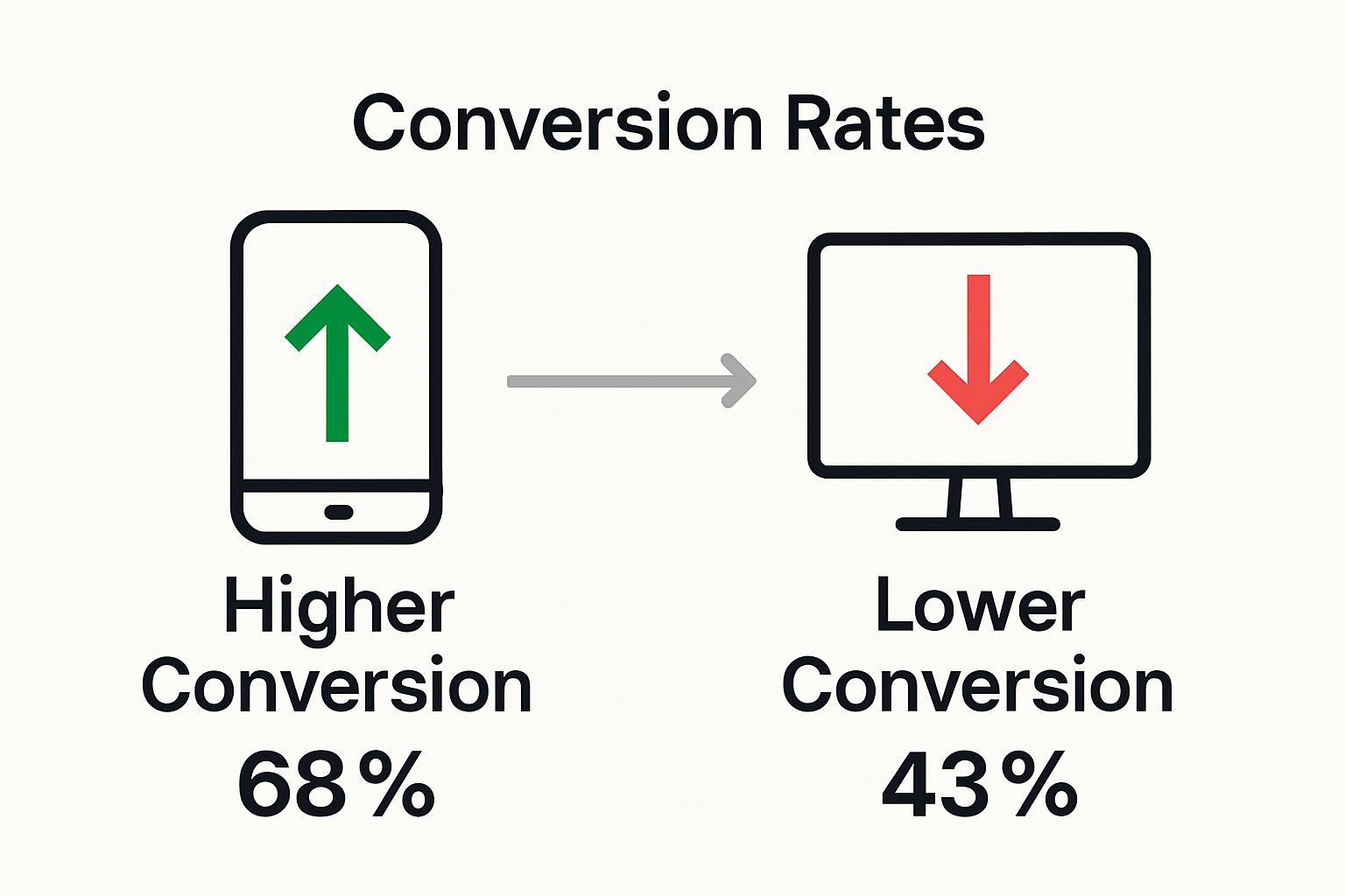
The psychology of user interaction shifts dramatically when websites provide seamless mobile experiences. Potential customers are more likely to explore products, read content, and complete transactions when interfaces respond intuitively to their device’s screen size and touch interactions. Websites that load quickly, display content cleanly, and offer easy navigation can reduce bounce rates by up to 50% and increase time-on-site metrics significantly.
Key engagement and conversion improvements include:
- Reduced Friction: Simplified mobile interactions decrease abandonment rates
- Faster Load Times: Quicker access increases user patience and exploration
- Intuitive Navigation: Touch-friendly menus encourage deeper site exploration
- Improved Readability: Responsive text and images enhance comprehension
- Streamlined Conversion Paths: Easier form completion and purchasing processes
Small business owners must recognize that increasing website conversions requires a mobile-first approach that prioritizes user experience across all device types. The most successful digital strategies transform technical optimization into meaningful customer connections.
Common Mistakes When Going Mobile-First
Transitioning to a mobile-first design requires careful strategy, as website user experience factors reveal numerous potential pitfalls that can undermine digital effectiveness. Businesses frequently stumble by applying desktop design principles directly to mobile platforms without understanding the unique constraints and opportunities of smaller screens.
Responsive Design Failures represent the most critical errors small businesses make. According to research, poorly designed mobile websites create significant user frustration through cluttered layouts, illegible text, and unoptimized content. The consequences extend beyond immediate user dissatisfaction, potentially damaging brand perception and reducing conversion potential.
The most common mobile-first design mistakes include:
- Overcomplicated Navigation: Menus that are difficult to use on touchscreens
- Hidden Call-to-Action Buttons: Obscured or tiny interactive elements
- Excessive Content Density: Overwhelming users with too much information
- Slow Loading Speeds: Images and scripts that dramatically reduce performance
- Non-Responsive Text Sizing: Font that becomes unreadable on smaller screens
- Horizontal Scrolling Requirements: Forcing users to scroll sideways
Small business owners must recognize that digital marketing strategy demands precision and user-centered design. Successful mobile optimization requires continuously testing and refining the user experience across multiple device types.
Elevate Your Business with a Truly Mobile-Friendly Website
Small to medium-sized business owners face challenges like slow loading speeds, complicated navigation, and poor mobile readability that hold back website engagement and conversions. This guide highlights the essential need for responsive design, streamlined content, and touch-friendly interfaces to connect with mobile-first customers. At ibrand.media, we understand the frustration caused by unoptimized mobile experiences and the lost opportunities they create.

Discover how our expert team can transform your website into a powerful mobile-friendly platform that drives results. With personalized strategies in SEO, web design, and local marketing, we help you reduce bounce rates, improve user engagement, and increase conversions with easy navigation and fast loading speeds. Visit ibrand.media today to explore our tailored solutions. Start your journey by checking out our Uncategorized | Ibrandmedia insights and see why businesses trust us for affordable, effective digital marketing. Act now to give your customers the seamless mobile experience they expect and watch your online success grow.
Frequently Asked Questions
What are the key characteristics of a mobile-friendly website?
A mobile-friendly website features responsive design, fast loading speed, touch-friendly interface, readable typography, and simplified navigation, all aimed at enhancing user experience on mobile devices.
How does mobile optimization impact SEO?
Mobile optimization significantly influences SEO by improving search rankings, enhancing user experience, reducing bounce rates, and facilitating faster load times, all of which are favorable signals to search engines like Google.
What are the differences between responsive and adaptive web design?
Responsive web design uses fluid layouts that automatically adjust to different screen sizes, while adaptive web design employs fixed layouts for specific device categories, allowing for more control over user experience but requiring more development effort.
Why is a mobile-friendly design essential for small businesses?
A mobile-friendly design is crucial for small businesses because over 50% of web traffic comes from mobile devices, enhancing user engagement and potentially increasing conversions by providing an accessible digital experience.
Recommended
- Understanding Mobile-Friendly Websites: Why They Matter | Ibrandmedia
- Mobile-Friendly Website Design: Complete Guide | Ibrandmedia
- 7 Best Website Design Practices Every Business Should Know | Ibrandmedia
- 10 Essential Website Design Tips for Small Businesses | Ibrandmedia
- Best Government Website Design Tips | singleclic
Recent Comments